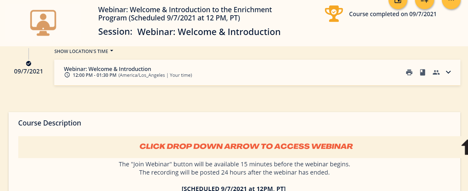
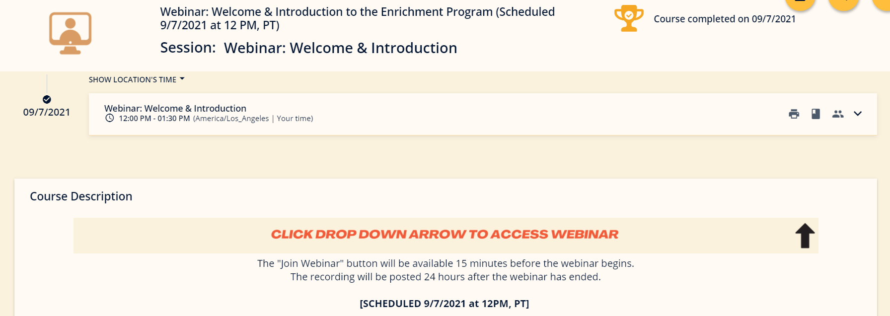
To get our users to click on the arrow to reveal their join webinar button we decided to add a banner with instructions to do so. The problem is that the image doesn’t stay within the course description box or even stretch to the end of the box to line up with the arrow we’re pointing to when the browser window size is changed.


I’ve been trying to find a code or setting to fix it but I can’t seem to find anything. Is there any way I can fix it?
As always, I appreciate the assistance!


