My Activity Donut Widget has so much Negative Space
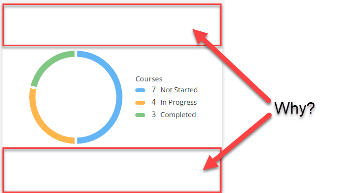
Hello! I am here with a CSS question. The My Activity widget that you can put on pages has so much negative space on the top and bottom. Has anyone figure out how to remove or reduce that? I don’t like how it looks on my page, but we want to provide this type of visual to learners directly on their courses page. Red boxes below are what I’d like to remove/reduce.
Page 1 / 1
This is tricky because you will also affect the bar chart on the other slide.
Try this and be sure to test things out to your liking.
You will need to identify the ID of your activity widget.
/** Target specific widget and reduce the height for the circle graph **/ /** Adjust the size as desired **/
/** This will adjust for the bar chart on the second slide **/ /** A value 100 less than the one above would be a good start **/ /** Notice the numeric part of the ID is the same as my widget ID **/
#barchart-204 { min-height: 175px; }
Hope this helps
You’re a genuis!
Hi, where would I find the Widget ID and does this go into the configuration and branding? Thanks!
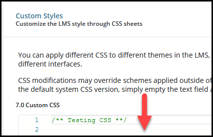
@KC_SS - Yes the code will go into the Configure Branding and Look under Custom Styles
You can search for the ID of the widget by right clicking on the widget and choosing Inspect.
This should bring up a panel in the browser with some code to review. The part you click on should be already highlighted.
You will probably need to look a few lines higher to get the ID of the widget itself.
Should look something similar to this.
Hope that helps
This is great! Any ideas for the mobile version? I am having the same issue on the Mobile it looks way worse! But this isn’t tricking the mobile version.