Best Answer

New Course Player header layout options issues


Userlevel 6
Badge +3

Anyone else not thrilled with the new course player header layout options?  I like having those options, don’t get me wrong, but they do not work like I would hope.

I am actually testing from a Learning Plan at this time, not an individual course, so please correct me if this does in fact work correctly from an individual course!

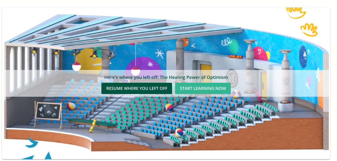
For the Solid Color Layout option, you can set a color to use, but it does not in fact show a solid color… it uses a gradient with no options to change the other shades in the gradient.  So we can choose to use one of our brand colors, but because of the gradient it does not align with our branding.  For example, we have a Cerulean color selected but this is how it appears:

...when it should just be the very top layer of color:


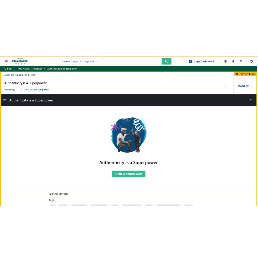
I also tried to use the Cover Image Layout option, using the suggested size of 1400 x 800, but that is not the correct size for the header at all… it should be a lot longer than it is tall, so my image does not display well at all.  This seems more like a course player cover image that would display in the course player itself, not as a header image for the course.

For now, I think we will stick with the Basic Layout for a simple, cleaner look.  But I would like to use some of these header options for some of our non-standard courses to set them apart visually from the more standard content we offer.

icon

Best answer by lrnlab 30 June 2023, 20:13

View original

10 replies

Userlevel 7
Badge +7

agree it’s not great...I played around with some CSS provided by Docebo...it’s a slight improvement but doesn't fix everything…


I agree and we have struggled with this spending way too much time on trying to find a way to make it look professional and not boring.  We like the dark mode, just want the ability to put an image that has some design and potentially identifying characteristics for the training to make it easy for the learners.  In addition, the header is way to thick and should be shorter. This definitely needs a lot more work to make it truly usable.

Userlevel 3

The cover image layout is buggy, and is not allowing images to be uploaded either from the stock images in the web library or my own.  I agree the header is way too thick and i wish the color layout would be not gradient.

Does anyone know if you can set the default for all learning plans, or will we need to go into each and every learning plan and update to the basic layout?

Thanks!

Lynda

Userlevel 4
Badge +2

Just chiming in to say I really don’t like the look of it… and I also don’t love these little cartoon icons, we worked really hard to create a look and feel that matches our brand and now I have to figure out how to get rid of these icons too… 


I have a setting that jumps user into the course almost immiadetly which seems to bypass the course player image anyway which seems to be the workaround… if you exit out you get back to this ^


But I much prefer this one 


Any idea if we can just opt out of the new player indefinitely? 

Userlevel 7
Badge +5

Just chiming in to say I really don’t like the look of it… and I also don’t love these little cartoon icons, we worked really hard to create a look and feel that matches our brand and now I have to figure out how to get rid of these icons too… 


I have a setting that jumps user into the course almost immiadetly which seems to bypass the course player image anyway which seems to be the workaround… if you exit out you get back to this ^


But I much prefer this one 


Any idea if we can just opt out of the new player indefinitely? 

Those icons are decently easy to swap out. Let me know which ones you want gone!

For the header, couldn’t you upload a single color 1400x800 image? Or does it gradient those too. It doesn’t seem to gradient mine. 

Userlevel 7
Badge +3

Any idea if we can just opt out of the new player indefinitely? 


I was wondering the same thing, but according to the following article, the old player will be retired in June 2024.

Transition to the New Course Page

Userlevel 2

@lrodman - I would love to remove the cartoon icons as above.  Could you let me know how?


Userlevel 4
Badge

Hello -- I am trying to remove the dark gradient on the course player header as well. I noticed that in Docebo University for a course I am taking that Docebo was able to remove the gradient for their own stuff. Any one know how they did it so I can too? 


Userlevel 4
Badge +2

Just chiming in to say I really don’t like the look of it… and I also don’t love these little cartoon icons, we worked really hard to create a look and feel that matches our brand and now I have to figure out how to get rid of these icons too… 


I have a setting that jumps user into the course almost immiadetly which seems to bypass the course player image anyway which seems to be the workaround… if you exit out you get back to this ^


But I much prefer this one 


Any idea if we can just opt out of the new player indefinitely? 

Those icons are decently easy to swap out. Let me know which ones you want gone!

For the header, couldn’t you upload a single color 1400x800 image? Or does it gradient those too. It doesn’t seem to gradient mine. 

Aggh! I missed your reply. 

Icons - All of them but the one pictured is a good start

Header Image - like just a block of one color…. I guess so but we really like our course player image we have now and I don’t want to lose it.


I gave up on this task because I’m trying unsuccessfully to get our branded mobile app running… but I know I’m gonna have to address these updates sooner rather than later. 


I just kind of wish I could kick the can down the road some more. 

Userlevel 4
Badge +2

If anyone is looking for the css for replacing the bike lady, I found this in the comments elsewhere


/*Replace Person on Bike with custom image */

lrn-training-material-player-embedded-package dcb-ui-illustration

{

background: url(https://img-9gag-fun.9cache.com/photo/aY4bvE0_700bwp.webp) no-repeat center;

background-size: contain;

}


lrn-training-material-player-embedded-package dcb-ui-illustration svg {

visibility: hidden;

}


Please note I just googled an image on the internet you’ll want to replace the red part with a link to your image. 

Reply