Morning all,

Another thing we have noticed during some update, is that the text for when there are no sessions scheduled for a course has changed.
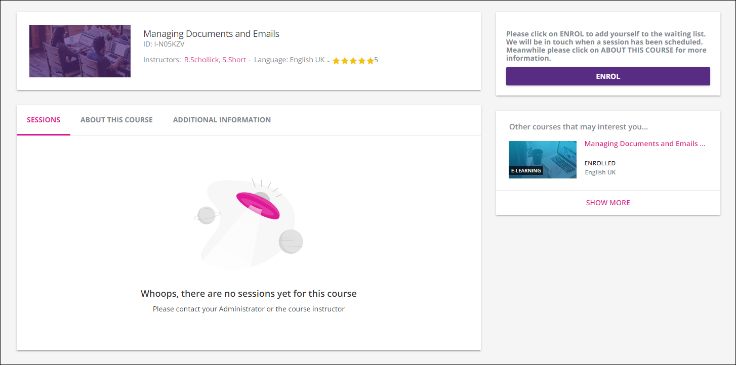
We used the localisation tool to edit this previously as we have some on demand courses that run once we have enough interest.  We get users to enrol on the course and then when we schedule a session, a notification goes out to those interested to book on to it.  You can see the text we changed to above the enrol button.

My question is where is the “Whoops, there are no sessions yet for this course” hiding in the localisation tool?  I have searched whoops, no sessions, the whole thing, and various other options, but cannot find it.

Anyone know?

I know this doesn’t answer your question, but at least there's info there now, used to be no sessions and the page basically made you feel like you were in the wrong place with nothing to do.


Looks like this is no longer a label and may need to be adjusted using CSS. I changed the word “Whoops” to “Sorry” in the inspection panel but could not find any labels in localization.


Well that’s annoying...


If I’m right, I agree! not sure why Docebo would change their strategy on something like this...


This messaging is definitely not user friendly in our instance.  We do not want people contacting the administrators as there is no need.  I’ll raise a support ticket for it.


Yeah it’s crazy to put directions like that in a form language. 


agree @Neil Patterson Thx


I’m sure i have read something elsewhere but can't find it.  is there any way not to have this page come up by default?  Most people browsing the courses would much rather see the ‘about this course’ first.  it makes no sense the course contents are hidden by default.


I’m sure i have read something elsewhere but can't find it.  is there any way not to have this page come up by default?  Most people browsing the courses would much rather see the ‘about this course’ first.  it makes no sense the course contents are hidden by default.


I don’t think so - I know it is an idea on the portal somewhere as I remember seeing it too!  Agree with you about people wanting to see ‘about this course’ first.  I think you would want to know what the course is about before seeing dates that you can book onto a course you know nothing about 😁


The whole idea of dropping users on a sort of blank page when there are no sessions booked is a poor experience all around. The user should at the very least end up on the description page with options. A “request a session” option would be amazing to see


The whole idea of dropping users on a sort of blank page when there are no sessions booked is a poor experience all around. The user should at the very least end up on the description page with options. A “request a session” option would be amazing to see

And if there’s a waitlist, should be able to join in this state too. It’s really crazy currently. 

I just think the whole ILT experience from front and back end needs an overhaul.  It is too complicated and time consuming currently


100% agreed. Wish I could replace the end user interface as easy as it was for the scheduling experience. So much room for improvement. 


can someone share the CSS coding so i can change this text.  its not helpful at all


Reply