I am getting feedback from our learners that the process to access e-learning content is confusing. Specifically, the scenario whereby a learner searches for a topic and search finds a video within a course the learner is not enrolled in.

Currently, in our platform, a learner clicks on that video, and instead of the video, they’re taken to the course enrollment page.

From there, they have to click Enroll, then Start Learning Now to access the video.

My question is whether anyone has any methods to simplify this process for learners?

I understand the need for the Enroll button, but ideally a learner would click Enroll and then go straight to the video search found for them. Instead there’s an intermediate step to “Start Learning Now.”

I saw the setting Advanced Settings ►E-Learning / Options / Directly play first item (or resume the last played object) when entering a course and thought it might help, but it’s had no impact on improving the experience so far.

Does anyone have any ideas or workarounds to help streamline the path between clicking on a search result and accessing that item within a course?

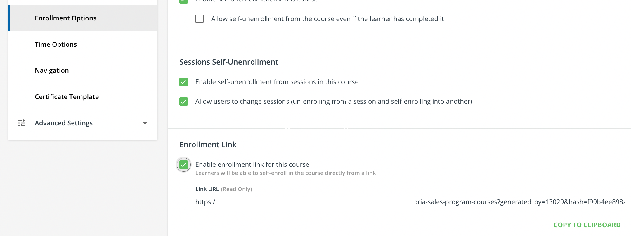
Hi @dgladfelter you can bypass the enrolment process by providing the users with the Course Enrolment Link. this option will automatically enrol anyone who clicks the link and allow then to get to your content more quickly.

Only trick is that you would need to create a custom content widget or other spot to place the link since if they find the course in the catalogue, they still would need to enrol first before getting to the content


@lrnlab - I’ve observed the same behavior for Course Enrollment links, and that’s what we typically use to promote content to employees.

Do you know of any way to improve the process for people who come into the course from a Course Catalog, Channel, or search result?


Unfortunately they are no controls through those routes to essentially “auto enroll “ when selecting the course tile when interested. It would be a nice setting/option to add I’d guess system wide. I suspect there are a few places that like the current for being able to peruse details before deciding to enroll. 


@dgladfelter have you tried the auto-play option? That’s the way we get users into a course quickly...if you use that + the enrolment link, I think you'll come close to what you want. You can find this option under the Player tab


Another option is to add a course deep-link into course description and make it look like a button with css. 

This html goes into course description:

<a href="deep-link-here" class="btn_auto-play-course">PLAY NOW</a>

 This css into global Custom CSS

/* Style for course description Play Now button */
.btn_auto-play-course {
height: 40px;
background-color: #049b8f;
color: white !important;
padding: 10px 15%;
font-weight: 800;
}
/* Hide course Play Now button */
.course-description .btn_auto-play-course {
display:none;
}


Example:


Reply