Since quite some time is Docebo working on a new reporting area and since roughly 2 years Docebo has 2 menu entries for reporting (“Reports” and “New reports”).

Unfortunately, our customers regularly run into time outs within the “Reports” section, because the reports are quite big.

@all: do you also experience time outs in the “Reports” section?

@Docebo: when will Docebo deactivate the “Reports” menu item? Because our customers are confused and as they also have time outs, they have a negative experience.

@all: does anybody know how to disable the menu item through CSS (keeping in mind that the menu is created dynamically, based on the right you have as a power user)?


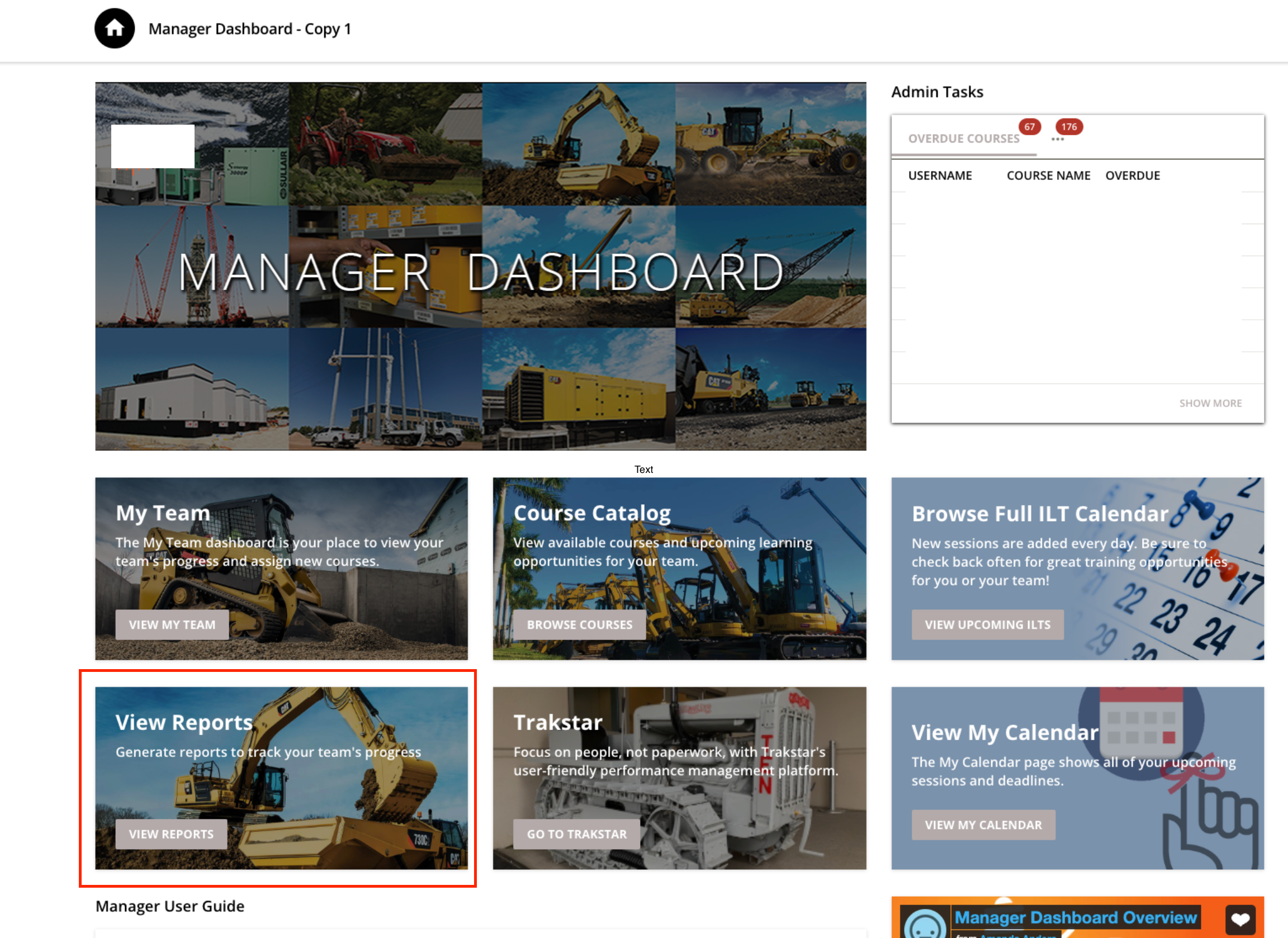
One thing I might recommend is creating a homepage/dashboard for your users who access the reports area and adding a link straight to the New Reports area on it- perhaps using a custom content box widget.


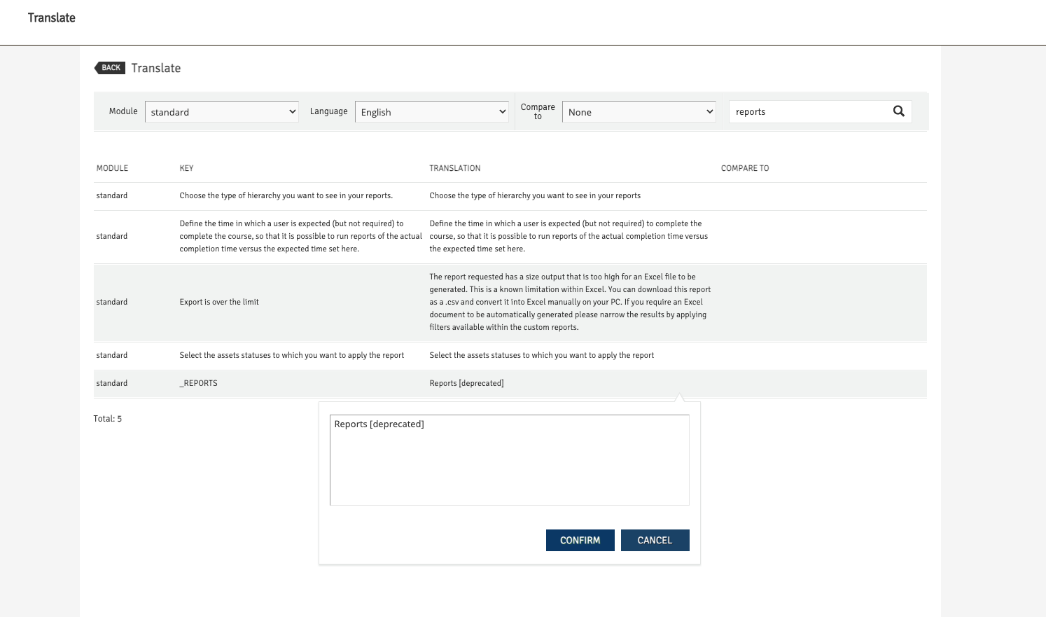
Another idea you could consider is using the localization tool to update the name of the Reports menu item to something like “Reports tDeprecated]”


That way when people see it they’ll be less likely to click the link. Just keep in mind that you’d have to do this for every language you support.


Agree with @nick.tosto we use a custom box as a launch point for admins and only advise on using the old Reports tool when absolutely needed as it will slow down the system and may time out, etc. I like the label change idea..thanks for that.


Same, we set up our pages with direct access to the New reports module as well to try and keep our power users out of that admin menu.  


@nick.tosto Thanks for the ideas! Just implemented both and I think our team members will appreciate it. 


We are already using Custom Content Box on our Administrator Dashboards but some user use the Admin menu on the right top side and for that we needed a solution.

My colleague @Sébastien Arbour found a nice CSS solution that works like a charm.

div#menu_E-Learning ul li aihref="/legacy/admin/index.php%3Fr%3DreportManagement/index"]{
display:none;
}

But this is only a quick and dirty solution. There is no advantage to keep the old reports section and I hope that Docebo finally will remove it soon.


Have to disagree with the last bit, there are still a bunch of folks I have encountered who have reasons for using the old reports, it has become less, but still needed. One very common case is needing the actual report in the email sent, not a link back to it, for instance. That being said there is an definite middle ground where a simple toggle to allow access to it in your system could/should be there by now.

Always remember, just because something doesn’t fit your use case anymore, doesn’t mean its universal, I imagine if you had a use case for the old still and it just disappeared, you would be quite upset :)


Hi @Bfarkas ,

From a product development perspective, it doesn't make any sense to keep two report sections. If there are customers that use the old reports, for example for the reason that you mentioned, Docebo should inorporate that functionality into the new one.


Hi @Bfarkas ,

From a product development perspective, it doesn't make any sense to keep two report sections. If there are customers that use the old reports, for example for the reason that you mentioned, Docebo should inorporate that functionality into the new one.

Sure. And we will all wait forever for progress to come since nothing is ever perfect….and no one here ever complains about that :)

Products phasing legacy with replacement systems over periods of time is fairly common, mechanisms to manage it are usually there and is what is missing here was my point.


One thing I might recommend is creating a homepage/dashboard for your users who access the reports area and adding a link straight to the New Reports area on it- perhaps using a custom content box widget.


Another idea you could consider is using the localization tool to update the name of the Reports menu item to something like “Reports tDeprecated]”


That way when people see it they’ll be less likely to click the link. Just keep in mind that you’d have to do this for every language you support.

Just realized that when you do this, the listing in the Course Management tab for Reports gets updated as well...so be careful. Caused some confusion briefly...

Tabs in Course Management


Reply