Survey displays funny

  • 25 October 2023
  • 7 replies
  • 33 views

Userlevel 2
Badge

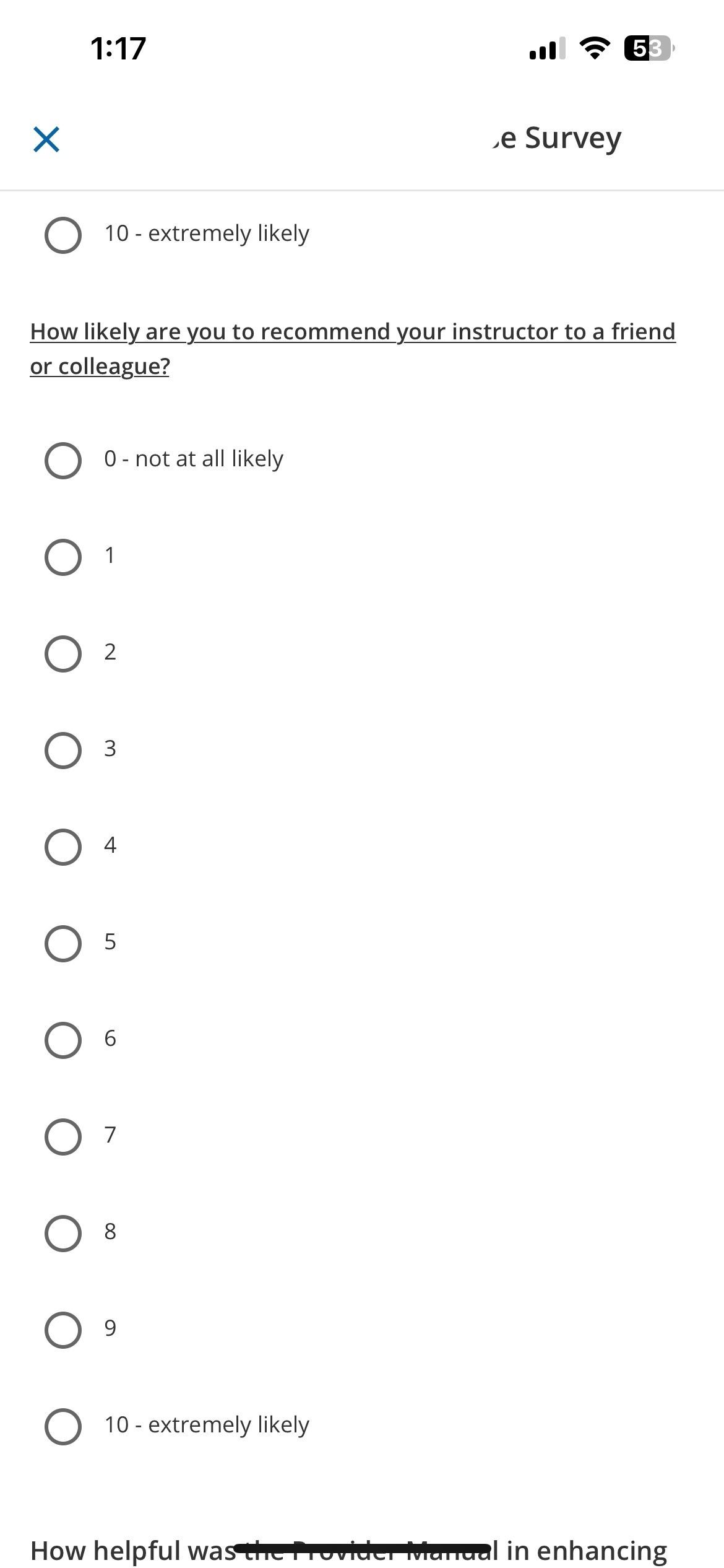
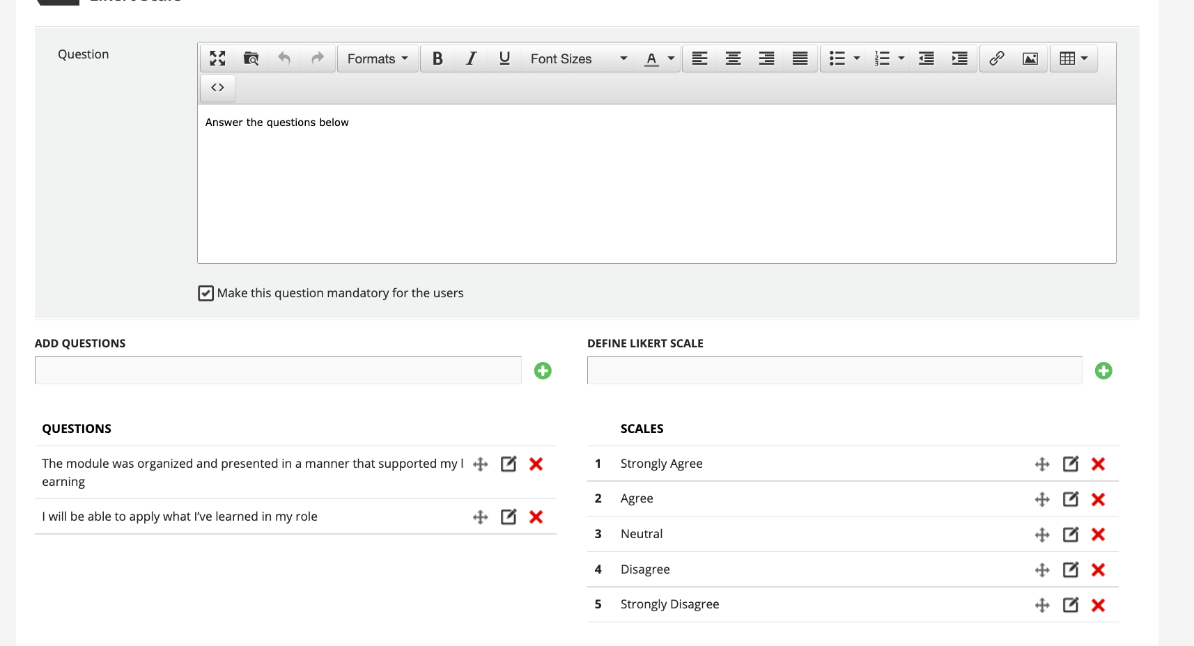
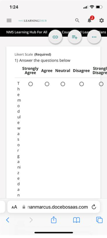
Has anyone Likely scale in a survey display like this in both desktop and mobile? I cant replicate the issue on my end. 


7 replies

Userlevel 7
Badge +5

Hello @Sgrullon12 … I’ve not seen this in a survey, but thinking about it from the perspective of HTML, it looks like the screen size of the device is too small for any of the “viewports” defined in the CSS.

Is this happening for multiple users? Is it coming from a specific browser? Is the Go.Learn app being used for the mobile view?

Userlevel 2
Badge

Just double checked is happening both in the Go Learn App and using the web browser in the mobile device. 


Userlevel 7
Badge +5

@Sgrullon12 ...this sounds like a ticket to support, if you haven’t already.

Userlevel 7
Badge +7

Definitely not on desktop and I just tested on my phone and the Likert scale type question appears like a single choice with the scale down the left side of the page and the question on top; this repeats for each question in the Likert scale.

In your example, it almost looks like you put the question in the wrong spot...when creating the Likert scale questions, did you place them on the left and create the scale on the right?

Userlevel 2
Badge

This is how i set it up


Userlevel 7
Badge +7

yep, that looks right…

did you test on another browser or phone/tablet to see if it’s the same across all devices? If yes, I would recommend you log a ticket.

Userlevel 7
Badge +3

Do you have any custom CSS related to survey’s? Could also be impacting it, although if in the app too, probably is not.

Reply