Hey community,
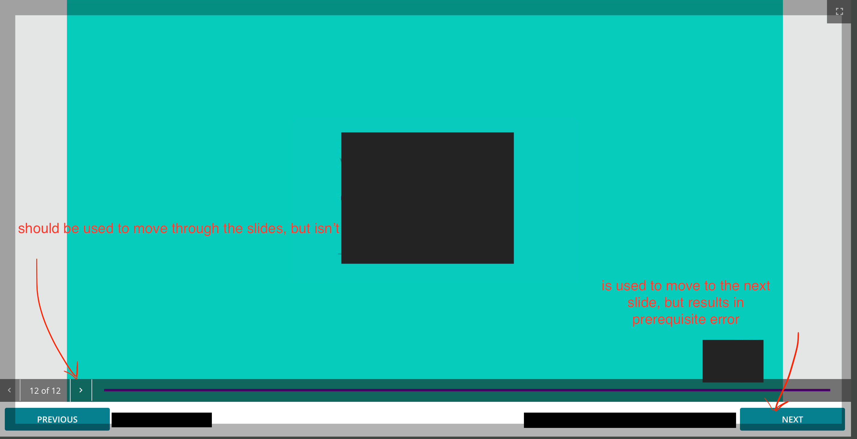
Has anyone else received any requests in regards to the course navigation Previous and Next Buttons?
Since our LMS have launched, most of the questions I’ve received from our learners have been related to these buttons that make me think we have a UI/UX issue.
Here are more details - I’d like to know if any of you have experienced something similar and how you solved it? Thanks!
Here are the steps our users follow:
- The user accesses a course
- One of the course lessons has slides that need to be navigated
- Instead of navigating the slides with “<” and “>”, the user clicks on “Next”
- Since next is linked to accessing the next lesson (not the next slide) the user gets an error “Prerequisites not met” (for those courses with sequential navigation)
- The user gets confused and contacts LMS administrators

In any case, I think there could be more ways to set up the navigation player or a quick-win fix. Unless I’m not aware that it already exists.
P.S. Please Ignore the dark blocks as I’ve hidden some data :)
Thank you!


