Hi folks,

Bit of an odd one here, we have multiple Learners within our environment that have two different experiences for their course thumbnails and it’s causing confusion within our team.

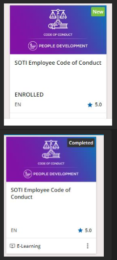
Within “My Courses and Learning Paths” it shows as complete (as expected as they've completed this), yet on another page/catalog it shows them as Enrolled (also the New icon as we just launched our implementation of Docebo this past month).

Note: We do not have duplicate courses for this course, and the user apparently didn't self-enroll themselves again into this course (either way even if they did they shouldn't see two visually different thumbnails on two different catalogs in my opinion). 


Any help would be appreciated!!!


Top Image: Custom page / catalog for New Hire Training

Bottom Image: My Courses and Learning Paths
 

Hi @bmyoung, and thank you for letting us know about this issue you’re seeing! It looks like you haven’t opened a ticket with our support team yet. I’d be happy to open one for you, but I want to confirm that you’re still seeing these discrepancies?


@elliott.vickrey  thanks for the comment, yes please open a case please for us!


Great, thank you for confirming @bmyoung. I’ve opened a ticket on your behalf, and you should receive a notification email shortly. We really appreciate you bringing this issue to us so we can work to resolve this behavior!


I seem to be having this same issue. The My Courses and Learning Plans page correctly shows the “Completed” status on learning plan and course thumbnails, but the same thumbnails show an “Enrolled” status on a custom widget page using the Catalogs widget. Opening a ticket...


Apparently, this is intended behavior. It’s hugely confusing to users, however, so please feel free to vote for a solution here:

https://community.docebo.com/ideas/show-completion-status-in-catalog-1634/index2.html


Apparently, this is intended behavior. It’s hugely confusing to users, however, so please feel free to vote for a solution here:

https://community.docebo.com/ideas/show-completion-status-in-catalog-1634/index2.html

Done!


I continue to receive inquiries from our users about this. They think something is wrong with the system, or that they did something wrong, because the course thumbnails displayed in catalogs do not reflect the fact that they have finished courses, only that they are considered enrolled. I opened a help desk support ticket on this, and can confirm that course thumbnails not being able to show COMPLETED but only ENROLLED is considered by Docebo to be expected behaviour.  I add my voice to asking that this tiny bit of code to be added to Docebo.


This issue generates several support requests from my users every week, and has been for over a year. It has now been escalated to the executive level, where senior leaders are saying Docebo either needs to be fixed or replaced. I just got off a call with a Senior VP who said just that. Docebo’s “vote for this feature” response is wholly inadequate. Users (and executives) do not understand why, if course completion status is accurately displayed in My Courses and Learning Plans, why it can’t be in Catalog tiles. Stating that this is intended behaviour because catalogs are general purpose listings for browsing, and not for user level specifics does not cut it. If so, why show NEW or ENROLLED at all? Those are user specific items. I have been scouring the forums for months on this and have opened service tickets. There also does not seem to be a way to simply suppress the misleading ENROLLED label. I am experimenting with using channels instead of catalogs.


This issue generates several support requests from my users every week, and has been for over a year. It has now been escalated to the executive level, where senior leaders are saying Docebo either needs to be fixed or replaced. I just got off a call with a Senior VP who said just that. Docebo’s “vote for this feature” response is wholly inadequate. Users (and executives) do not understand why, if course completion status is accurately displayed in My Courses and Learning Plans, why it can’t be in Catalog tiles. Stating that this is intended behaviour because catalogs are general purpose listings for browsing, and not for user level specifics does not cut it. If so, why show NEW or ENROLLED at all? Those are user specific items. I have been scouring the forums for months on this and have opened service tickets. There also does not seem to be a way to simply suppress the misleading ENROLLED label. I am experimenting with using channels instead of catalogs.

I wonder if it is possible to hide the “Enrolled” tag on the course cards in Catalogs with CSS?  This way users only see the status from their Courses and Learning Plans widget.


To your point, @Annarose.Peterson, this (or something similar) ought to do it:

.ui-card-content-row.ui-card-price-enrollment-status {
display: none;
}

Which is not to understate the significance of the underlying issue. Hiding the enrollment status from the catalog is hardly an ideal solution, but I agree that it’s probably better than nothing.


Reply