Hi all,

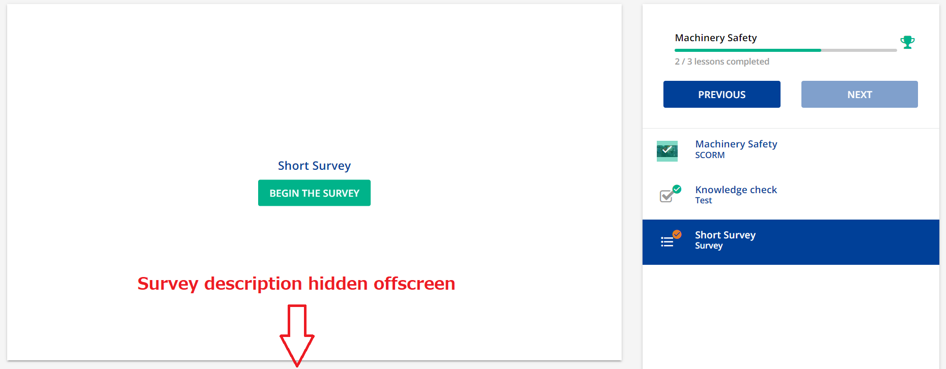
Does anyone know if it’s possible to use CSS to move the survey description to the top? At the moment, it’s positioned below the survey and hidden offscreen as shown in the following screenshot.
 

That’s tough without trying to recreate something.

An idea did pop in my head though… so… just brainstorming out loud… take it for what its worth...

If this is just a one-off - how about a custom player graphic that has the description embedded within?


That’s tough without trying to recreate something.

An idea did pop in my head though… so… just brainstorming out loud… take it for what its worth...

If this is just a one-off - how about a custom player graphic that has the description embedded within?

Just be careful over the accessibility of that route, adding text through images presents many potential problems. something else to consider is the players are getting redone soon…how much of an investment to this now for it to probably change soon?


Thanks @gstager and @Bfarkas It sounds like this would take a lot of work, so I think I’ll wait to see what happens with the player update.


Thanks @gstager and @Bfarkas It sounds like this would take a lot of work, so I think I’ll wait to see what happens with the player update.

Yeah, I keep a bunch of things in a investigation queue now that there is significant work being done to those pages soon.


Reply