The hot topic of auto-tagging and whether or not we like/want them has been discussed before.

I am not sure, however, that we have brought up the idea of hiding them yet, though, so I am just gonna leave this right here.

/** Hide Chapter Tags **/
.chapter-tags-wrapper {
display: none;
}
/** End Hide Chapter Tags **/

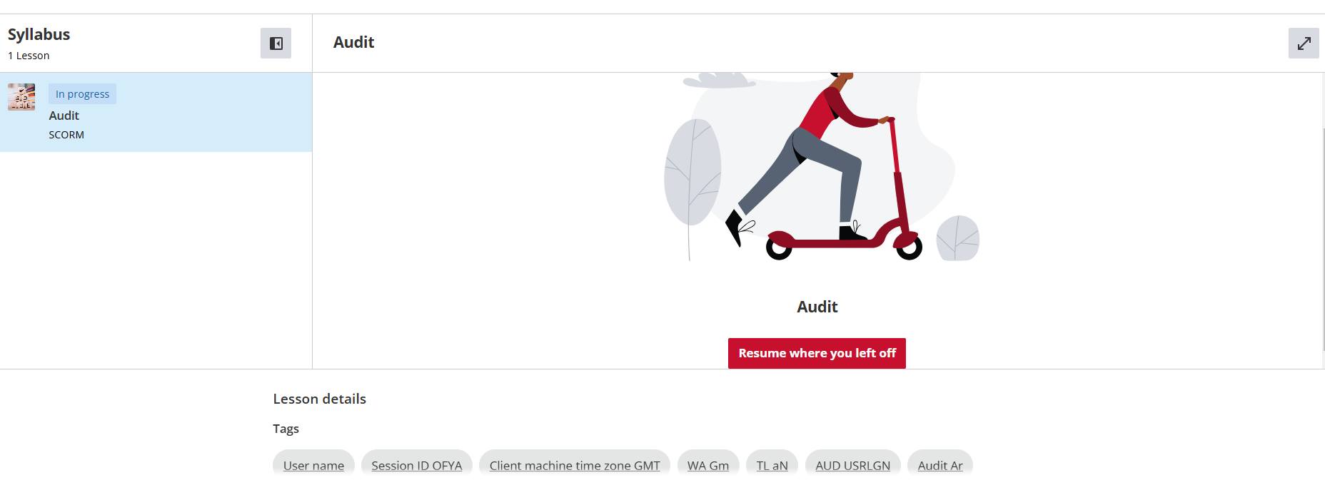
Here is the before


Here is the after


This is the area right underneath the player within the course.

At least now when I forget to go back and delete bad tags - my learners don’t have to shake their heads and wonder about the garbage.

As always - continue to test. I will be keeping an eye out for issues that may arise from this mod.

Be sure to vote on having the ability to disable auto-tagging if you have not already.

Hope this makes someone smile today!

@gstager deserves a medal for this!  I do not like how tags are always visible and we cannot control what gets tagged.


Thanks, @Annarose.Peterson - Maybe a few more posts to earn the HTML/CSS community badge. 😎

I don’t think they have one of those.


@gstager needs his own section.


@gstager needs his own section.

I am afraid they would have to put me on the payroll, then.

We would also need to call the section Stagman Styling

LOL


with the new course player, the TAGS are popping back up.  😥


any ideas here?


with the new course player, the TAGS are popping back up.  😥


any ideas here?

Looking for the same!  Put in a ticket too, if I hear back on it I’ll share here. 


Heard back on the ticket.  They said to ask someone on here for updated CSS to hide the tags in the new course player. 


Heard back on the ticket.  They said to ask someone on here for updated CSS to hide the tags in the new course player. 

Wow - that is actually pretty lame.

I have not changed to the new player.

I like the look but my courses don’t function at all. So I didn’t bother.

I did notice the tags had reappeared but I didn’t attempt a fix.

I can try it in preview mode and hopefully it persists when going live for all.


Give this a try.

I did not test beyond preview mode nor did I test with other items in the widget area so be sure to do some more testing with this if you are using the new player for all users.

It could remove more than just the tags.

/** Remove Tags **/

.lrn-course-player-lesson-info {
display:none;
}

/** End Remove Tags **/


👑👑👑👑 @gstager you rule.  I’ll play with this today!


thanks yall, that new CSS code works to hide the tags in new player!!


/** Remove Tags **/ .lrn-course-player-lesson-info { display:none; } /** End Remove Tags **/


@gstager@Annarose.Peterson - do we apply the css change to the custom styles? Or the course player custom style? I hope I dont sound silly.


@gstager@Annarose.Peterson- do we apply the css change to the custom styles? Or the course player custom style? I hope I dont sound silly.

Not silly at all.  I put it in the Custom Styles area under Configure Branding and Look and it worked for the new course player. 


This is amazing! Will not have any problem with tags showing in course player! Worked perfectly in the new Course Player... Thank you, folks!


Give this a try.

I did not test beyond preview mode nor did I test with other items in the widget area so be sure to do some more testing with this if you are using the new player for all users.

It could remove more than just the tags.

/** Remove Tags **/

.lrn-course-player-lesson-info {
display:none;
}

/** End Remove Tags **/


This worked like a dream, unfortunately when we tested we realised that it also removed the free text and transcription links which we have under a number of our videos so we’ve had to disable it for now. 


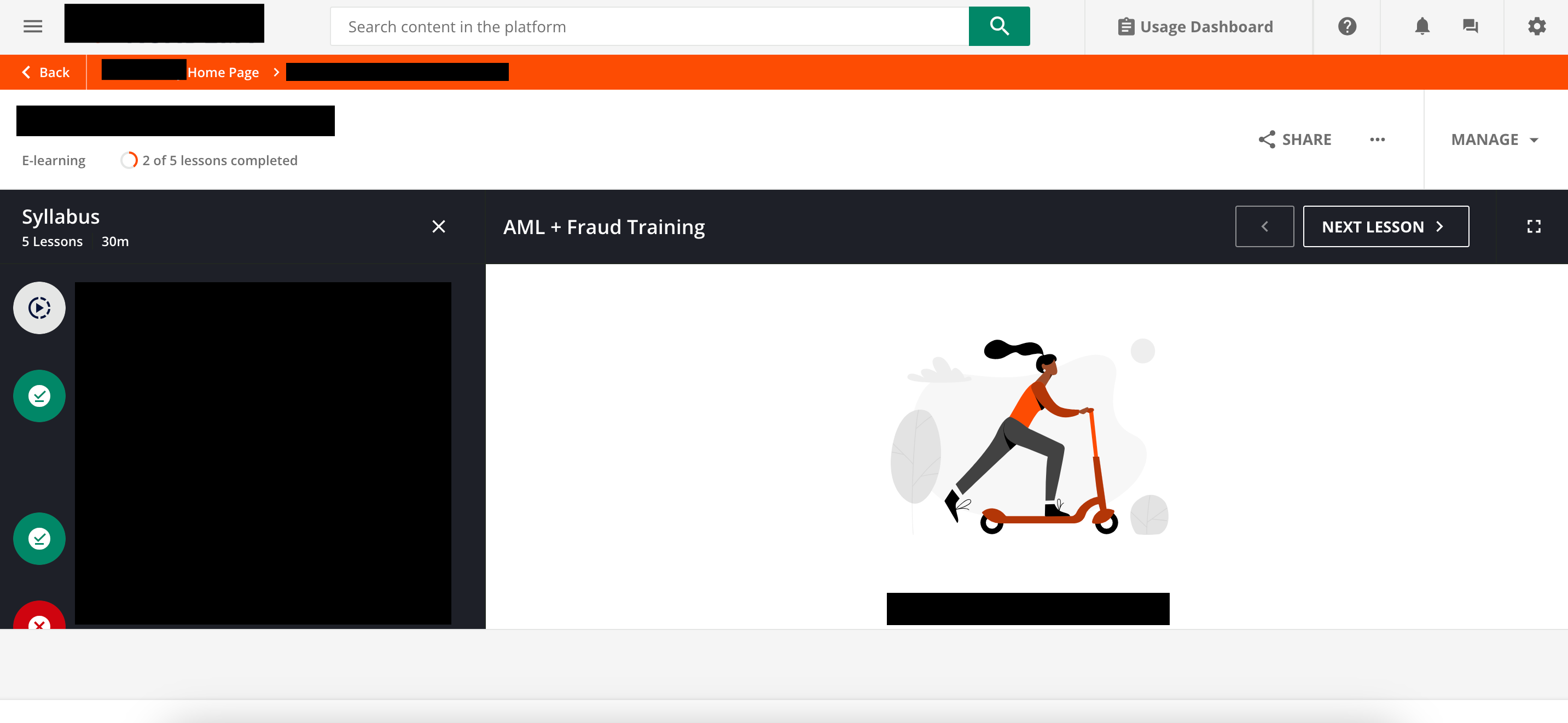
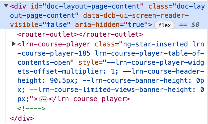
@gstager Thank you so much for the great code! It works great - but do we know a way to remove the gray bar at the bottom altogether instead of just removing the text? The gray bar still covers the green “Start Learning Now” button in my player unfortunately. I tried using “inspect” but couldn’t figure out what of this would result in what I want.

Black bars are all text


@sara.cramer - Hmm… I do not have any grey bars on mine. So something is different somewhere.

I also disabled AI tagging altogether - did you do that as well?


Hi! Thanks for the new CSS code. :) 

We too have the problem with this grey bar and the AI tagging options are all disabled. Any idea which element could be responsible?


Maybe a GUI choice?

Again - I do not see this issue and I don’t recall doing anything extra CSS-wise to do anything here.

I am using the Theater Mode (Lightbox) setting for the view mode.


Ah, I can see another difference in your screenshot. You still have other widgets like Comments, Repository and Forum active in this course. I have no other widgets activated.


Reply