Hi, I am currently working on designing the Landing Page for my company’s LMS. I have read through some Community Posts and Knowledge Base articles about best practices and what others are doing in their LMS. 

I’m a visual person and I would like to see what others’ Landing Pages look like to spark some ideas - something like a Pinterest board. (Obviously I am not planning to copy & paste anyone’s)

Would anyone mind sharing what their LMS looks like and maybe a few sentences/bullet points explaining the thought process behind it? I would like to make mine very user friendly and “easy on the eyes” while also keeping it interesting & engaging. Anything helps! Thank you. :) 

@dominikacharczuk good morning - I dont mind sharing, but I do think you will find some extremely different and interesting approaches.

I think you will want to consider who your targeted audience is and the experience you are trying to emphasize first.

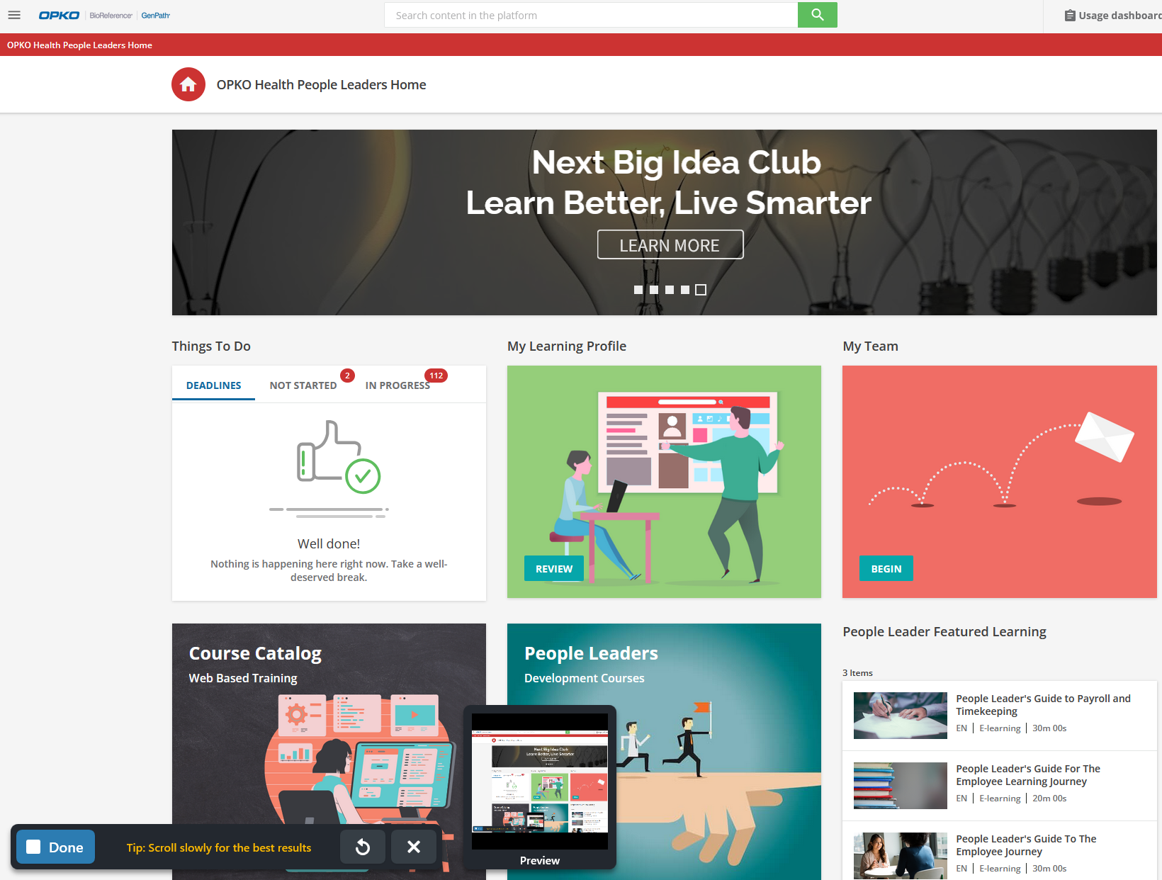
Big for us is really making sure we target a few different audiences with the right amount of information. After getting some feedback we landed on the following:

We target Individual Contributors vs People Leaders at our orgs. And we support different (shorter) landing pages for “externals”.

You may also have some secondary drivers as well with some of your elements on page. We got some early feedback that we needed to make certain elements pop because the hamburger menu was not an obvious element on the screen.

Sorry about the snagit overlays

We use a carousel at the top to support a dynamic CTA (call to action). There is no official carousel supported by Docebo, but there are cloud-based solutions and articles that can help you with things like this.

So nothing too fancy...pretty clear tiles to bring folks to:

  • their tasks,
  • some featured learning
  • and some key functions.

Reply