We are SO close to launching our Docebo instance. While I’ve been hustling behind the scenes giving sneak peeks whenever possible, we are going to need to launch the product company-wide. We have offices in 7 countries and everyone is fully remote.

We have a solid plan for training on the product, but we really need the messaging and marketing around deployment. Our big challenge: our soon-to-be former LMS was not inspiring or remotely user friendly from a browsing perspective.

  1. How did you launch your LMS? How did it go? What would you have done differently?
  2. How did you encourage employees to jump in, poke around, and start contributing? (we have Discover, Coach, & Share)

Many, many thanks in advance!

Anne

We did our soft launch with new hires in select departments, and then rolled Docebo out companywide a month later. We are global company that’s partially remote. The fact that our former LMS was not inspiring or user-friendly really worked in our favor with regard to getting buy-in from people on the new system. We also began reaching out to department heads and other key stakeholders during our LMS selection process to understand their needs and get buy-in early on. So people knew this was coming.

Our onboarding process when it came time was to reach out to training stakeholders in various departments separately, schedule introduction sessions with them, then undertake a needs analysis with regard to what power user rights (if any) should be allocated to trainers and managers in that BU, as well as additional training. 

Key points of our elevator pitch:

  • Overall user-friendliness of the system.
  • The course player and learning plans - ability to have multiple different materials in one course, something we didn’t have before, and string those courses together into learning plans.
  • ILTs - the ability to created blending learning by including videos, elearning, and other materials in ILT courses.
  • Catalogs - the ability to now group courses into different catalogs and create custom catalogs for departments or business units.
  • My Activities - the learning dashboard.
  • For managers - My Teams and expanded reporting capabilities.

We don’t have Coach and Share yet, but for us the emphasis is on the content. We have LinkedIn Learning integration, so our focus right now is on curating and creating professional and skill development courses that are relevant to our employees and getting them into our catalogs, to give people a reason to want to keep checking out the system.

Another thing we did was to create a pair of “What’s New?” e-learning courses (using Rise) for end users and managers, that we enrolled everybody in on go-live day, in addition to making Docebo University courses available to our power users.

Best of luck on your launch!


@rtomchuk Thank you SO much for this thoughtful response! Love the elevator pitch points in particular.


Congratulations @AnneG !!! When I was part of the launch of Docebo with my last organization here are some things we did to help drive adoption with the employee users: 
 

  • To promote adoption, talk about the LMS and talk about it often to your organization before you go live, have an email campaign, give sneak peeks.
  • For our launch, a way we were able to drive adoption was incorporating the use of the LMS with events that are not regularly associated with training (such as new brand launch or employee appreciation event).  Have a video or fun activity that the users can go into to LMS to complete, like a scavenger hunt where people have tasks to complete to get points - upload a video using the docebo native screen recorder, or upload an assignment in a course.
  • Post launch - collect feedback on the user’s experience with the LMS.  Not so much feedback on your course content, but feedback on the platform itself.  Are courses hard to locate?  Do you know where to go to find what you need to complete?  Address those pain points that users may have, because the easier it is for users to navigate your platform, the more they will use it.  In our case, it turned out the way we were titling our courses was making it hard for our users to find anything because our naming convention did not match the names users were using to search our courses. (we put version numbers in our course titles, and we were using “v12.3”, but users would search “12.3”, and so search results would not display what they were looking for!)

What we would have done differently? -

Had the post launch feedback sooner so we could address pain points faster.

Good luck and wishing you all the success with your launch!


Hi @AnneG 

We rolled out our site in the following 3 stages, collecting feedback and improving the user experience as we went along.

  1. Pilot test for a small group of managers and stakeholders.
  2. Official launch for employees and partners.
  3. Official launch for customers.

Docebo is our first LMS, so fortunately we didn't need to overcome any negative preconceptions based on a previous one. We give new users a simple PDF guide, and this seems to take care of any questions they might have. We've been running the site for almost 2 years now, with over 1000 users, and I can honestly say that we've only had to answer a handful of questions about navigating the site. I think this demonstrates that Docebo is, on the whole, very intuitive from a browsing perspective.

We don’t have Discover, Coach and Share, so I can’t really comment on that, but with regards to motivating users to study, I think this is largely dependent on the quality of the training materials you provide. Docebo is a great interface, but ultimately the training materials themselves must be as interesting as possible and provide real value to your users.

Hope this helps and best of luck with your launch 🚀😀


@Daniel  Hi Daniel, by any chance would you be willing to share the simple PDF guide that you developed?  It sounds like yall had a fantastic rollout and I might well be able to get some good ideas for my rollout.

Much thanks!


Hi @shardwic 

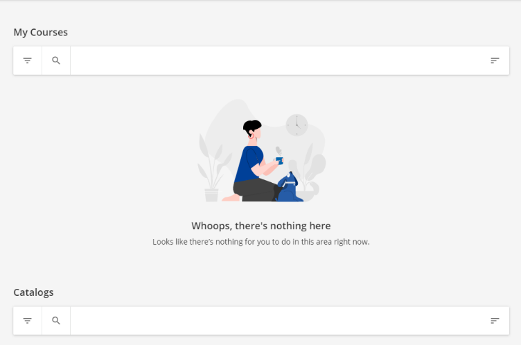
Sorry, I can’t share the PDF guide itself because it contains some confidential information, but I can give you some tips on creating the guide. One of the things new users struggle with is the My Courses landing page shown below. They need to scroll down the page to view the catalogs and enroll in courses, but some don’t think to do this and get stuck. If you can make this clear in the guide, you should be able to reduce the number of inquiries you receive on launch.

Apart from that, I would include a simple procedure with screenshots showing how to enroll in a course and start learning (which are separate steps and might be a little confusing at first).  In our case, all our courses are video based, so we showed them how to enroll in a course, start learning, and then navigate from one video to the next. We also showed them how to view the video in full screen mode and how to use the seek bar to scroll through the video as needed. Most users should be able to figure this out on their own, but it doesn’t hurt to include this information just in case. 

Another thing to consider is how your users will sign in to your site. If you’re using SSO or have separate sign in pages for internal and external users, it’s best to make the sign in procedure as clear as possible to avoid confusion later on.

We also included a summary of the system requirements for desktop and mobile to make sure users use the correct browser and operating system. You can find all those details at the link below.

https://help.docebo.com/hc/en-us/articles/360021001819-Docebo-Learn-System-Requirements

Finally, don’t forget to include a contact email address in the guide so users have someone to contact if they have any questions.

Hope this helps and good luck with your launch!


Daniel -- Thank you SO much. I really appreciate you taking the time to give me those tips. You are amazing ;-)


Reply