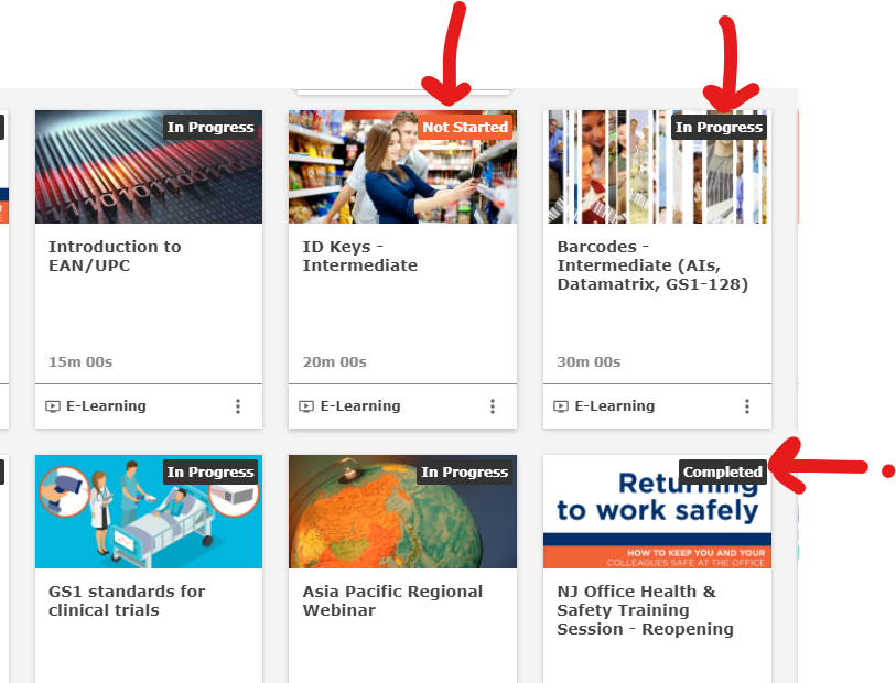
Both “in progress” and “completed” statuses have identical classes associated with them, and no specific id to target. In both cases the gray/black background is set by the class .ui-badge-status-neutral, so changing that through custom styles would not work to differentiate “in progress” and “completed”. I also attempted to inject style information through the Localization function (it sometimes works), but could not.
This is one of those times where I wish I could add a script that could target an element based on its text, but Docebo doesn’t yet allow that.
What type of page/widget is shown in that screenshot? I have this working on the channels widget with CSS:
/* Sets style of the In Progress status tag */
.ui-card-status-in_progress .ui-badge-status-wrapper {
background-color: #e67e22;
text-transform: capitalize;
}
/* Sets style of the Not Started status tag */
.ui-card-status-subscribed .ui-badge-status-wrapper {
background-color: #e74c3c;
}
/* Sets style of the Completed status tag */
.ui-card-status-done .ui-badge-status-wrapper {
background-color: #ff0000;
}
This would apply to all of them in the system, although you can select just specific widgets or pages if you wanted. Note I added the text-transform to the in progress as i wanted consistent capitalization between the three, it is not needed. Just update the color values for the background color and this will work on at least channel widgets, if you let me know other locations I can take a look.
Totally agree though that there are some places this may not be possible and would be nice to do simple scripts for this type of thing.
Hey @Bfarkas - any suggestions on how to do it for the Courses and Learning Plans widget? We have that on our homepage and would love to update the statuses! Also, do you have a screenshot showing the varying colors in your environment?