

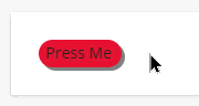
In this example - I decided to create a custom button that has the effect of being pressed.
It has the look of a momentary push button rather than a persistent one.
To do this we are simply changing the size and position by just a few pixels and adjusting the color and shadow.
Here is how I did it.
/* Button Press Effect */
/* This is the CSS for the Branding and Look section */

#myBtn {
  width: 75px;
  height: 25px;
  background-color: #e21836;
  border-radius: 25px;
  position: absolute;
  box-shadow: 3px 3px grey;
  left: 25px;
  top: 25px;
}

#myBtn:active {
  background-color: #9d061f;
  left: 29px;
  top: 29px;
  width: 74px;
  height: 24px;
  box-shadow: none;
}

#myBtn:active p {
  color: #ffffff;
}
Here is the HTML
<!-- This is the HTML for your widget or other page -->

<div>
<div id="myBtn">
<p style="padding-left:7px;">
Press Me</p>
</div>
</div>


<!-- Want to actually add a link to this button? -->
<!-- You can just add the following and change the URL as desired. -->

<div>
<div id="myBtn">
<p style="padding-left:7px;">
<a href="https://community.docebo.com" target="_blank" style="text-decoration:none;">Press Me</a></p>
</div>
</div>
Hopefully this is helpful for someone.