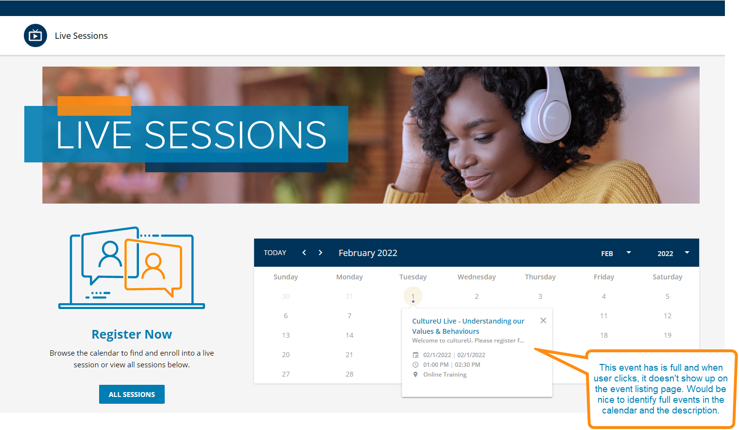
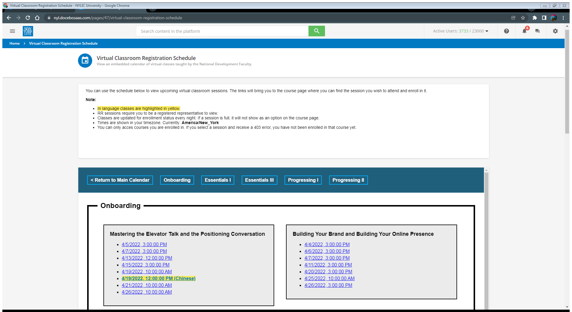
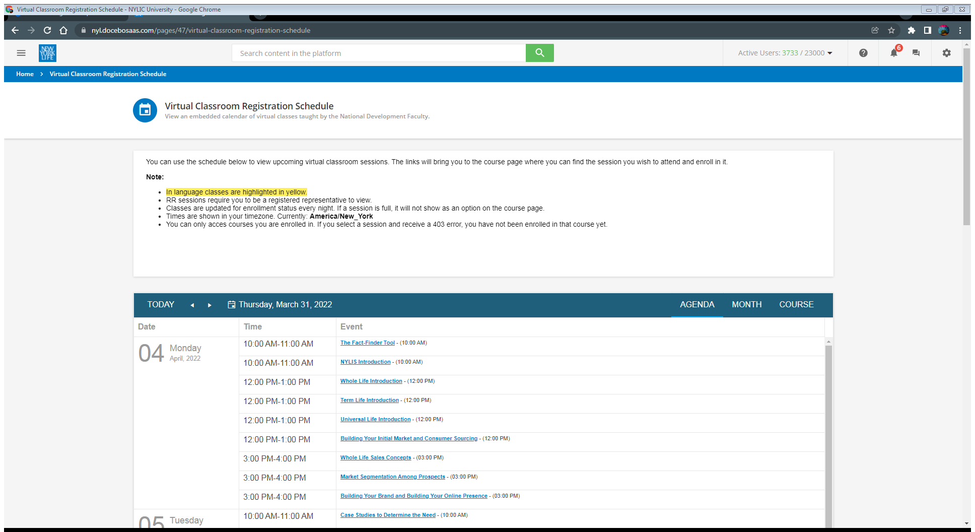
We recently ran a few tests using ILT in Docebo. There’s definitely some issues with ILT (and vILT) and I wanted to post these here in case someone at Docebo is listening. ILT is overly complicated in general and the end user experience leaves A LOT to be desired. Here are some of my findings.
End User Issues:
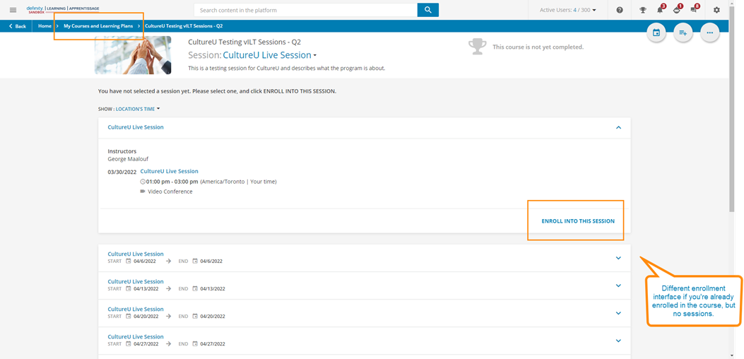
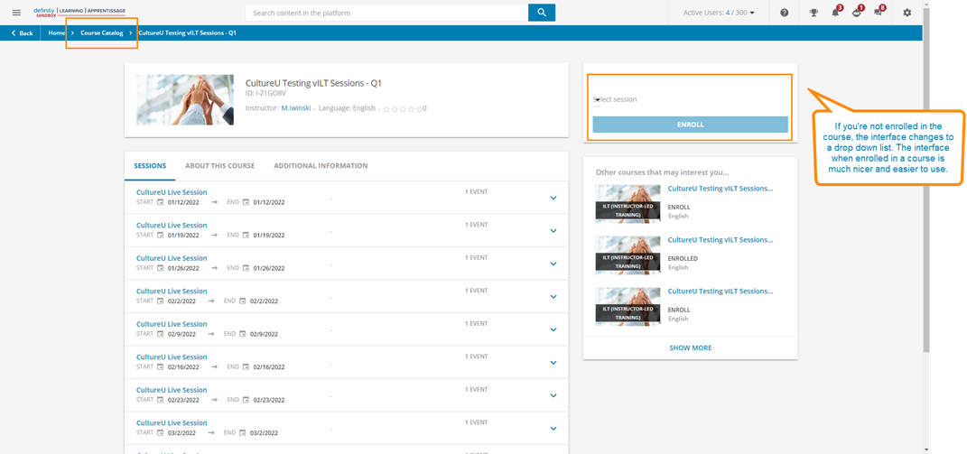
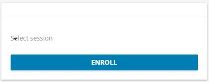
Two different interfaces if users are enrolled vs. not enrolled into the vILT course.
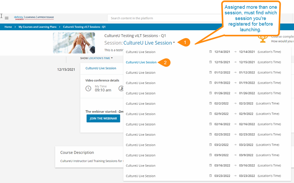
Issue if user is assigned more than one session. Difficult to find and launch session.
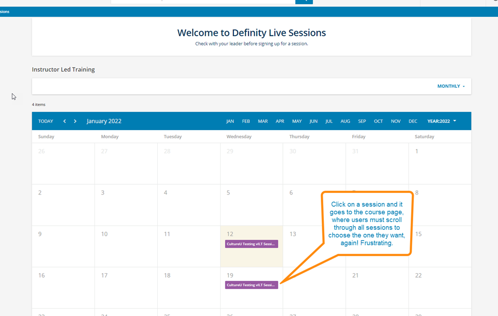
Course calendar entry in Docebo sends users to the entire list of entries, instead of the one they clicked on. Very frustrating if many sessions are listed.
Calendar issue when user clicks on an event calendar link within Docebo. It creates another calendar within Outlook. Only happens when user clicks the link in Docebo, not the confirmation email .ics file, which adds to the primary calendar.
There is overlapping text on the drop-down menu above the enroll button.
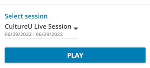
Shows PLAY button after enrollment and wasn’t 100% intuitive since it’s an ILT.
If user changes session, they get two different emails; one saying they are unenrolled and one saying they are enrolled into the new session. However, users must click the unenrolled email .ics attachment to remove this calendar entry. It might get confusing for users who forget to do this and still have the old session in their calendar.
Overwhelming for users to see all sessions listed for the year. We tried splitting them up by quarter, but this presented other issues since it wasn't easy to change a session to another one.
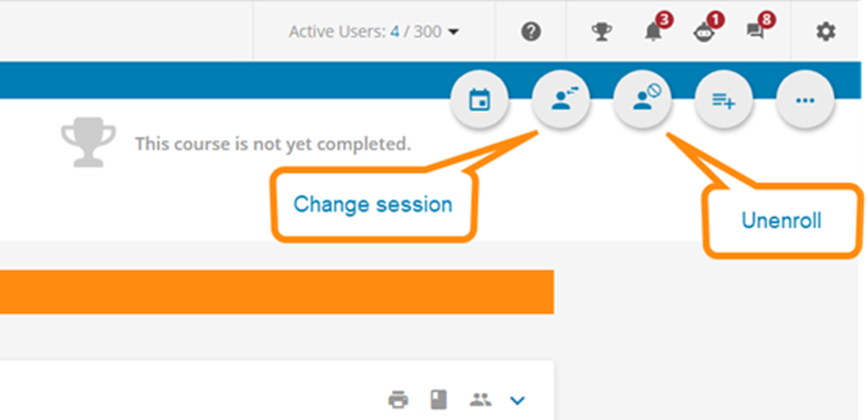
Not intuitive how to change session or unenroll. The system lacks labelling for the icons.
Administrative Issues:
There isn't a notification to send to assigned instructors by default. If instructors change or ones added, no notification is triggered.
vILT is complicated with the Session > Event structure. For each session, you need to create an event as well (doubling the work). E.g. most platforms allow creation of sessions with all of the necessary info. there.
Batch updating sessions and events isn't easy. There is no way to download existing session/event information to a CSV file to make batch updates.
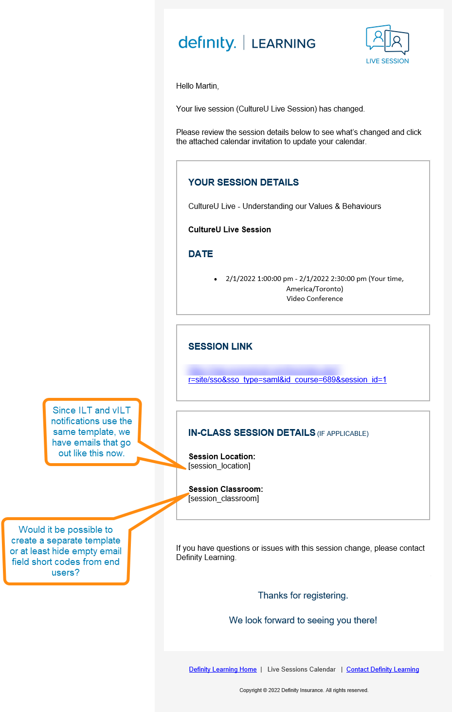
Email notifications lack distinction between ILT (which would contain location information) and vILT (which would have a link). Only one template available for all.
MS Teams integration stopped working all of the sudden. Needed to change a setting (MS Teams Webinar to MS Teams Meeting). Odd that nothing changed, but stopped working.

Page 1 / 2
Here are a few screenshots with comments as pictures can speak a thousand words sometimes :)
Thank you so much for compiling this comprehensive list! We and our learners struggle with most of these issue regularly.
I hope the Docebo team appreciate your effort and bring this to their development team.
Thanks Anders! Hopefully ILT will get some much-needed improvements. It’s a mess in my opinion and difficult to administer when we have lots of sessions to plan.
First of all, thank you very much for your feedback: for us it's pure gold!
At the moment the two user interfaces are different since the purpose is slightly different, in the first case the user is performing a self-enrollment from the catalog (which can even be connected to an E-Commerce feature and have a price tag), in the second case the user only has to choose a preferred session and f.e. it is not necessary to present courses to which the user might be interested.
Nevertheless, I agree that the current enrollment feature obtained by the select box at the top right of the page is more complex than needed; it is for this reason that, in the context of a wide restyling of the learner experience, we intend to change it. I am posting below some screenshots taken from the new mockup that we are currently studying and that will be built and released in the coming months. Please remember that this is still work in progress and subject to changes. Consider it just a small preview.
From the image below you can see an example of how the page that allows a user to enroll in the course could change. The choice of the session (and the consequent enrollment in the course, can be done through the button each session’s row). However, we will keep a general button, which is usually more visible, but pressing it will open a window on top (second screenshot) that will in any case ask the user to make the choice of a session. In this case it has the E-Commerce verbiage but the idea is the same even for courses non on sale.
In the image below instead, you will find an example of what the user interface could look like when the user is already enrolled in a course and only has to choose the session to attend: as you can see, even with some small differences, the user experience will be definitely more consistent between the two cases.
Even if a user is enrolled in several sessions of the same course - I agree 100% with your analysis - it is difficult to manage access to individual sessions. Below you can see how we are thinking to solve the problem: the box on the right shows all the sessions a user is subscribed to with a much more user friendly interface, equipped with filters and much more meaningful informations.
Here I post also you some details, in the following two images: the first concerns the display of the events that are part of a session and the second the panel with the actions allowed to the user, which accompanies a clear explanation of each single action, limiting the need to rely on icon graphics.
You also mentioned the complexity of having to create sessions and events in the case of a single event ILT / VILT. In this regard, I would like to say that a modification of the administrative side navigation flow will be released shortly which will allow you to create an event entirely from the right panel, therefore without the need to drill-down into the details of the event. This should certainly limit the work to some extent. The panel will also be able to autonomously propose the values of the fields, pre-populated with those of the last created / modified event, in order to streamline even the operations of multiple entry of events. We are still evaluating the hypothesis, over a longer period, of inserting a Quick Session creation function, which allows, in a single user interface, to create a session and an event at the same time.
A last note for notifications, we plan to update them in general this year with a new approach and, following this release, we would like to start introducing new ones even for ITL. In any case, a feature will be released in the first part of the year that allows you to interact via email directly with the instructors, both at the session and at the event level.
Thank you again! Riccardo
Hi Riccardo,
Thank you so much for the detailed response! The screenshots look great! I think these new interface mockups are much more user friendly and cleaner.
The feature to create a session and an event at the same time would be very useful. I find that 99% of our sessions are one day and time. Other multi-day training is done outside of Docebo with no bookings, just new hires taking training they are assigned. It would be great to have that quick option.
The enrollment process looks a lot easier for the end user too! Very cool to see progress being made to update this part of the system.
I attached another image regarding the ILT/vILT sharing the same email template. We’re forced to use this generic template and it includes empty in-class fields in the email. Would be nice to have separate templates or toggle the fields somehow, or not display empty shortcode fields to users.
Thanks so much for the update and we look forward to seeing what updates are made to ILT!
Martin
Great conversation on both sides. I’d like to add for @riccardogalimberti for a use case that uses learning plans for the sake of providing order and prerequisites for courses, it’d be helpful to allow users to see the currently available sessions prior to enrolling into the learning plan. Similar to one of your screenshots above, I think it could present the upcoming sessions, but it’s greyed out until they enroll in the learning plan.
Great points, I agree with every one of them.
Additional pain is caused when features like Google Drive integration which works nicely with eLearning courses isn’t available with VILT courses. Why would you not want to include that, when even with the Google Drive integration’s obvious flaw of not working with shared drives (implementation of this feature seems to have stumbled on the last hurdle, which seems a repeating story), it is still better than having to upload complimentary material as powerpoints or pdfs or worse, use HTML.
When are we going to see a true blended course type where admins and learners can truly choose how and when they are consuming the learning content?
@RicardoLeite - are your screenshots of what is coming or are they of something you have built out in html for your own purposes? I love the look and feel but have zero background in html so if this is something coming I am excited.
First of all, thank you very much for your feedback: for us it's pure gold!
At the moment the two user interfaces are different since the purpose is slightly different, in the first case the user is performing a self-enrollment from the catalog (which can even be connected to an E-Commerce feature and have a price tag), in the second case the user only has to choose a preferred session and f.e. it is not necessary to present courses to which the user might be interested.
Nevertheless, I agree that the current enrollment feature obtained by the select box at the top right of the page is more complex than needed; it is for this reason that, in the context of a wide restyling of the learner experience, we intend to change it. I am posting below some screenshots taken from the new mockup that we are currently studying and that will be built and released in the coming months. Please remember that this is still work in progress and subject to changes. Consider it just a small preview.
From the image below you can see an example of how the page that allows a user to enroll in the course could change. The choice of the session (and the consequent enrollment in the course, can be done through the button each session’s row). However, we will keep a general button, which is usually more visible, but pressing it will open a window on top (second screenshot) that will in any case ask the user to make the choice of a session. In this case it has the E-Commerce verbiage but the idea is the same even for courses non on sale.
In the image below instead, you will find an example of what the user interface could look like when the user is already enrolled in a course and only has to choose the session to attend: as you can see, even with some small differences, the user experience will be definitely more consistent between the two cases.
Even if a user is enrolled in several sessions of the same course - I agree 100% with your analysis - it is difficult to manage access to individual sessions. Below you can see how we are thinking to solve the problem: the box on the right shows all the sessions a user is subscribed to with a much more user friendly interface, equipped with filters and much more meaningful informations.
Here I post also you some details, in the following two images: the first concerns the display of the events that are part of a session and the second the panel with the actions allowed to the user, which accompanies a clear explanation of each single action, limiting the need to rely on icon graphics.
You also mentioned the complexity of having to create sessions and events in the case of a single event ILT / VILT. In this regard, I would like to say that a modification of the administrative side navigation flow will be released shortly which will allow you to create an event entirely from the right panel, therefore without the need to drill-down into the details of the event. This should certainly limit the work to some extent. The panel will also be able to autonomously propose the values of the fields, pre-populated with those of the last created / modified event, in order to streamline even the operations of multiple entry of events. We are still evaluating the hypothesis, over a longer period, of inserting a Quick Session creation function, which allows, in a single user interface, to create a session and an event at the same time.
A last note for notifications, we plan to update them in general this year with a new approach and, following this release, we would like to start introducing new ones even for ITL. In any case, a feature will be released in the first part of the year that allows you to interact via email directly with the instructors, both at the session and at the event level.
Thank you again! Riccardo
This is VERY exciting! Is there any type of ETA for when we can expect the ILT overhaul? Our first ILT pilot for our customer-facing domain produced challenges similar to what @martiniwinski described. The pilot data reviled that users were very confused by the current UI, which dramatically affected our attendance compared to attendance using Calendly. We are hoping to launch a second pilot of the ILT functionality in Q2/Q3 of this year, but we are waiting for the Outlook alias functionality to be built and (now) this ILT re-design.
Looking at the possible new UI, I think it is MUCH more intuitive. I am also eager to see the admin feature that will pre-populate the event details in a side panel. In case it wasn’t already mentioned, event level notifications and reporting fields are also something we need.
I agree that the new UI/UX preview looks really good and seems to follow industry standards for usability. Looking forward to the update and hopefully it’s coming this year!
Also having the session and event details on one page to populate would make life a lot easier from the admin side.
Being able to export csv’s and import them would also make it easier. Right now, the system allows you to download a csv template, but not existing data to alter and re-upload. This would be great if there were many changes to make. The csv upload process is also very difficult and I get lots of errors. I need to read the instructions each time to know which field I can have or not.
Another usability idea that would make it easier to find a session that is available and not full. Please read the note on the screenshot.
@martiniwinski That screenshot looks great! Would you mind sharing some details how you set this up? Is this through a channel?
Hi @LSP,
A colleague of mine set this up as a new page with a widget for the header, the left feature, and the calendar widget for the ILT course catalog.
Hope that helps.
Ah, gotcha, thanks! I kept trying to figure out how to adapt the My Calendar widget to show a catalog and completely forgot you can have a calendar view for the catalog widget! Thanks for sharing!
@martiniwinski - Just wanted to give a huge thanks for posting this list… we are working on a plan for incorporating our weekly webinar series directly into the LMS instead of standing independently…. the reasons we haven’t yet - you detailed out beautifully in the initial post.
Our primary focus is creating a good end user experience, and right now, the vILT just isn’t. We don’t want to make changes to the current process unless there is a net positive…as change is already hard…and right now, you have so eloquently detailed out the faults with the current work flow.
That being said, what is your adoption of the vILT and ILT sessions you have set up even with the current issues?
Hi Tavia,
Thanks for the kind words.
Our team launched vILT this year and it’s been alright so far. We’ve had several successful registrations and sessions. We kept the implementation very basic to avoid issues. We allow anyone to register and don’t have any wait lists or authorization.
The problem with a lot of the more advanced settings is the lack of notifications out-of-the-box. Almost every advanced setting requires you to customize and enable another ILT notification. It would be nice for the system to advise if you enable a setting to also tell you if the notification is required for it to work (e.g. waitlists, approvals, etc.). It’s a real pain that all of these notifications are blank and we need to start from scratch to update each one.
The UX/UI in ILT isn’t great for end users and admins. We have a really hard time to update enrollments, sessions, events via csv. It’s horrible actually. If you have a lot of sessions, be warry.
We’re trying to roll things out with baby steps since it’s a minefield in ILT.
Good luck!
Martin
Thanks @riccardogalimberti I really want the new updates, we have mainly one issue and that is people can’t join the webinar as they don’t click on the arrow to drop down the menu to join.
Another usability idea that would make it easier to find a session that is available and not full. Please read the note on the screenshot.
This looks really good. Out of curiosity - do you know if your coworker was using the “Custom Content Box” widget or just building in HMTL. We use the content boxes mostly, but formatting of pictures in it is near impossible that way. It almost always off centers. You end up tweaking the image dimensions dozens of times until it’s reasonably close to where you want it.
Would also be very helpful to display “remaining seats” and the status of the enrolment, ie: “on the waitlist”, “pending approval”, etc.
We do this precisely in a a custom calendar that updates hourly using api to pull current statuses. We completely ditched the built in calendar in favor of the custom from all these issues.
@Bfarkas is that some code you can share?
Its tough to share exactly, and I thought I had posted notes on it before but can’t seem to find, so I’ll do this.
So the calendar runs on a seperate server and then is iframed into a page so that user’s don’t know the difference (note the original calendar code was inherited from two LMS’s ago, I would love to overhaul it a bit)
The main issues at the time we were trying to solve for were:
Displays course name, not session
Doesn’t work on mobile app.
Time zone was confusing the way it is configured.
Tough to find a specific event on days with more than 1-3.
Can't add or highlight information about specific session types.
Full sessions still show, but when user clicks on them they disappear on the course page which is confusing.
The custom one has three main views:
An agenda view listing of all sessions, if a session is full it is styled differently in red and marked FULL and the link is removed since it is confusing when you get to the course and the session is not there (this happens across views too).
A month view which is used the least and only there because some people supposively print it which I hate, but all sessions are loaded fully instead of needing to pop another box to view them.
A custom “Learning Plan” view which groups them by course and by learning plan which the managers use a lot when pushing agents along to find the next session quickly for all of their courses.
In terms of “code”. Attached are two docs, one zip of the calendar container which as I said above really needs some cleanup and love from just changes over time, and then a document I had put together for how the power automate flow works to update the source csv file that sits on a azure storage space that handles the loading of all the data for the calendar. There is a lot of data pulled, current seats for instance that gets used to generate the full parameters.
The power automate flow basically uses the API to connect and search for all the courses that meet a certain criteria, then pulls all the sessions of those courses in the future, and then pulls the data on those sessions and creates an array of data which is then easily converted into a csv table and updates the azure file.
@Bfarkas - hey - definitely do a talk on this. I know alot of folk that would attend this one because there are times that the system just does not cut it. As long as we can keep the system as the “system of record” for learning? Then we all stand to learn from aspects of the architecture you pulled this off with.
I just started tinkering with PowerAutomate - there is alot of promise there for folks with a “low-code” type of experience.
@Bfarkas- hey - definitely do a talk on this. I know alot of folk that would attend this one because there are times that the system just does not cut it. As long as we can keep the system as the “system of record” for learning? Then we all stand to learn from aspects of the architecture you pulled this off with.
I just started tinkering with PowerAutomate - there is alot of promise there for folks with a “low-code” type of experience.
I have an old post on some of the things I had done until that point here
have done some more interesting things since then.
Thanks @riccardogalimberti I really want the new updates, we have mainly one issue and that is people can’t join the webinar as they don’t click on the arrow to drop down the menu to join.
I haaate this from a design perspective. People overlook it so much and on pages where there’s only one, why keep it closed. I tried to override the style and have it always open but the elements in the container don’t exist until someone opens it on the page and so without scripts can’t do it.