Hello,

We have been helping test the Insights tools. We love where this is going. However, we want to be able to customize the data fields used in some of the visualizations.

For example: The heatmap (Completions by Group). We love how easy it is to understand this visual. However, we don’t use groups very much and would like to switch out the Group field for a Branch field. Is this something that will be possible in the final product?

Thanks,

Erin

You can create your own version of the dashboards...the tile you see in the row are what I call “data cubes” so it shows how the data is pulled together but you can mix and match from different “cubes” to create your won with a variety of filters, etc.


Hi @lrnlab . Yes, I’ve been playing with how to mix and match the different cubes in customized dashboards. However, what I want to do is change the data field used within specific cubes.

For example, one cube shows course completions based on the group data field. I want to change the group data field into a branch data field.

Right now, I don’t see how to do that, and I’m asking if this is a capability will be available in the final version of Insight.


so you want to show completions by branch?


This is part of the defaults...you can add additional filters as well…


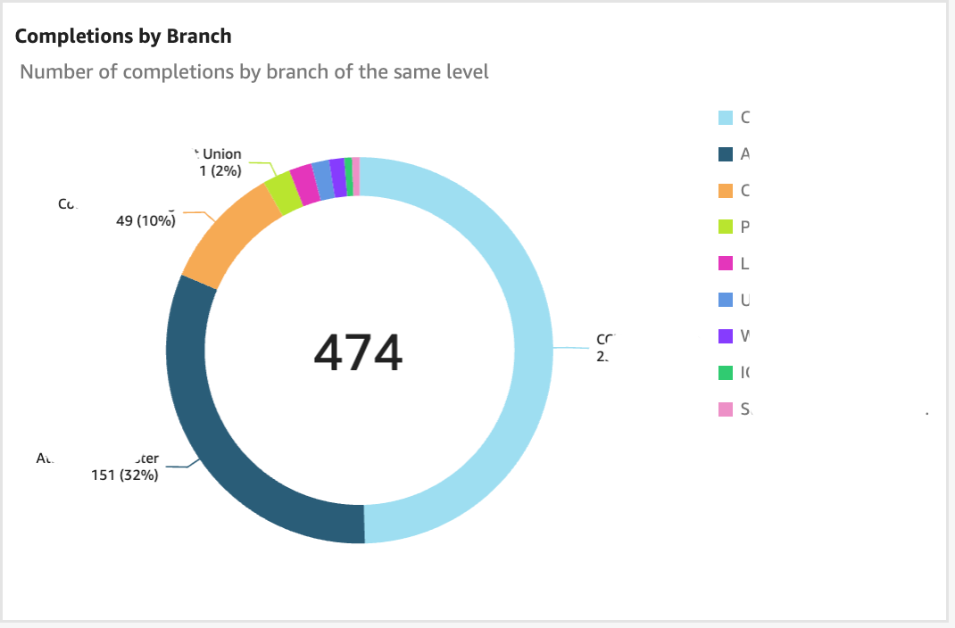
Yes, but rather than the Pie graph, I’d like to use the Heat Map graph (The box-based graphic). I’m not sure if you use the same terminology, so I’m adding a snapshot of the graphic I’d like to use.


There are other graphs that I’d also adjust the data fields, but this is the easiest one to point out.


I found a way too add the Branch filter to the Groups tile but it’s only a filter...you cannot combine the Group heat map with branches unfortunately...I don't see how you could do that…

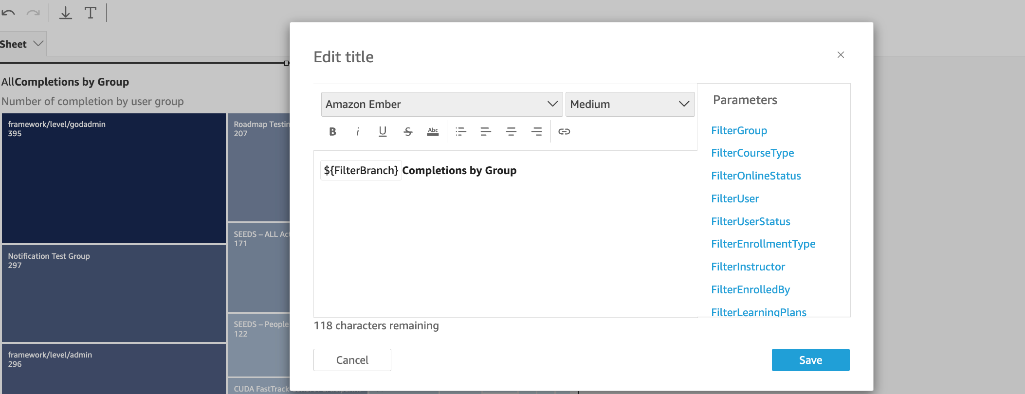
If you want to add extra filters to the heat map, in EDIT mode, double click the title of the chart and you'll see this:

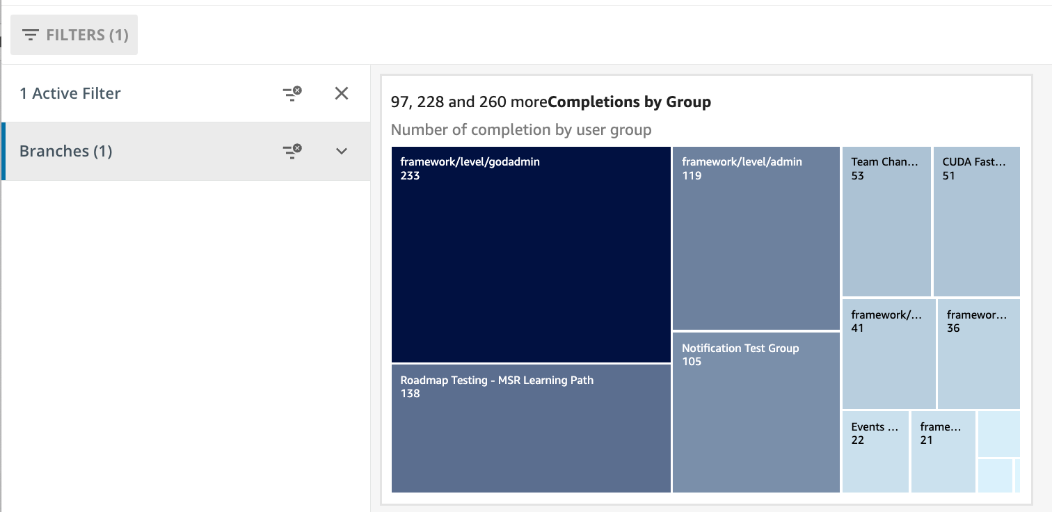
I added the Branch filter


Then I have access to that filter for this heat map


I get what you're asking but don't think you can change the graph style (maybe a later enhancement??)

Maybe @federico.carugati can assist?


Hello!

Thank you for your message. Insights is set to get even better in the coming months.

We chose to represent Groups and Branches with two different chart types (Heatmap & Donut) due to the distinct nature of these elements. Groups are all on the same level and are essentially independent of one another. In contrast, Branches have a nested structure, and by using the drill-down capabilities of a donut chart, you can easily explore all levels, up to the tenth.

With the current version of Insights, you can create custom dashboards by combining different visuals, but modifying or customizing those visuals isn’t possible. However, we’re excited to announce the upcoming release of Advanced Insights, which will include a full-featured BI tool. This new version will allow you to create visuals from scratch and modify existing ones.

If you’re interested in this level of customization, stay tuned, Advanced Insights will be announced very soon.

Thanks!


Thank you for your help @lrnlab and for looping in @federico.carugati.

Federico, thank you for this explanation. It was very helpful, and I agree that having the drilling capability is fantastic.

Also, I’ll keep an eye out for the Advanced Insights announcement. The Insights tool has already developed a lot, and we’re excited about what we’ll be able to do with it.

Cheers!

Erin


thanks @federico.carugati 


Reply