Best Answer

Course element status icon

  • 7 September 2022
  • 10 replies
  • 145 views

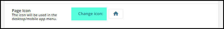
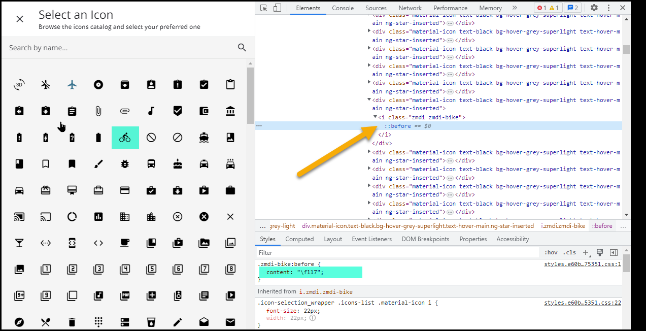
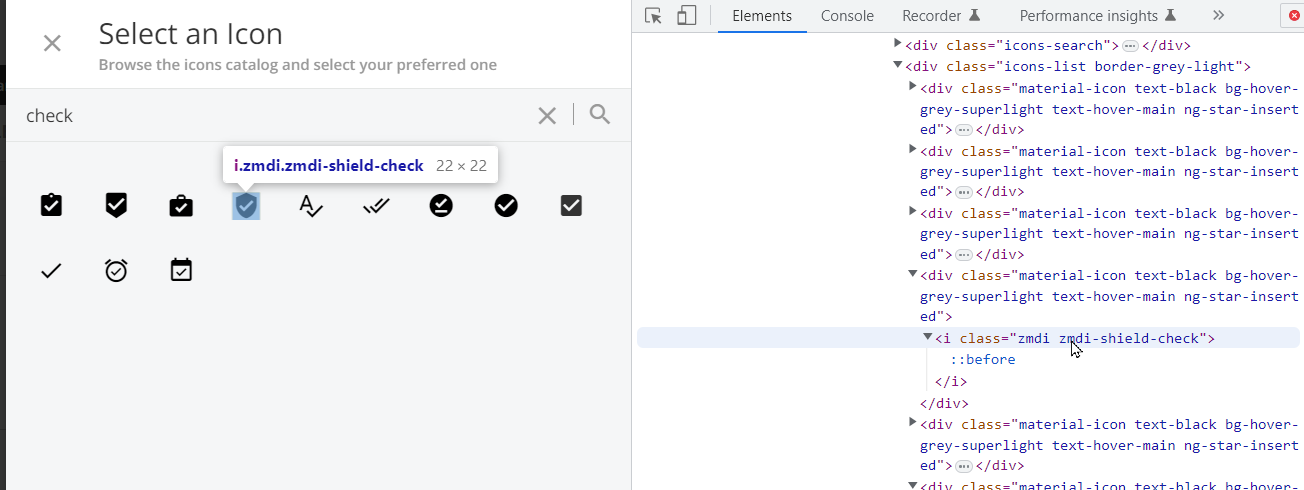
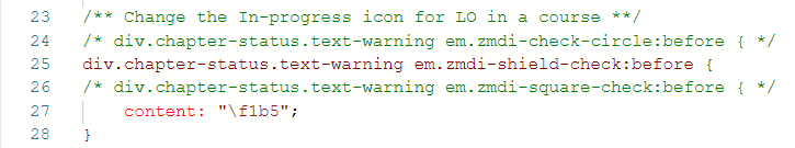
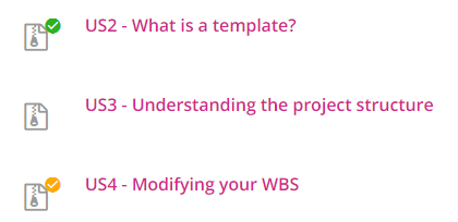
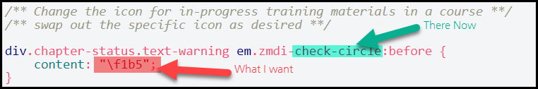
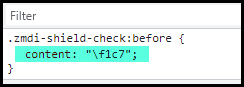
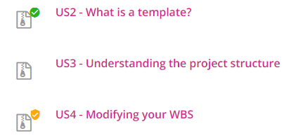
The icons for course element status are the same and in our UX also very similar colours. We have a couple of videos that never mark complete because they are not quite watched till the end. Unfortunately they are not our videos so I can’t clip them. I wonder if there is a way to change the icons that display for In Progress or Completed to make it more obvious. I don’t find this in the settings but I thought someone may know how to do it with CSS. 

Many thanks!

Aimee 

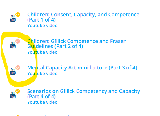
*circled ones are In Progress the other two are completed. 

10 replies

Userlevel 7
Badge +6

This change would affect all of your courses.

I was able to make the change but you’ll want to do some more thorough testing to make sure the desired effect is what you want and there are no conflicts.

I went with the little refresh one for an example but feel free to make it what you wish.

/** Change the icon for in-progress training materials in a course **/
/** swap out the specific icon as desired **/

div.chapter-status.text-warning em.zmdi-check-circle:before {
content: "\f1b5";
}

Hope this helps.

Userlevel 5
Badge

Fabulous thank you @gstager that looks great. I’ll give it a try. 

Userlevel 7
Badge +6

Fabulous thank you @gstager that looks great. I’ll give it a try. 

As a side note - not sure why your icon colors are so close.

This code should allow you to adjust the color of the completed icon which as you can see in my screenshot above that it is green. That is the default so perhaps you have something that is adjusting that now…? The color below is what I show as default.

Anyway - see if this will help with that part.

/** Adjust completed icon color **/

div.text-positive-green {
color: #008767 !important;
}


Userlevel 5
Badge

Fabulous thank you @gstager that looks great. I’ll give it a try. 

As a side note - not sure why your icon colors are so close.

This code should allow you to adjust the color of the completed icon which as you can see in my screenshot above that it is green. That is the default so perhaps you have something that is adjusting that now…? The color below is what I show as default.

Anyway - see if this will help with that part.

/** Adjust completed icon color **/

div.text-positive-green {
color: #008767 !important;
}


Thanks! That will make it even clearer. I haven’t adjusted the colours manually. It is using these two colours as set in the Branding Look & Feel settings. These colours are also used in a lot of different places so I didn’t want to change them everywhere but it is great to be able to do it on the course element status. 


Userlevel 7
Badge +6

@aswartz - ahh - mine are still the defaults there. Hopefully that code does not change more than those icons. Keep an eye out. 😉

Userlevel 4
Badge

@gstager The icon replacement works fine, but you say  to swap out with the icon of our choice… how do you do it ?

I understand (maybe wrong) we replace the ZMDI icon “check-circle” (based on https://zavoloklom.github.io/material-design-iconic-font/icons.html), with

content: "\f1b5";

?? Am I correct ?

Where can I find the list of icons available to replace ?

Userlevel 7
Badge +6

Where can I find the list of icons available to replace ?


There may be an easier way but here is how I did it…

I like to go off of what I know is found in Docebo already since going to an external site may have more options than supported in Docebo.

I went to the Manage Pages part of the Admin Menu and chose  Change Icon


Then I used the inspector to inspect the icon of my choice in the box that opens. So suppose I wanna use the guy on the bike… I right-click and inspect on the bike and look at the  ::before
That is where I found the code to use in Docebo.

Hope that helps.


Userlevel 4
Badge

@gstager This is exactly what I did (thanks for the explanation though !)

But whatever I try to set… nothing is working and it always displays the zmdi.check.circle… 😵


Userlevel 7
Badge +6

@Bouben - we need to change what is already there to what we would like to have in its place.

Consider my original example.

When I look up the shield icon - this is what I see.


So I might try the following…

/** Change the icon for in-progress training materials in a course **/
/** swap out the specific icon as desired **/

div.chapter-status.text-warning em.zmdi-check-circle:before {
content: "\f1c7";
}


Userlevel 4
Badge

Congratulation you’ve nailed it !! Thanks a lot. I know where to look to customize it now

Thanks a lot again 

Reply