I’ve created a course calendar with the course widget, showing all of our training opportunities. Is there a way to color code it? So far all of the courses are purple.
Thanks!
I’ve created a course calendar with the course widget, showing all of our training opportunities. Is there a way to color code it? So far all of the courses are purple.
Thanks!
Hi
If you wanted to change the tags from purple to red, for example, give this a shot in your Branding and Look area for Custom CSS
/** Change Color of Calendar Event Tag **/

.docebo-calendar .cal-month-view .cal-days-events .cal-event {
	background-color: rgb(255, 0, 0) !important;
}
Let me know if that works for you.
Would there be a way to use key phrases to trigger different colors? For instance, having any event that said “New Hire Orientation” be green?
Thanks!
Glad that worked out.
I think things get a bit more tricky if you want to have multiple colors going on.
I didn’t have any events at all in my calendar so I had to make one to poke around with so now I have only one. I am only a month into my onboarding at this point. So I got a lot of bare bones, so to speak.
Do you currently have more than one color for various event types?
If you do, it would suggest that maybe it is possible.
I am more of a JavaScript guy who would have tried figuring something out with some conditional statements - but alas - that is not a tool available to me in Docebo.
I am not aware of a way to perform a check for specific text using CSS.
Perhaps there is a CSS expert who can help carry you further along with that one.
Thx
Thanks very much for this post
I’ve tried implementing this change on our CSS, but I noticed a couple of odd things.
This is what the colours looked like originally in the Monthly View (wanted to move away from the purple too):
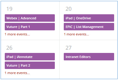
When I implemented the CSS it became this:
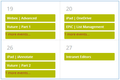
Don’t pay too much attention to the nasty green - it was just a test. But notice that the “1 more events...” link at the bottom is also coloured here but not in the original.
Also - when I switched to the Weekly view:

The purple is still there - grrrrr!
I tried playing around a bit with the CSS code to see if I could get it to change, but to no avail.
Does anyone have any suggestions as to what I need to do to get the colours the same in the Month and Week view and to not colour the ‘more events’ link in the Month view?
Thanks very much
Sean
Perhaps something like this will work a bit better.
Give it a shot and let us know.
/** Change Color of Calendar Event Tag **/
/** Monthly View - First two entries only **/

.pos-1, .pos-2 {
	background-color: rgb(191, 220, 247) !important;
    color: #000000 !important;
}

/** Change Color of Calendar Event Tag **/
/** Weekly view **/

div.cal-week-event {
	background-color: rgb(191, 220, 247) !important;
    color: #000000 !important;
}
You are a miracle worker - Yes, yes YES!
It really looks fabulous on both the monthly and weekly views now.
I’m not entirely sure how you get the codes for the elements that need changing, but it’s really amazing! Here’s the month and week view now:

I’m not noticing that pesky purple dot that remains on the week day headings, I can live with that.
We went for a charcoal colour with white text in the end - looks better than the green :-D
Thanks so much again for your help - very pleased!
Sean
Great to hear!
Let’s take care of that pesky balloon too…
Give this a shot.
/** Change the color of the little dot on weekly view **/

.cal-event-balloon {
    background-color: rgb(191, 220, 247) !important;
}
Great to hear!
Let’s take care of that pesky balloon too…
Give this a shot.
/** Change the color of the little dot on weekly view **/

.cal-event-balloon {
    background-color: rgb(191, 220, 247) !important;
}
Ha ha ha! You clearly love a challenge eh!
Well done - success again :-)
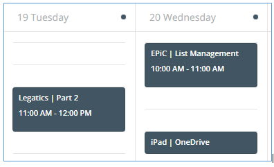
All looking neat and matching now.
Thanks so much for your help - will try not to bother you for a bit now!
Cheers
Sean
Thanks so much for your help - will try not to bother you for a bit now!
No bother at all.
Glad to help.
That’s brilliant. Thanks so much for providing.
Additionally, does anybody know if it’s possible to define the color per course? We have courses for different regions all over the planet so it would help a lot if we could easily visually identify where the course will be held. I can see the course detail is there, I’m just not sure how to target the element based on the course.
Hi, thanks so much for this code. That purple always made me shudder a little.
I know it’s been awhile since this first post was made, but I’ve found that when I click on the events in the monthly view, the background has been recoloured to dark as well. This hides most of the text.

Anyone have a solution to fix this? This doesn’t seem to be a problem in the weekly view.
Thanks!
Hi
/** Change Color of Calendar Event Tag **/
/** Monthly View **/
.docebo-calendar .cal-month-view .cal-days-events .cal-event {
    background-color: rgb(109, 203, 209) !important;
    color: #000000 !important;
}
Let me know if you’re still stuck. I have a bunch of other calendar settings from different community chats that I’m using, but I’m pretty sure that’s the only one that affects what you’re looking at.
Thanks for replying, Gus. It’s didn’t help, unfortunately, so I just adjusted the background colour to a light grey with dark text. This way it’s visible for the popup. Appreciate your suggestion!
Hi,
This is really awesome. I also have a question for you Docebo experts regarding using this as a sign up tool page for external clients. Does this work?
Also I think the best way to create this use case is if you can set the standard viewing of the catalog widget under agenda instead of monthly or weekly.
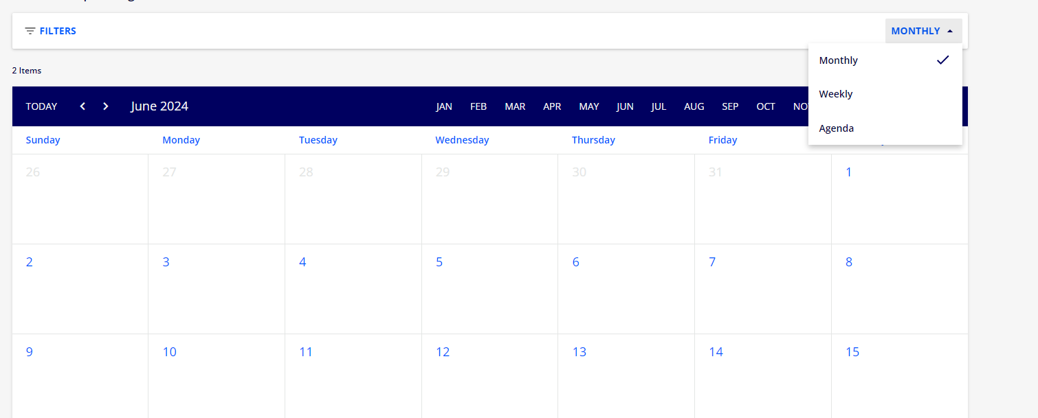
is this possible?
Hi everyone,
I am trying to get this to work on our platform to remove the purple but it isn’t working! I have other CSS that is working fine. Is there a delay in the changes showing up on the platform. I am using this from the thread:
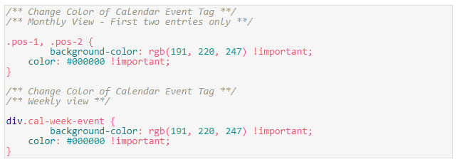
If I copy and paste it into the CSS box on line 52 below, do I need to add any other code to separate the CSS?

Hope you can help - I am desperate to remove the purple as it is not on brand! Thanks
It appears from the screenshot that you are missing the closing curly brace from the CSS above it.
School boy error then! Thanks so much - working now! Just need to figure out the colours that are more visually pleasing now :)
This is great information!!
Enter your email address or username and password below to log in to Docebo Community. No account yet? Create an account
Enter your E-mail address. We'll send you an e-mail with instructions to reset your password.