Question

Is there any way to make surveys look cleaner?

  • 3 November 2021
  • 5 replies
  • 235 views

The survey feature is great, but the graphical display of questions is a bit sloppy. For example: 

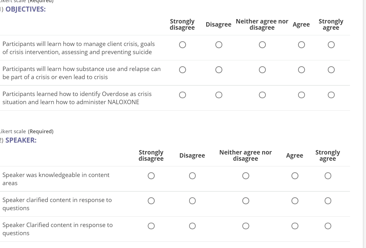
You can see how the likert scale is misaligned. Likewise, every question that has a likert scale attached to it says: likert scale (required). I’d like that to not show if possible, but primarily, for the questions to graphically align. 

Hello @tommyVan I played with doing multiple Likert Scale questions in a survey this morning, and was unable to duplicate the view you shared above, where the Scale isn’t aligning. Sharing a couple of screen shots to compare with how your questions are constructed - the setup below worked for me so everything lined up, even though the questions are significantly different lengths (text wrapped fine). Hope this gives you some ideas for setting up your questions. For clarification on your other question, were you wanting the questions to be Required, just not show the word “Required” next to it?


That is how it will appear if you use one likert scale with multiple responses, which looks great. If, however, you break your likert scale into categories like above, it will become misaligned. 

And for the second part, I don’t mind it saying required, I mind it saying ‘likert scale’ next to required. 

Thanks for trying though. 


Ok, thank you for clarifying - I don’t know if it is possible to hide the question type description.

I did try doing Question 1 as “Objectives” and Question 2 as “Speaker”, both using the same Defined Likert Scale, and got something that looks aligned. Could this work for you?


Can I ask? Where I seriously understand establishing surveys to collect feedback is huge. Is anonymity supported with the survey?


Hello @dklinger Yes, the surveys in Learn are anonymous, and the surveys in Docebo Learning Impact can selected to either be anonymous or not.


Reply