Hi Everyone, We’re always looking for ways to simplify and best streamline both our processes to manage our programs as well as the user experience for our learners.
A tough balance we’ve been struggling with is auto-enrollments vs. self-enrollments.
This is particularly the case for courses included in our course catalogs which users can browse and search to find the content they’re looking for.
Self-enrollment Issue
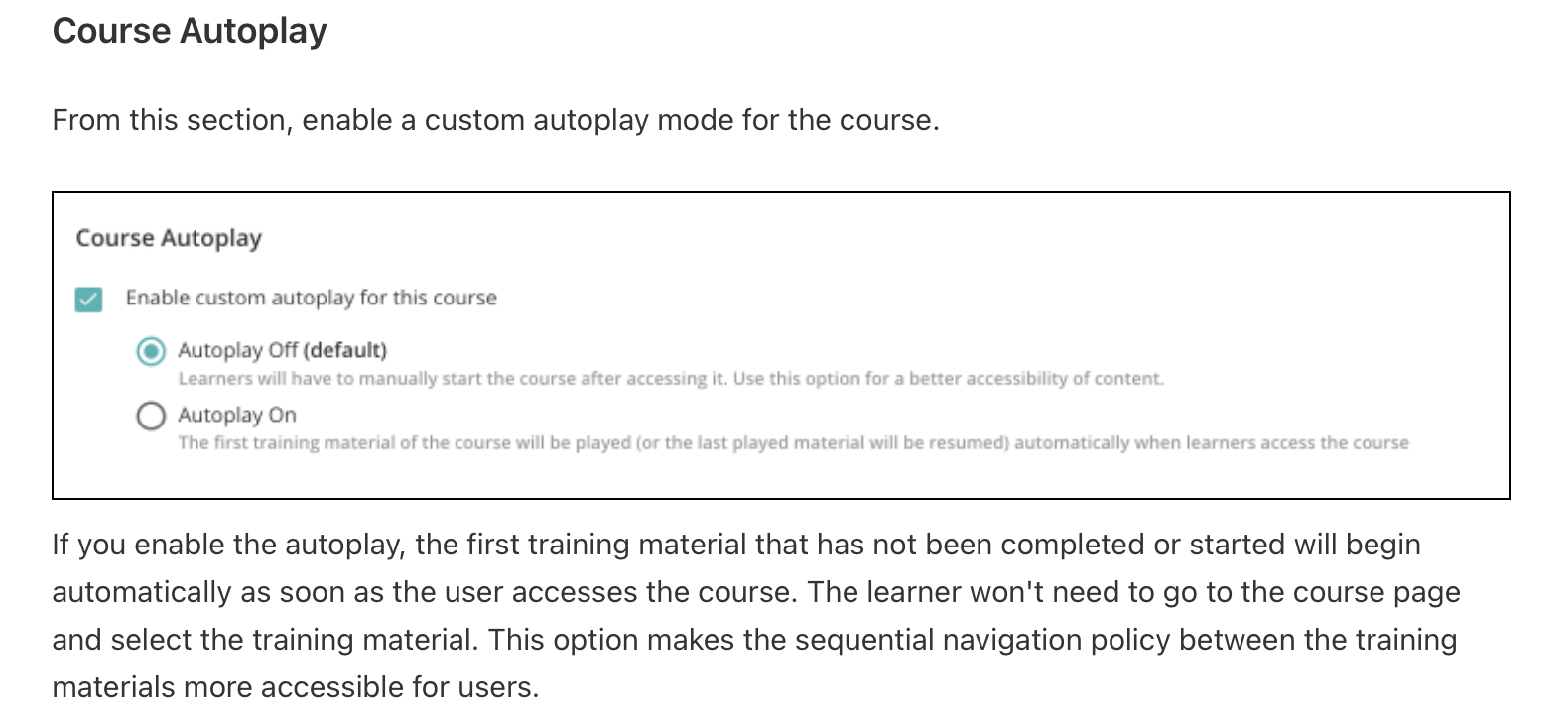
From a course catalog it takes four clicks to enroll yourself in a course and start learning. This IMHO is to many! I saw under Advanced settings / E-Learning an option to “Show course after enrollment”. Per Knowledge Base article: Enable this setting to force the user, after a self-enrollment, to navigate directly to the course player. This setting applies to theme 6.9 only. Theme 6.9 only 😫!
Step 1: Click course tile
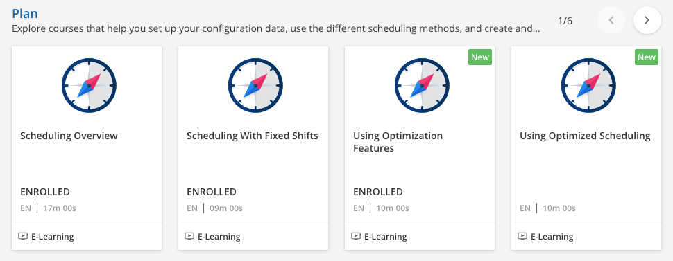
Step 2: Click Enroll
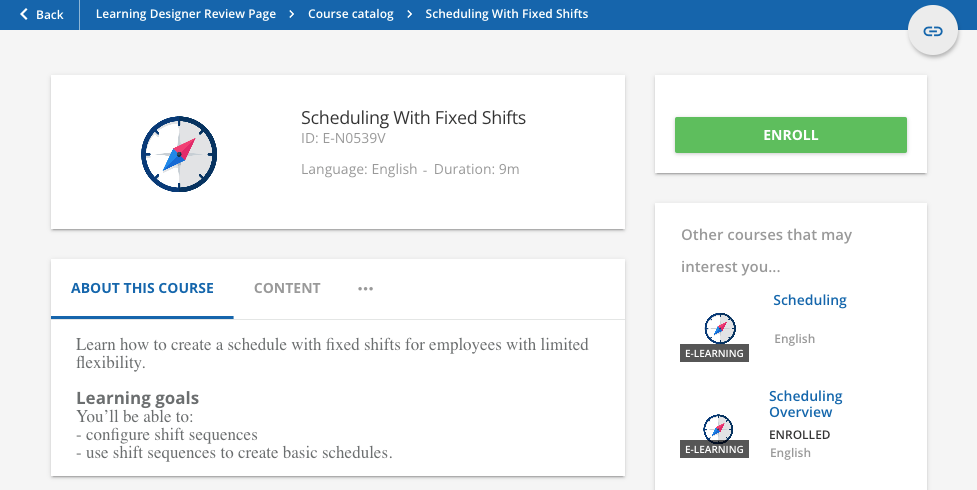
Step 3: Click Start

Step 4: Click Start
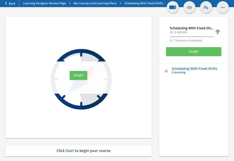
As a workaround/solution we auto-enroll our learners in ALL courses. This provides a better user experience for the learner (reduces process to two clicks!), BUT it adds complexity to our management of the program.
Auto-enrollment Issue
Adds steps and complexity to our continuous course shipping process and a whole lot of unnecessary data in reporting:
- Need to manage groups for enrollment rules (single rule for each language)
- Need to manage enrollment rules (single rule for each language)
- Instead of reports resulting in self-enrolled training allowing us to easily analyze what topics users are searching for most we have 100K+ subscribed records. Sure we can filter out subscribed records, but all that subscribed data is unnecessary.
- My Courses and Learning Plans page is useless as it’s filled with our entire catalog instead of the courses the user enrolled themself in and is interested in referencing.
Reducing the number of clicks required to self-enroll from a course catalog and start a course would be greatly welcomed!
Questions
- Am I missing a self-enrollment option or setting or is this currently how it works?
- Any chance the upcoming Course & Learning Plan Player enhancements include an option to streamline the self-enrollment process?
- Would this be a good IDEAS topic for a future enhancement?
Thanks! Dave


