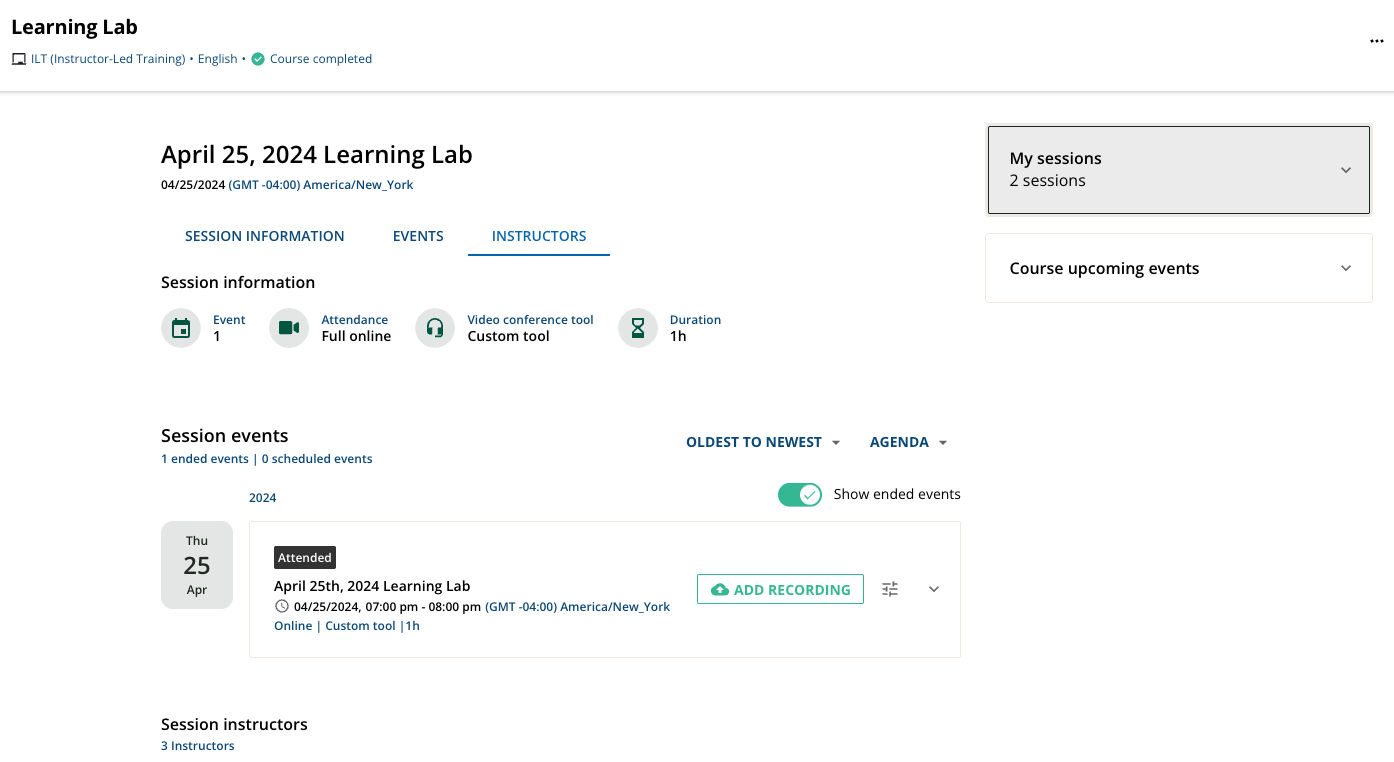
Has anyone done anything interesting with the new course player ILT layout. It seems like there is a lot of duplicative information wand the new layout feels a bit overwhelming. 


Also visually I  miss the course image that was in the old layout. 


What have you done? How have you made it better and more clear for users. 

Yeah this New ILT is still really overwhelming and less clean. It shows all the information at once what is the purpose of the toggle if it doesn’t actually toggle information and shows it all at once?


Also there are options for different headers but they don’t seem to work for me. I can get any of them to show. 

Anyone make any progress in this? 


Reply