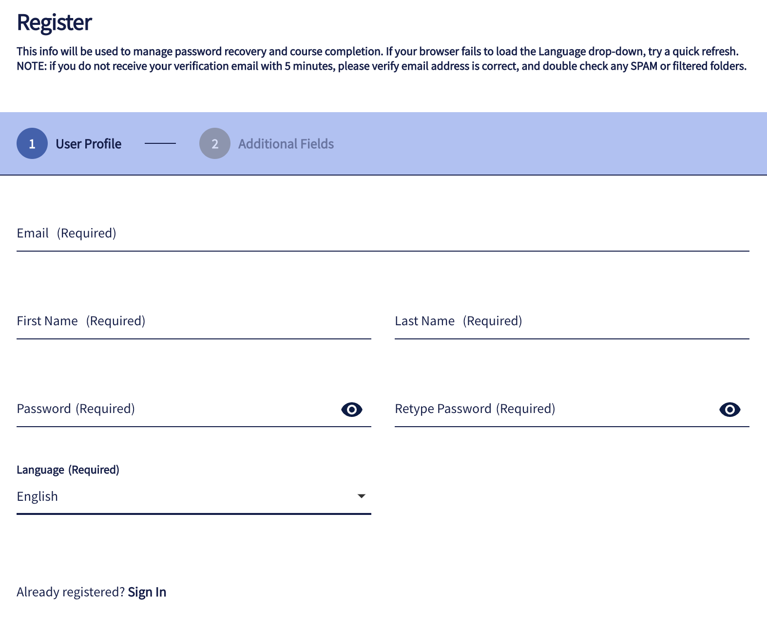
Hey there!
I can’t seem to find where to turn off this requirement at the registration page.

Hey there!
I can’t seem to find where to turn off this requirement at the registration page.

Not sure you can just turn that part off but you may want to play around with these settings...Think “hide my map preferences” tab hides the whole thing. IF you dont need anything more than English on your platform, have a look at Localization app and turn OFF all languages.
I’ve already liked this and now I’m commenting for reach. English is our only supported language. It’s really weird/unpleasant UX for users to be asked for their language during registration when there are no language options. For uni-language instances, the registration field and language selector in the toolbar should both be disabled (or disable-able).
Hi, anybody with a solution for this? Not even with CSS? Thanks!
Hi, anybody with a solution for this? Not even with CSS? Thanks!
This is a prime example of ‘dangerous’ CSS  Using CSS just hides the field to you, it does not change validation checks or the page looking for it, so since it is a required field, if you hide it, and theres no choice, you simply won’t be able to proceed and have no idea why, since the warnings/errors are usually tied to the field/area that you have hidden as well.
Hi, anybody with a solution for this? Not even with CSS? Thanks!
This is a prime example of ‘dangerous’ CSS  Using CSS just hides the field to you, it does not change validation checks or the page looking for it, so since it is a required field, if you hide it, and theres no choice, you simply won’t be able to proceed and have no idea why, since the warnings/errors are usually tied to the field/area that you have hidden as well.
Thanks
There should be an option to remove this though, for uni-language platforms.
Enter your email address or username and password below to log in to Docebo Community. No account yet? Create an account
Enter your E-mail address. We'll send you an e-mail with instructions to reset your password.