Best Answer

Thumbnail size of training material in course

  • 5 August 2021
  • 9 replies
  • 396 views

Userlevel 6
Badge +1

Hi everyone,

I’ve added nice thumbnails to some SCORM modules in my central repository which when added as training material appear in a course I’ve created. My concern is the thumbnails look small and ugly.

Is this normal? Can I enlarge them so they match the size you see when viewing modules in the central repository?

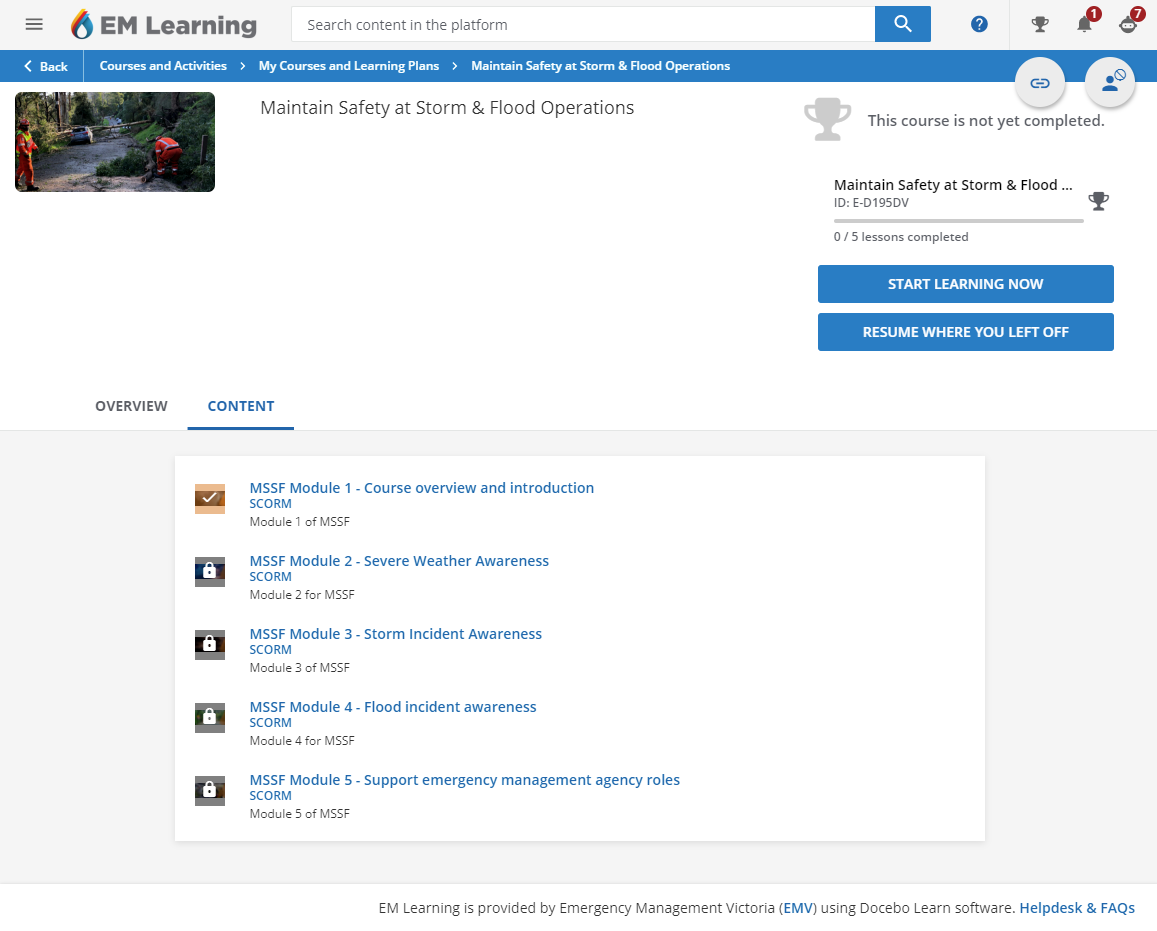
This is a screenshot of the course on the desktop web browser version of the course. The thumbnails seem very small and I do not believe I have configured my platform to look that way by default.


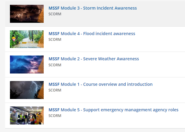
If I search the platform for the training material by keyword I get nice results in the search results and the thumbnails set for those scorm modules look nice.


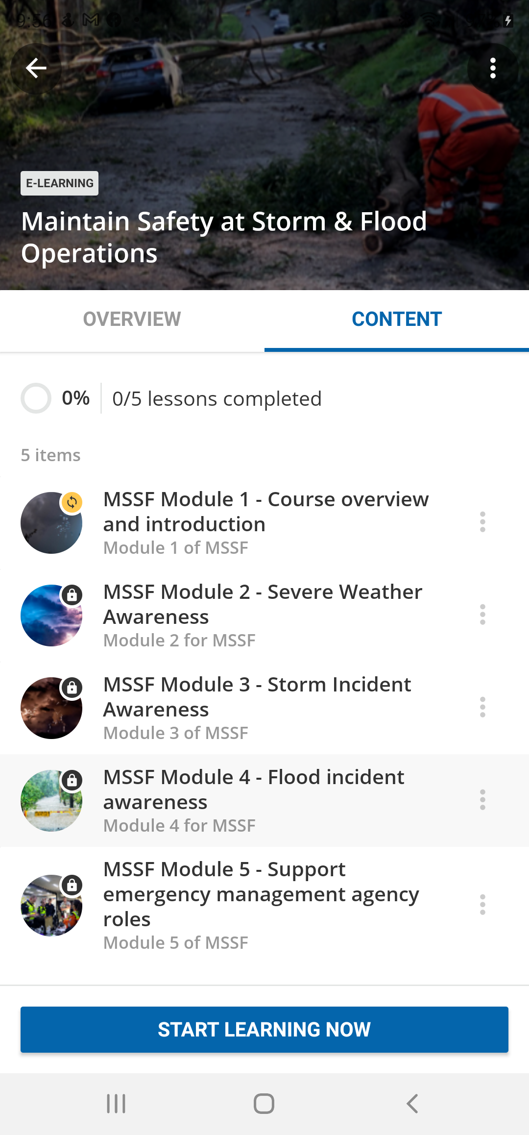
The course as shown in Go Learn app which looks nicer luckily.


icon

Best answer by Alan 6 August 2021, 09:03

View original

9 replies

Userlevel 6
Badge +1

Can someone just confirm with me that the thumbnail size on their platform is similar to what I am seeing? Worried if somehow I have modified it without knowing how.

Userlevel 6
Badge +2

Hi @jckemv,

Yes, we get the same thumbnail style, and I agree it is ugly. We haven’t tried to target these with CSS yet, but it might be possible. Would be interested to hear whether anyone else has tried that.

Userlevel 7
Badge +7

Hi @jckemv same here...they vary in size depending on where they are viewed...Must be CSS controlling this.

Userlevel 6
Badge +1

I do not have a sandbox environment to test playing around with changes to the CSS (procurement in Government is a nightmare) so I’m seeking assistance from anyone that has managed to modify some CSS to enlarge the thumbnails to something like the search results size which is nice and matches the size of the material object.

Userlevel 4
Badge

I just submitted an idea addressing this issue, I’m hoping it gains some traction because this feels like it needs to be a platform-level fix. Bottom line is, the learning objects still use square thumbnails while the rest of the platform uses rectangular, I think that is a source of the ugly presentation. During our onboarding process last year (2021) I brought this up to the team we were working with and they admitted that this was a part of the platform that hasn’t be updated, and couldn’t say whether there were plans to fix it or not. I wouldn’t know where to start with trying to fix this via CSS :(

Userlevel 1

Here is a bit of styles I wrote/tested in our sandbox, it makes training thumbnails look rounded and slightly larger. 
 

/* Rounded Course Navigation Thumbnails */

course-navigation .tree-view .item.chapter .icon {

overflow: hidden;

border-radius: 100px;

width:50px;

height:50px;

}

course-navigation .tree-view .item.chapter .icon img {

max-width: unset;

max-height: unset;

height: 100%;

width: auto;

left: -50%;

}

course-navigation .overlay-status {

border-radius: 100%;

}

Userlevel 5
Badge

Here is a bit of styles I wrote/tested in our sandbox, it makes training thumbnails look rounded and slightly larger. 
 

/* Rounded Course Navigation Thumbnails */

course-navigation .tree-view .item.chapter .icon {

overflow: hidden;

border-radius: 100px;

width:50px;

height:50px;

}

course-navigation .tree-view .item.chapter .icon img {

max-width: unset;

max-height: unset;

height: 100%;

width: auto;

left: -50%;

}

course-navigation .overlay-status {

border-radius: 100%;

}

@krzysztof.walder that is a huge improvement, thank you so much!!

I have another problem though. The symbol that is put on top of the icon is a tick box for both ‘In progress’ and ‘Completed’ . Someone gave me the CSS to change the symbol to something else so it is more obvious to users what lessons are not completed but when I apply your CSS it seems to overwrite that other code. 
The code for the In Progress status is pasted below. Do you know how I could combine the two?


/** Change the icon for in-progress training materials in a course **/

/** swap out the specific icon as desired **/


div.chapter-status.text-warning em.zmdi-check-circle:before {

    content: "\f1b5";

}

/** Adjust completed icon color **/


div.text-positive-green {

    color: #008767 !important;

}

Userlevel 5
Badge

I just submitted an idea addressing this issue, I’m hoping it gains some traction because this feels like it needs to be a platform-level fix. Bottom line is, the learning objects still use square thumbnails while the rest of the platform uses rectangular, I think that is a source of the ugly presentation. During our onboarding process last year (2021) I brought this up to the team we were working with and they admitted that this was a part of the platform that hasn’t be updated, and couldn’t say whether there were plans to fix it or not. I wouldn’t know where to start with trying to fix this via CSS :(

I found it!!


In case anyone else can lend a vote: 

Thanks,

Aimee

Userlevel 4
Badge

I just tried this code in our sandbox, and it works great! (see screenshot). I’ve proposed it to our director, but it since it means updating the thumbnail for every item in our CLOR (since you can’t change the thumbnail in one place and have it trickle down to every item assigned ot it) it’s not something we’ll be able to implement soon. But, it’s nice to know that this workaround exists! I’m still hopefully Docebo will make the fix system-wide eventually.

Reply