We want to users to be able to see the type of purchase they have made but we don’t want to let them edit the field. Is there a way to make a user field visible but not editable? I am sure someone out there has gotten clever!
Advanced Settings > Users > Options (at the top), we only have the option to display the entire section or not; nothing to allow/not allow editing of the visible fields. We turned them all off except for the basics because of this…
Docebo should add the option to make these fields read only, or read/write...there are a few Ideas on this already posted so I just voted on them (found 4-5)
I will get out there and vote too! Thanks for the reply.
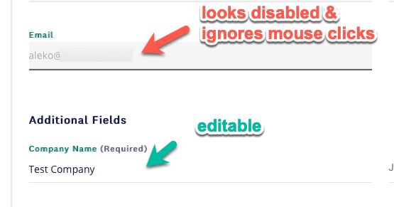
Still, using CSS you can make fields look like being disabled and make them not accepting mouse clicks (it will still be possible to navigate to them using the keyboard, but it’s rather unlikely that someone will know and be willing to make it - but I’d not base any group rules on them, as technically people will be able to edit them).
In our case, we are getting person’s email as well as their first and last name from the SAML identity provider, so we don’t want users to edit them in Docebo.
You may need to play with the right selector to get to the correct filed, but once you figure it out you can add something like:
{
pointer-events: none;
color: #AAA;
background: #F5F5F5;
}
To get something like this

Thank you Alek! This might work. I think we are going to have a new field that would display that we could use this code on. Our original field that is used to automate group enrollment will get hidden so it doesn’t impact the automation.
I’m having trouble finding mine
I don’t suppose anyone has a workaround like this for mobile?
I want users to be able to opt out of email via Boolean UAF but not edit their library card number.
.dcb-ui-input-text-input-element #ui-input-text-5{
pointer-events: none;
color: #AAA;
background: #F5F5F5;
}
Not working
Edit: fixed!
/*user additional field 1 (library card) uneditable */
#ui-input-text-5.ui-typography-body.dcb-ui-input-text-input-element {
pointer-events: none;
color: #AAA;
background: #F5F5F5;
}
Is it possible to make it so tab skips it? keyboard-events?
I know this thread is a couple years old but we need this capability as well.
Using Extended Enterprise across multiple domains, we have SAML connected to different domains, each one syncing over several of our user additional fields. We need these fields for reporting at both the super admin level, and power user level.
Some of the fields contain sensitive data that is not appropriate for power user access, so we would like just some of the fields visible for reporting purposes. The problem with making the fields “visible” to our power users for reporting, is that as mentioned earlier in the thread, the users can then alter the fields themselves. This is a dealbreaker for us, as our automated groups rely on the fields being accurate. This is inviting manual data input problems that will be very difficult to track. The CSS patch might be somewhat effective but comes with risk, especially across multiple domains at the scale of large enterprise.
I very much agree. Our users can edit their username, first name, last name, and email address, all of which come from the SAML identity provider and should be read-only.
Here's an idea to vote on to make the personal info read-only.
Thank you
/*user additional field 1 (library card) uneditable */
#ui-input-text-5.ui-typography-body.dcb-ui-input-text-input-element {
pointer-events: none;
color: #AAA;
background: #F5F5F5;
}
I want to urge users not to use this solution. It’s breakable by regular user navigation.
“My Profile” has 4 sections, defaulting to “Personal Info.” If users navigate to another section like “Change Password” or “Preferences,” when they navigate back to “Personal Info” your CSS won’t affect the desired fields.
Docebo increments the ID number of these page elements as users navigate. So while this element may be ui-input-text-5 when you first load the page, it could be ui-input-text-12 if users clicked other sections then returned.
This increases the importance of Docebo giving admins direct control of which fields can be viewed or edited. I’m sure this is a common need, and CSS won’t hack it.
Reply
Log in to Docebo Community
Enter your email address or username and password below to log in to Docebo Community. No account yet? Create an account
Docebo Employee Login
Enter your E-mail address. We'll send you an e-mail with instructions to reset your password.

