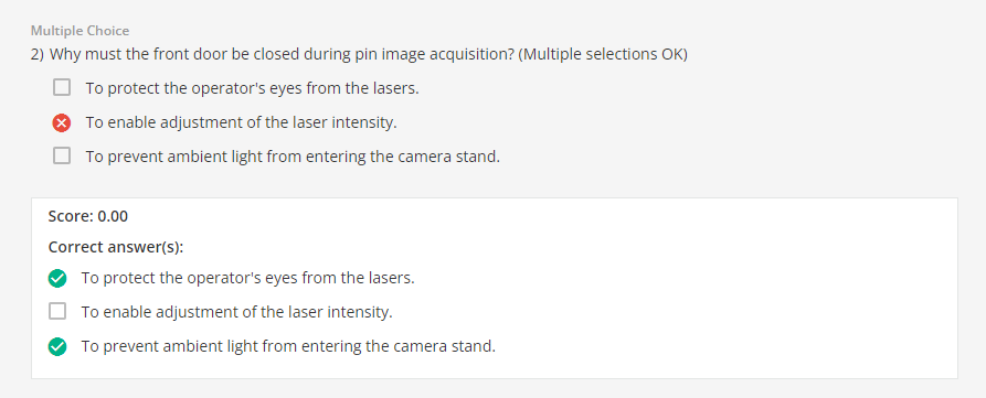
Wrong answers in multiple choice questions not shown as incorrect
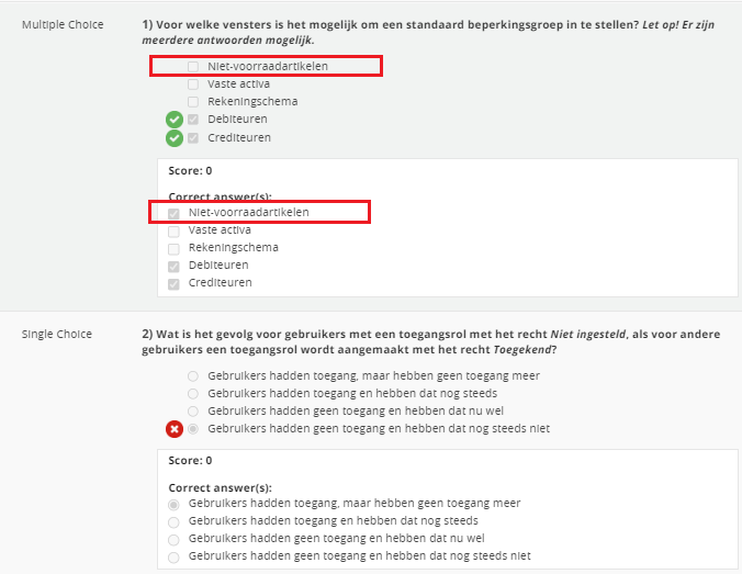
Hi, while checking exams, we have noticed that in the case of multiple-choice questions, the incorrect answers are not marked with a red cross. (As is the case for single choice questions) This is confusing because the correct answers have a green checkmark.
For clarity, I would expect that both incorrect and correct answers are checked accordingly.
I want to provide feedback to the learner on what they should improve, which currently takes more time than necessary since I have to be extra sharp in identifying which answers were incorrect.
I believe the checkboxes should facilitate this by allowing for a quick glance, which is not currently the case.
Please advice/fix.
Kind regards
Page 1 / 1
Hi @Arnold I see your reasoning behind this and I think it’s a good idea as it would provide way more clarity on what’s correct and what’s incorrect.
I think this should lead to a solution in which there will be a mark next to each possible answer informing the user what was correctly and what was incorrectly checked or left unchecked.
So in your example, it would highlight:
(x) one answer incorrectly left unchecked
(+) four correct answers, two correctly left unchecked, and two correctly checked
like this:
I think you can submit this as an enhancement idea in the ideas section of the community.
I will for sure vote for it.
Hi Arnold,
I agree. This is very unclear. It would be better to have:
A) a red cross appear when a multiple choise answer that is correct isn't selected B) another visual added. If there are 0 points a red cross underneath the question type, in this case the '’single choice'’ (left in the table) would help. And ofcourse a green checkmark at the same spot if points are given
I just tested this and in my case the wrong answers are already marked with a red X for multiple choice questions. I wonder if this is something you can control in the test options...
Interesting Daniel. Could it be that when you select a wrong answer that you get the red cross and when you fail to click one of the correct multiple choice anwers (and leave it empty) there is no visual feedback?
Right now, only the answers in which you checked the box (correctly or incorrectly) are marked.
What you need, and what I suggested above, is that Docebo also provides correct/incorrect indicators on answers that were not checked (correctly or incorrectly left blank).
I conducted some validation in a test course, and the hypotheses proposed by @AnneCS92 and seconded by @alekwo are correct.
Checked correct answers are marked with a green checkmark. (as expected)
Checked incorrect answers are marked with a red cross. (as expected)
Unchecked (in)correct answers are not marked with a red cross. (Not as expected)
The fact that unchecked answers, correct or incorrect, are difficult to identify creates a situation which is unnecessarily timeconsuming.
I will create an enhancement idea. Thanks for your input everyone :)
Edit:
The enhancement idea:
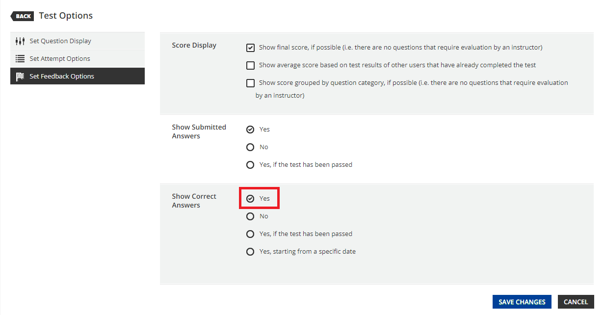
@alekwo and @Arnold I see what you mean now. I agree that it would be better for theunchecked incorrect answers to be marked as well. I played around with the test feedback options, and depending on the settings, it is possible to show the unchecked correct answers as shown in the screenshot below. However, as you say, there is no way to show the unchecked incorrect answers. Perhaps the solution would be to add a “Show Incorrect Answers” options field below the “Show Correct Answers” field. This would give admins granular control over the settings and allow anyone who doesn’t want to show incorrect answers the ability to turn the setting off.
Also, apologies for not reading the original posts carefully enough. I was in a bit of a rush last night when I posted my response