Hello, all!

TL;DR - how do you organize your “My Courses” area of your user experience?


Our “My Courses” area of our homepage does not really meet the needs of our different users. Some of our users have 3 courses and some of our users have 150. Some of that is because our users have been here for 3 years, others just access that. many. courses.

One thing I was hoping to do was better utilize the widgets, but I’m finding that they don’t meet the need. Here’s the widget I’ve tried using:
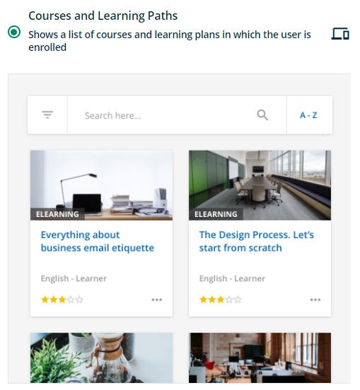
Courses and Learning Paths Widget


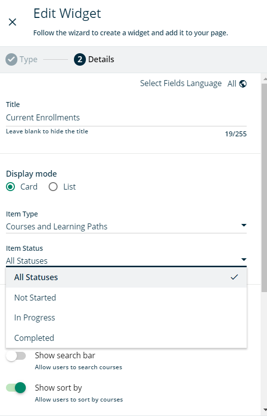
The primary problem is with its filtering options, seen below. You can only set one “Item Status” per widget, and so if you want to show a user their Not Started and In Progress courses, you have to make two separate widgets on your home page. Suddenly, you’re losing a lot of visual real estate to more apps.


Is there a better way to manage this for users? Am I missing something on auto-hiding courses upon completion that would help here?


Thanks!

@willingworth There are a few things that you could consider.

  • Collect course and LP into channels or catalogs, and then use the appropriate widget on the dashboard. This allows you to create some segmentation without regards to the status. You can add up to 20 widgets to a page (I think, maybe it’s 10) but I found that this many widgets makes for a very long page
  • Use the My Courses and Learning Plans built-in PAGE on the menu to collect the ‘in progress’ and ‘completed’ status, and just use the Courses and Learning Plans widget to do the ‘not started’ status
  • Consider building different pages based on the learners place in the “lifecycle”. For example, create a “New Hire” page for when they first join the LMS, and then move them to a “Guru” page when the New Hire programs are complete. This typically requires an additional fields that you can use to mark a learner as “guru”, then build a group of ‘gurus’ and use the group to assign visibility of the Guru page.

Good luck!


@willingworth - so get this - we dont leverage a single widget like My Courses to pull off our catalog. We follow aspects of @KMallettes model mentioned above. Our Course Catalog user experience is actually a series of pages for our consumers at the right subsidiary. Those pages serve up more narrowly scoped course widgets.

Because the menu, the page, the catalog, and group can drive the visibility of the courses? This has worked out pretty well to deliver the right learning to the right people.


Hi @KMallette that sounds like a very interesting and innovative solution. Could you help elaborate the first point about collecting courses and LPs into catalogs please, and how that looks in practice? We’ve got a similar issue and need to have more specific segmentation/ curation of courses and learning plans instead of a whole jumble of ‘em. Thanks so much! 


Yeah. As many have stated, a lot of the widgets seem better than they are practically so thinking through setups that get around them is often needed. For your first issue, make sure to vote this idea:


Hi @KMallette that sounds like a very interesting and innovative solution. Could you help elaborate the first point about collecting courses and LPs into catalogs please, and how that looks in practice? We’ve got a similar issue and need to have more specific segmentation/ curation of courses and learning plans instead of a whole jumble of ‘em. Thanks so much! 

@Nazneen Halim Sure! This is a core feature of the Learn, so there are a lot of KB articles around managing catalogs, so I’ll suggest that you use that as a resource for the “How to” part.

IRL, this is my overall process.

  • I create a catalog for a given audience about a specific topic, for example, call center agents who are completing new hire training. In that catalog, I’ll add learning plans and/or single courses.
  • I create a page specifically for the call center agents and I use a catalog widget to assign this catalog to it. There may be several catalogs that apply to call center agents so I might select several catalogs in the same widget.
  • I create a menu that uses branches (or groups) to assign the visibility to the call center agents, and then I assign the page to their menu. When they log in, their home page is the one where I’ve added the catalog widget.

Hope that helps. DM me if you have any specific questions.


We are leaning heavily on the Channels widget, placing single courses in a sort of Learning journey path by using the channel widget with 6 channels from onboarding to advanced. Hiding filters and search for less clutter.


There are however some caveats to this approach as channels can only be sorted alpha-numerically or chronologically (creation date). 


I know you can do that in catalogs, but the layout of the catalogs widget is much more cluttered and does not really fit our needs to create something where you immediately know where to just jump in and take courses.


Reply