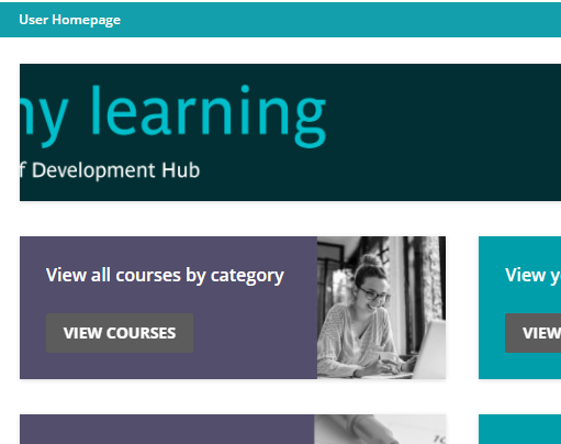
I am looking for some clean and engaging home page layout designs for Learners, Supervisors and Admins.  I’m not a designer so it is always best for me to see examples and copy things that look good.  Does anyone have screenshots or links they can share to give me some ideas?

I just posted an example the other day.

Have a look. Sky is the limit.

There are a few other threads in the Show and Tell section as well with some examples.


Hi @stacyroderick 

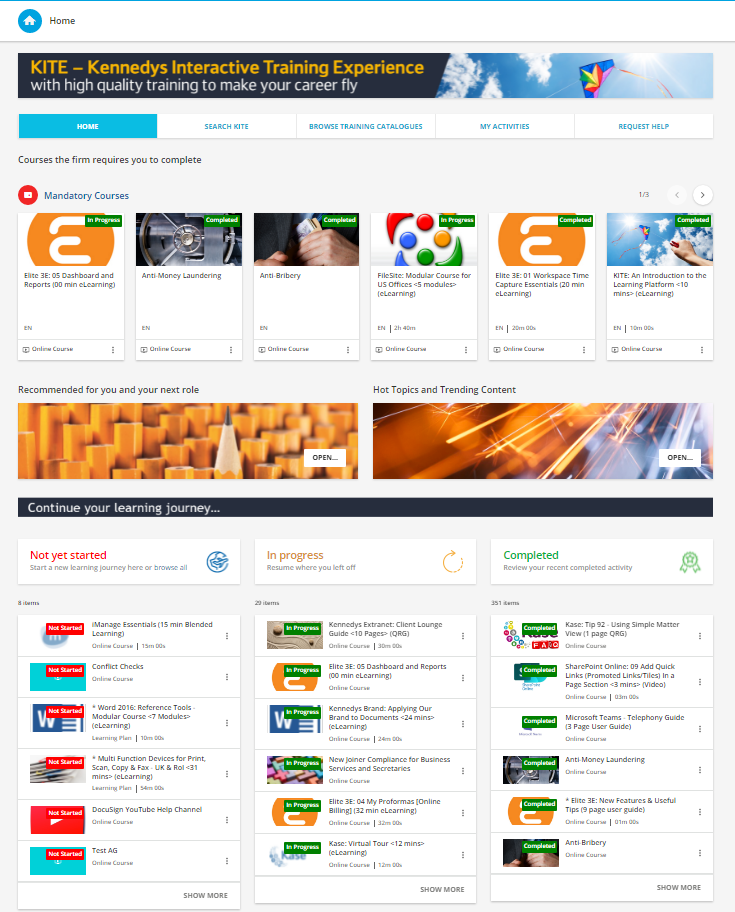
I’m not claiming what we’ve done here is Best in Class, but we (and our user community) like it.

Kennedys Law LLP


These are great-thank you!  I’m just looking for the possibilities at this point.  All examples are appreciated.


@stacyroderick 

Here is a post with a bunch of examples! 

This post is full of super helpful tips and tricks for when you are ready to create your home page!


This is fabulous.  Thank you.


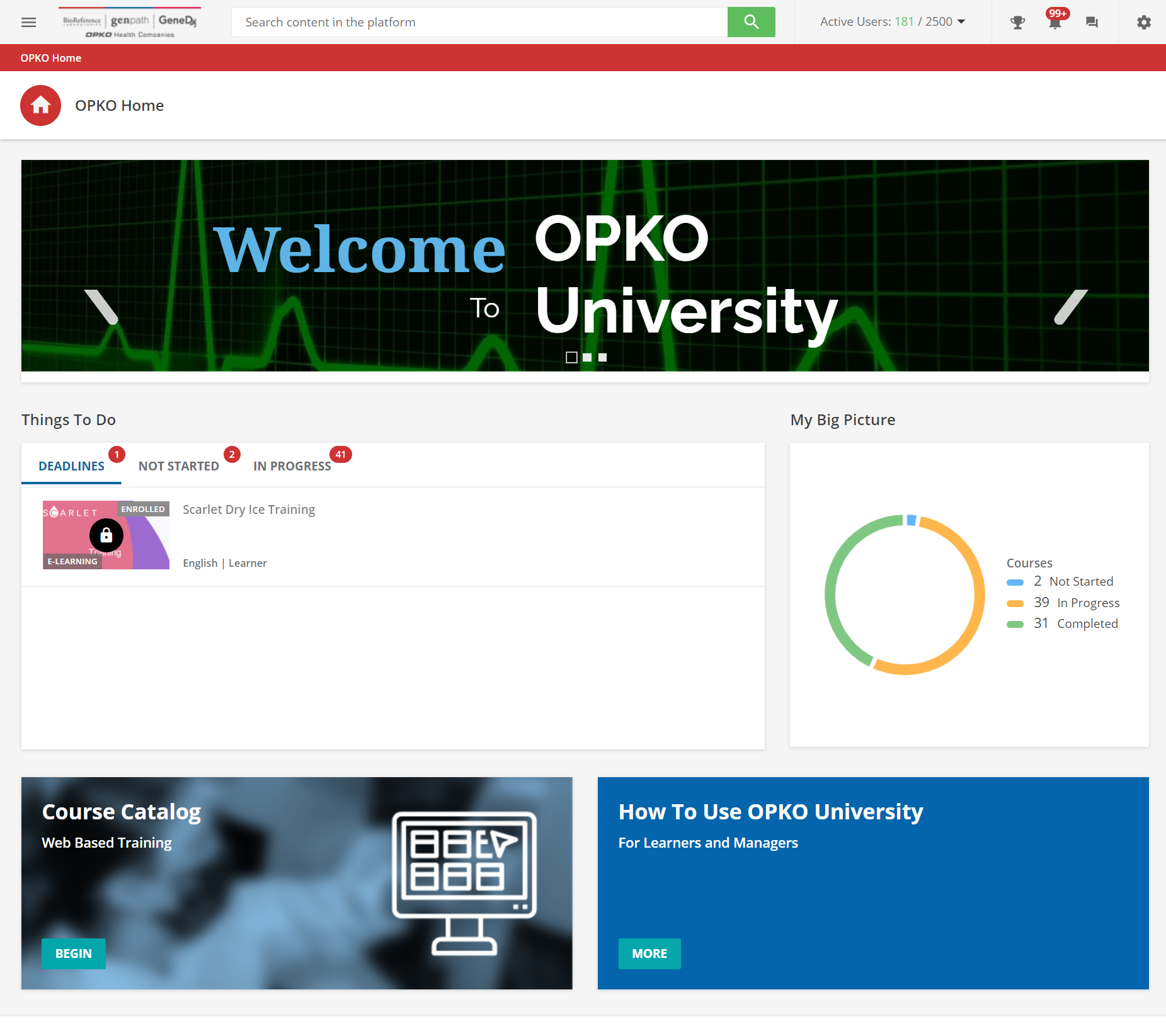
Keeping it way simple, here is a full page of “not too much” but people have been finding it pretty effective. The lowest value comes from the one graph/widget of KPIs. To be fair to myself and others? We mostly target folks for learning in the current state. This approach:

  1. shoves the Tasks widget up front and center
  2. and the Course Catalog and some “how to videos” to be secondary level elements on the front page. 
  3. the call to action up top with a caroseul up top….and thats about it 🙂.

My only note to you. There is something to making a user experience simple and elegant.


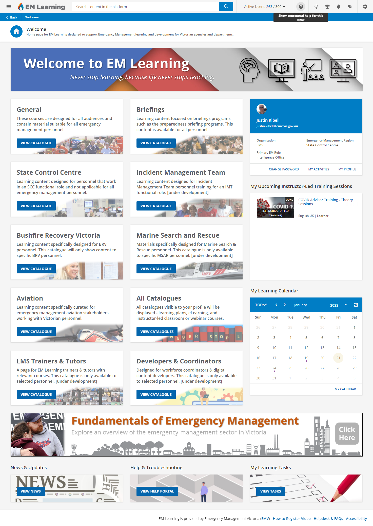
The homepage for my learners looks like this. We are a Government organisation managing Emergency Management training for a number of stakeholders across Government.

The front page is using a range of custom content boxes with links to various sub-pages with content curated for the desired audience. Most have a catalogue of courses, calendar widget and some branding for the area of interest.

The banner near the bottom cycles through various courses people may want to do, top 3 new ones - all using a Google Slide embedded as an html content box.


Hi @stacyroderick 

I’m not claiming what we’ve done here is Best in Class, but we (and our user community) like it.

Kennedys Law LLP


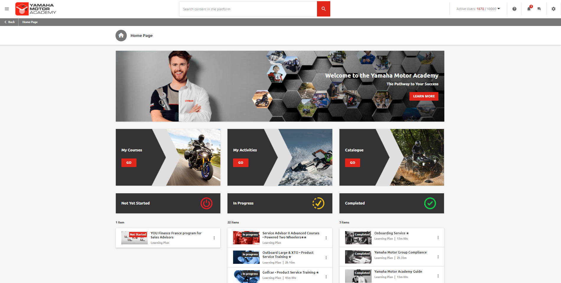
Nice interface well done. How is the bottom “continue your journey...” section done? On the page what widgets are you using for the “Not yet started”, “in progress” etc...


@jckemv ,

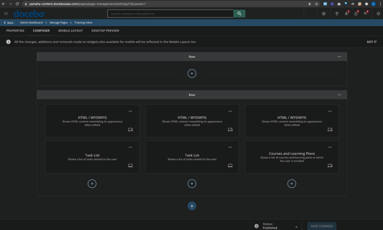
It is build like this, of course the top 3 block could also just be picture.
But you use the task list widget to create the status progress sections


Ps this how it looks on our homepage
 

​​​


@stacyroderick Here is a look at our SuperAdmin page and main Store page. @ChrisPrice did an awesome job designing these and putting in the really basic HTML code for the page icons at the bottom of the Store Hub.


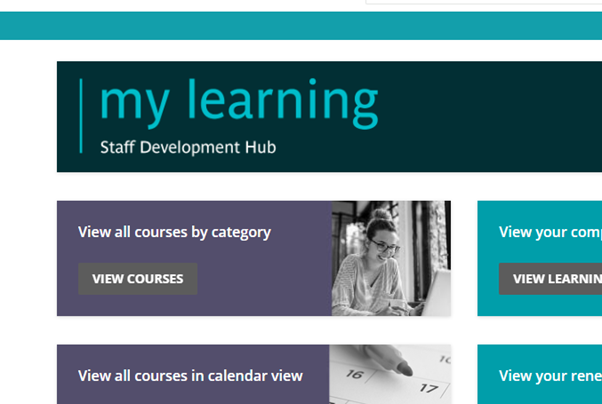
A lot of designs look similar to mine, but i have one main issue that im wondering if you have overcome?  A lot of our staff are now using laptops, and when the home page is viewed using these laptops the screen resolution is chopping off the top banner.  This is what it should look like:


but this is what it looks like for a lot of our users.  


advising people to change their browser to view to 90% isn't really a solution.  Any ideas on how we over some this?


@KTJD - Are you using fixed width such as 1280px or 100% in the HTML and CSS?


@KTJD - Are you using fixed width such as 1280px or 100% in the HTML and CSS?

I don’t know.  I just created a page with a custom widget box across the top row and uploaded a picture into that widget.


@KTJD - Are you using fixed width such as 1280px or 100% in the HTML and CSS?

I don’t know.  I just created a page with a custom widget box across the top row and uploaded a picture into that widget.

We have run into this when using the custom content widget.  If that banner is only an image, you may have more luck with the Image widget.


I don’t know.  I just created a page with a custom widget box across the top row and uploaded a picture into that widget.

Here are a couple other thoughts that may be worth trying.

  1. Craft the graphic for the specific height of the widget.
  2. Image widget as @Annarose.Peterson suggested above
  3. Use the HTML/WYSIWYG widget and craft the look with CSS and HTML

@KTJD - Are you using fixed width such as 1280px or 100% in the HTML and CSS?

I don’t know.  I just created a page with a custom widget box across the top row and uploaded a picture into that widget.

We have run into this when using the custom content widget.  If that banner is only an image, you may have more luck with the Image widget.

perfect.  thanks both.  the image widget solved the issue!!


This is also an issue with mobile app users. The cause is that the “normal resolution” displays the full image, but smaller resolutions, including mobile devices, simply center the same graphic. @ChrisPrice solved this by modifying our image design so the “centered” portion still displayed what we needed if I recall correctly.


Hi @stacyroderick 

I’m not claiming what we’ve done here is Best in Class, but we (and our user community) like it.

Kennedys Law LLP


Nice interface well done. How is the bottom “continue your journey...” section done? On the page what widgets are you using for the “Not yet started”, “in progress” etc...

@jckemv looks like the “Courses and Learning Plans” widget, set to “List” instead of “Cards” with one status showing per column/widget and the “Load More” button chosen so it only shows up to 6 at a time. The task list widget doesn’t allow you to show completed.

Looks great!  How did you get the images to display on the Completed, In Progress, and Not Yet Started? 


Hi @stacyroderick 

I’m not claiming what we’ve done here is Best in Class, but we (and our user community) like it.

Kennedys Law LLP

@Stephen.Barton can you share how you create the menu bar?


Hi all,

I'm still really struggling to find a good way to get my home page to work for us.  I love the home page example above where there is a catalogue showing the mandatory courses.  But this also presents a problem with those who need to renew their mandatory training as we do not want to them to go back to the course page (otherwise it doesn’t register their renewal.

We have 2 sets of users.  those who need to do mandatory training for the first time, and those who have done them but need to renew.  Can anyone tell me if anyone is dealing with the same thing and how they are designing their home page to make it easy for people to get to the right place.


Keeping it way simple, here is a full page of “not too much” but people have been finding it pretty effective. The lowest value comes from the one graph/widget of KPIs. To be fair to myself and others? We mostly target folks for learning in the current state. This approach:

  1. shoves the Tasks widget up front and center
  2. and the Course Catalog and some “how to videos” to be secondary level elements on the front page. 
  3. the call to action up top with a caroseul up top….and thats about it 🙂.

My only note to you. There is something to making a user experience simple and elegant.


@dklinger How did the caroseul up top section done?


Reply