Hello,

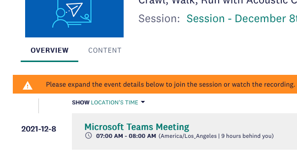
Is it possible to remove this message that appears at the top of ILTs?


We only have one event scheduled for each ILT so this message is not necessary. 
 

I am aware that I can change the phrasing in the Localization Tool but I would like to remove the notification completely.


As always any advice or tips are appreciated!
You can use CSS to hide it. Something like this should do the trick:

.webinar-completion-warning {

    display: none;

}

But before you hide it - we have edited this message to instruct users that they need to expand the session details, to see the Join (or Replay) button, as for many this wasn’t intuitive. So in the end it turned to be very useful.


HI @nicole.roman are you using the “Attendance based” tracking method? is it set to “all events”? not sure if that would change things. Think if you switch to “manual” that message should go away. Otherwise you might need to look for a CSS solution. 


You can use CSS to hide it. Something like this should do the trick:

.webinar-completion-warning {     display: none; }

But before you hide it - we have edited this message to instruct users that they need to expand the session details, to see the Join (or Replay) button, as for many this wasn’t intuitive. So in the end it turned to be very useful.

@alekwo That. Is. Genius! Thank you so much for sharing both the CSS and that tip! Would you mind sharing the language you used in the notification to instruct your users to expand the session details?


@nicole.roman sure, as simple as:

“Please expand the event details below to join the session or watch the recording”


Much appreciated, @alekwo!


@kferguson something interesting to consider for this issue we’ve previously discussed for helping users find the join link easier. 

@nicole.romansure, as simple as:

“Please expand the event details below to join the session or watch the recording”


Reply