Hello!
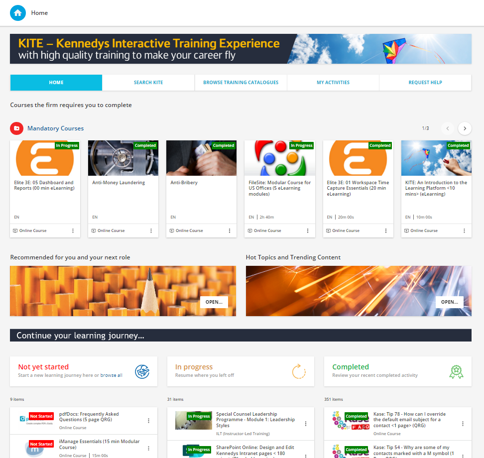
I’ve been receiving alot of feedback that about the accessibility of courses. For instance, if someone is searching for a piece of content based on a topic, if they are not enrolled, it will take 5 clicks to actually begin learning (Click on result > click on enroll > Click start learning now from pop up > Click content > actually begin learning).
This is a HUGE barrier to learning and our audience is use to 1-2 clicks to get into content. For those pieces that need to be accessible to everyone quickly (ex: DEI materials, company values, company benefits, etc) how can I remove some of these clicks without enrolling the entire company into the course? I’m utilizing the Advance Properties > Social & Learning > Course Enrollment link when sharing content which corrects this but does not correct it if someone is organically trying to find the material themselves. Any ideas?
