
Hello Community!
Hope you are ready for the weekend!
Last work-related thought before leaving the laptop on the desk, I promise ![]() … how has been you experience with launching the platform to first time e-learning users?
… how has been you experience with launching the platform to first time e-learning users? ![]()
We might be talking about not extremely tech-savvy audiences or, more simply, learners using an LMS for the first time.
I think custom pages can be very helpful in these situations and I really love the clean and effective result you can obtain with just a couple of widget types, like in the following example:
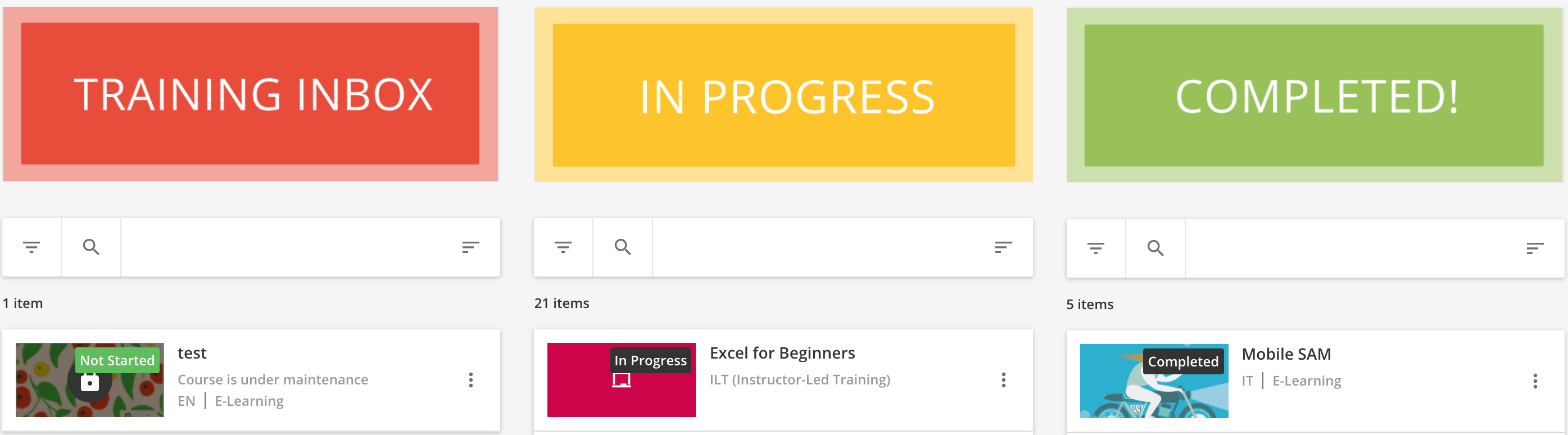
How do you do that? ![]() The recipe is very simple: 3x image widgets, 3x My course and learning plans widgets, a pinch of color design
The recipe is very simple: 3x image widgets, 3x My course and learning plans widgets, a pinch of color design ![]() , mix everything together and don’t forget to pre-filter the content by learning status before baking!
, mix everything together and don’t forget to pre-filter the content by learning status before baking!
This type of page will give your learners immediate, unmistakable information about where they stand in their learning journey and most likely increase your courses’ completion rate.
You are new to the custom pages concept? We got you covered! Feel free to consult the KB guide on how to build up custom pages with our platform. If you know it already and want to get inspired, have a look at the wonderful webinars given by Netflix and our own Docebo team (led by our amazing Head of Design
And You, how did you make the experience of your learners as simple and straightforward as possible? Share your examples in the thread if you like!
![]() Remember, the more ideas...the merrier!
Remember, the more ideas...the merrier! ![]()
Cheers!

