We recently moved to the new course player and have found that tests include large white margins of unused space. We have test questions that include images. The images are too small for learners to see and cannot expand into these margins. We are brainstorming possible solutions to this issue and would like to see if anyone can offer additional ideas. Our ideas so far have included:
- Learners zoom in via the browser to better see the images.
- Add a link to the images so they open in a new tab. This requires learners to navigate back and forth between tabs.
- Rework our test questions to remove the images.
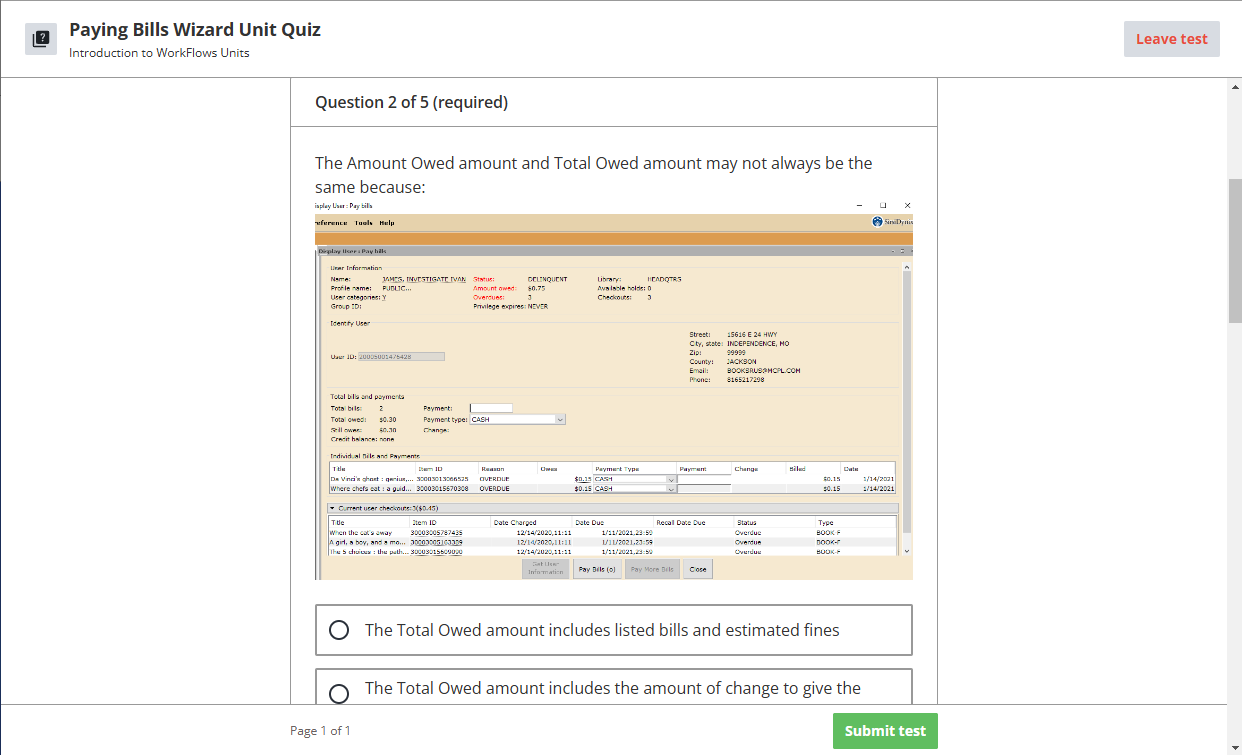
The following screenshot is an example of one of our test questions. You cannot click on images in tests to view a larger image in a pop out as you can with my screenshot in this post.


