Captions obscured by new course player bar

  • 13 June 2023
  • 6 replies
  • 100 views

Userlevel 4

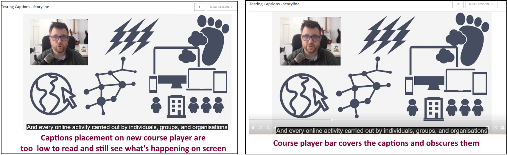
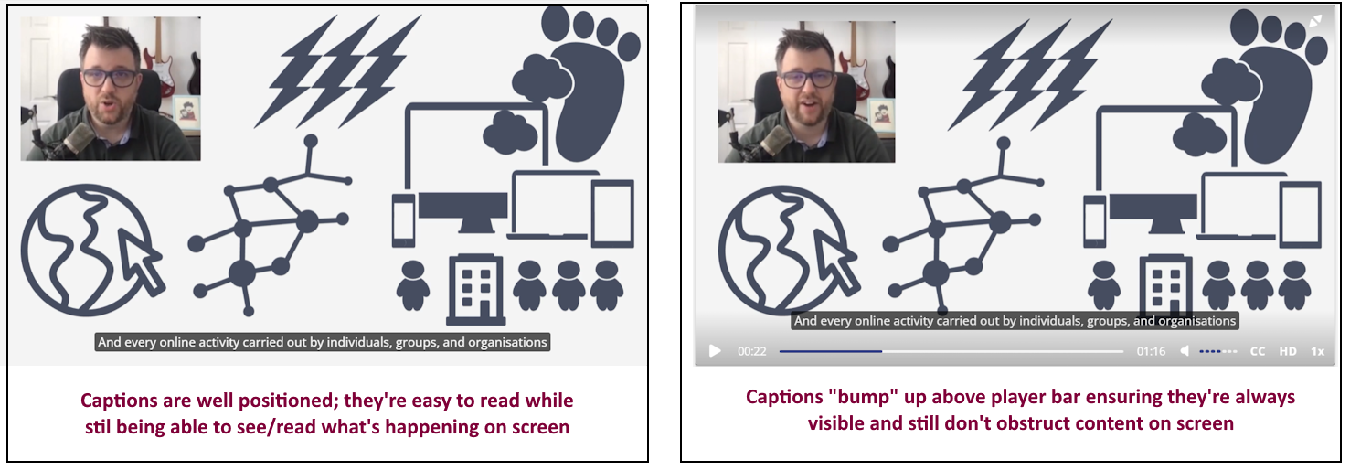
Howdy all!  Has anyone else noticed the new course player bar obscures captions? 

In the current player, the captions appear neatly and visibly above the course player bar. Not so with the new incoming course player bar.

The issue seems to be the hover settings for the bar are very sensitive, so the slightest move of mouse/cursor brings up the bar, obscuring captions. This is not good UX for our customers who certainly like to move their cursors around during videos (!)

Any workaround/suggestions to improve this? Reducing the bar opacity via CSS perhaps? 


6 replies

Userlevel 3

I’m testing captions today for our courses and saw this post. This is still an issue with the new course player look. As you can see when I paused the video, the captions are hidden behind the player bar. The bar will disappear after a while but it still covers captions. 

In the current version of the course player, when the player bar would appear the captions would shift up to still be visible and shift back down when the player bar disappeared. 


Userlevel 5
Badge +1

I agree, this is damn annoying for the learners. The bar seems to appear either when a fly moves withing 15 Metres of the mouse or when anything important is displayed on the subtitles 😁.  But seriously it is one of the things stopping us transferring to the new player.

Userlevel 3

Have Docebo recognised this as an issue? We’re just in the process of making CCs available for videos, but we haven’t switched to the new player yet.


Also I find it frustrating that the CCs have to be turned off for every video, which isn’t what a lot of users are used to.

Userlevel 3

Hi @GRuss

We’re just testing captions across the current course player and the new one and are having the same issue.

Also, as the captions are at the very bottom of the screen in the new course player they feel very far away from the content, making them very hard to read … especially if you’re trying to watch the video content and read them at the same time. Your eyes have to constantly shift up and down the screen: 

We like the position of the captions in the current course player. They’re close to the bottom but there is white space below them making them easier to read. They’re also easily within line of sight while watching the video content so you don’t have to make effort to read them as you go:

Fiona

Userlevel 5
Badge +2

This is a big issue for us as we are adding CC to all our product training videos to help with accessibility for our global audience. Beyond the undesirable location of the Captions, we have the added difficulty for learners in finding the CC language choices as the old player provided a list when clicking on the CC icon from which the user could select two click to turn it on and choose.

In the new player the learner can turn on/off CC with the CC icon, but they must figure out that they can turn CC on and off with the CC icon but must click on the settings gear icon to select another language adding 3 clicks and confusion to the process. This is a regression in the UX and not workable for us long term.


Userlevel 3

Has anyone heard anything regarding this issue and if there is a fix coming out.  This is a huge issue for us as well.


Thanks.

Lynda

Reply