Good Morning!

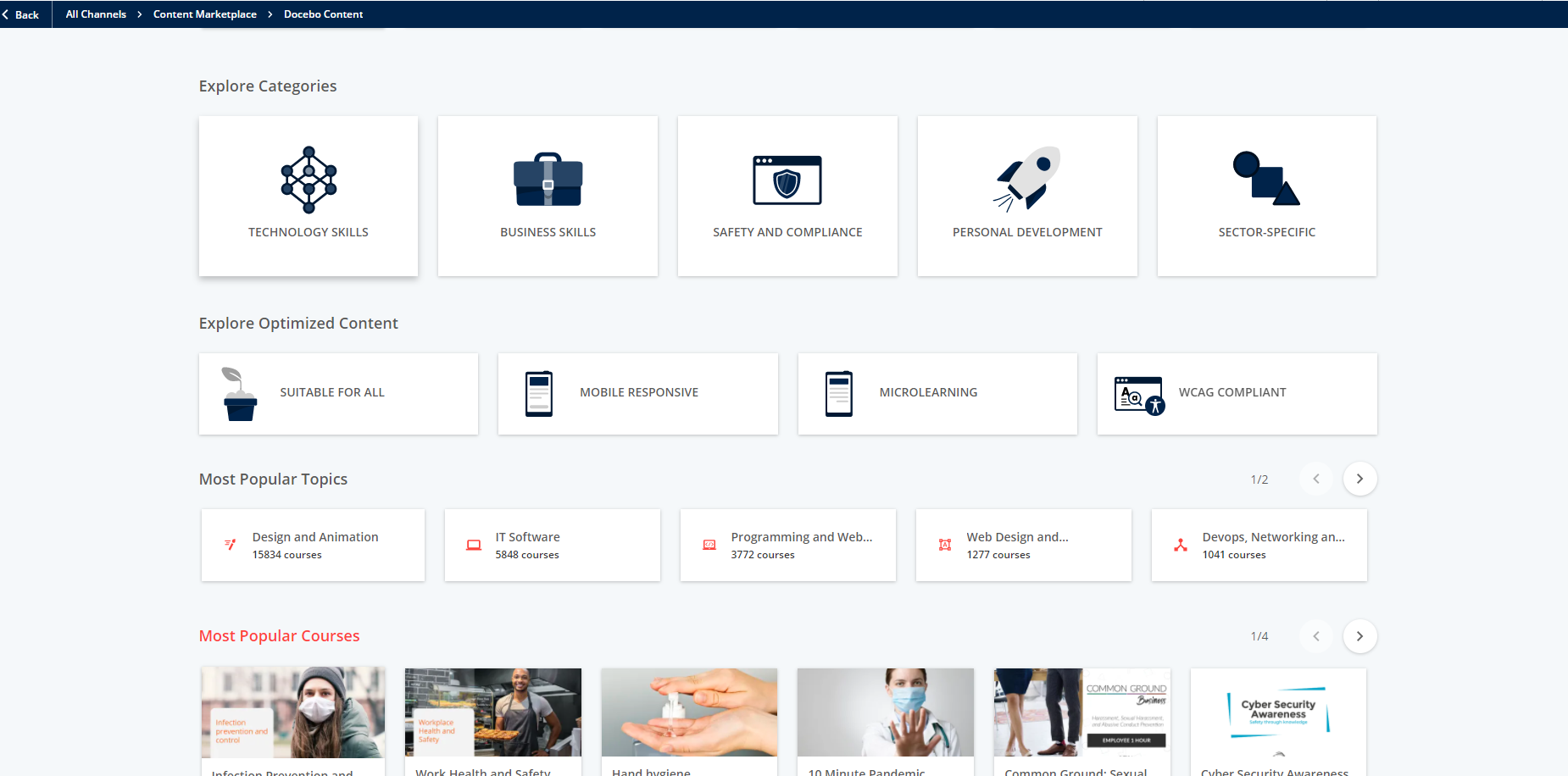
My organization is currently implementing Docebo Learn and we are trying to work with the UI/UX to create some custom catalog pages.  Specifically, we have a page on which we’ll have buttons for access to titles by category (image #1). The challenge comes in whether we can create the effect of the white back drop and course listing appear when clicking on one of the topic buttons (image #1).

Since we are so new to the application I was hoping there was an expert here who could share whether they think we can make this work and how we might approach it.  I have two excellent designers who code in HTML/CSS but we didn’t want to go too far down the rabbit hole if this simply isn’t functionality that could be supported.

Would anyone be able to share their thoughts on if this is something we can get working in our portal?

Thank you so much!

Michelle

Thanks @Neil Patterson !


@Bfarkas I was just curious as to how Neil achieved it.  I currently have a good layout on my local machine, but when I bring it into docebo there are a bunch of styles that aren’t coming through correctly.  I’m also running into an issue where the Docebo Row is not full width, so my cards are coming through smaller.  Not a huge issue, but was wondering if there is an easy way to make a certain row full width, or if I could add a CSS ID to one row and not change all the others.

No way to add the row ID, it is on a page which you can get specific and then do like first row selector, but then it is very easily broken on updates/changes, so worth weighing the pros/cons.

Understood on wanting to know how he did it, I was more just putting as a info blurb for potential users coming in the future to make sure the full ramifications of image with text for main navigation is represented.


@Bfarkas thanks! yeah I think I’m still going to attempt to do it via custom html and css.  Its a great point that the text image would make things tricky for anyone with a disability.  Best bet right now I think is to modify my design size wise so it will fit in the docebo row.


@Bfarkas @Neil Patterson 


Im attaching a screenshot from the Content Marketplace.  This was the original inspiration I was going for.  Do you know how these were created?  It looks like the text is actual text and not just an image.


Is this the content marketplace from Docebo? I would bet they get to customize their stuff a bit :)


@Bfarkas yeah its the marketplace.  I honestly wasn’t sure if this was different from what is available.  I’m new to Docebo and this was one of the first things I saw when looking for layouts


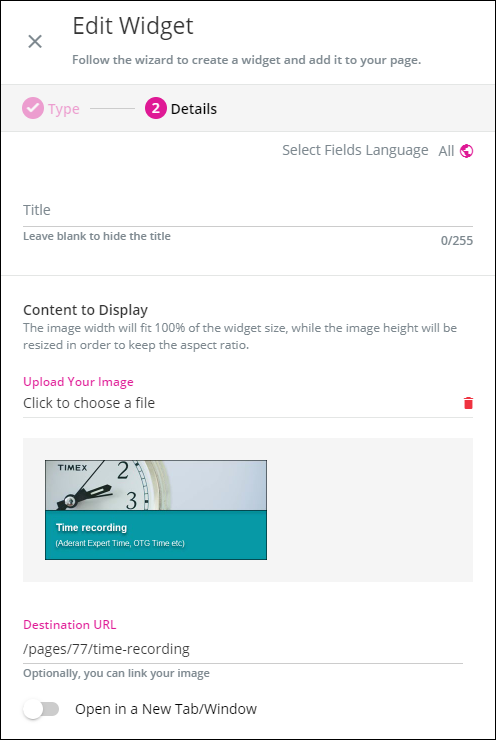
They are image widgets.  We created the images in SnagIt and then put them on there withe the URL of each page,


Friendly reminder, in this type of setup using images for text navigation, anyone who has trouble seeeing, uses other ways to see the page or interact with the page will essentially see nothing here but a link since all the descriptive text is within the image and there isn’t alt text or descriptive text. This gets tricky for those with disabilities as well as other use cases like those who rely on browser translation or changes in spacing, sizing, contrast, etc.

I’m curious why not just use the custom content box which you can get extremely close to this effect and could probably mimic completely with some css changes?


We discovered this after spending a lot of time creating them.  Just haven’t had the time to convert them to HTML (plus i’m very new to CSS / HTML so only have a limited knowledge!) 

I have managed to replicate them however now in HTML, which look and work great (we stuck to the standard 3 widget row for ease) BUT they look rubbish on the app.  This is why we should just have basic coloured custom content widgets and be done with it 😂


Yeah, the difference in app is a major dealbreaker for me in terms of so many changes I would want to make as I am not a big fan of completely different experiences based on device but have done some work like those boxes that gracefully degrade onto mobile. Or if super important doing the styles inline works, but is a maintenance nightmare!


@Annarose.Peterson Can you share the code for the Role based image. We need something like that!


@dakande 

Here is the html code I used:

<table style="background-color:#enterhexcolor;padding:5px;border-spacing:1px;"><tbody>
<tr><td><img src="insert image link" alt="alt text" width="270" height="270" /></td>
<td>
<div class="signal-nav"><a class="active" href="insert link here"><img src="insert image link" alt="alt text" width="270" height="270" /></a></div>
</td>
<td>
<div class="signal-nav"><a href="insert link here"><img src="src="insert image link" alt="alt text" width="270" height="270" /></a></div>
</td>
<td>
<div class="signal-nav"><a href="insert link here"><img src="src="insert image link" alt="alt text" width="270" height="270" /></a></div>
</td>
</tr><tr><td>
<div class="signal-nav"><a href="insert link here"><img src="src="insert image link" alt="alt text" width="270" height="270" /></a></div>
</td>
<td>
<div class="signal-nav"><a href="insert link here"><img src="src="insert image link" alt="alt text" width="270" height="270" /></a></div>
</td>
<td>
<div class="signal-nav"><a href="insert link here"><img src="src="insert image link" alt="alt text" width="270" height="270" /></a></div>
</td>
<td>
<div class="signal-nav"><a href="insert link here"><img src="src="insert image link" alt="alt text" width="270" height="270" /></a></div>
</td>
</tr></tbody></table>

To make it easy to put the images in, I put the code in the HTML source code, and then switch over to to the WYSIWYG to add the images.  This sizing works best with a 2/3 column.

To have the outline of the image change when the mouse is hovered over the image, I used this CSS code:

/*HOVER COLOR CHANGE ON HTML WIDGETS - START */
.signal-nav {
display: flex;
justify-content: space-evenly;
background-color: #f3f3f3
}
.signal-nav a {
display: block;
width: 100%;
padding: 3px 3px;
text-align: center;
text-transform: uppercase;
color: rgb(11, 188, 228);
font-weight: 700;
font-size: 14px;
background-color: #9ea1a3;
margin: 0 1px;
}
.signal-nav a.active:hover {
background-color: #ffffff;
color: #FFFFFF;
}
/*HOVER COLOR CHANGE ON HTML WIDGETS - END */

I have not been able to find the post where someone shared this CSS code - they used it for a top navigation menu, I will keep poking around to find it, because I want to give the appropriate credit to the person that shared this on the community first.


@Annarose.Peterson  Thank you so much!


@Annarose.Peterson , would you be willing to share your code for the image of your “Role-Based Skills”? I like how it highlights the box without a lot of other action. It’s more subtle, which is what we’re looking for on some of our pages.


Thanks!

Ariel


@Annarose.Peterson , would you be willing to share your code for the image of your “Role-Based Skills”? I like how it highlights the box without a lot of other action. It’s more subtle, which is what we’re looking for on some of our pages.


Thanks!

Ariel

@ariel.zimmerman, the code is posted about two replies above this one.  The image hover would be the CSS code. 


Reply