

A few colleagues and I have an ongoing joke that one of us will throw out an idea late in the afternoon on a Friday, and normally it would go nowhere, but there is something special about that magic hour before taking a weekend break, not only do we tend to come up with a solution, but it is usually ready for Monday! These could be small quality of life improvements, style adds, complex automations, or anything in between. I thought it might be nice to start documenting and sharing some of these that are applicable to other organizations.
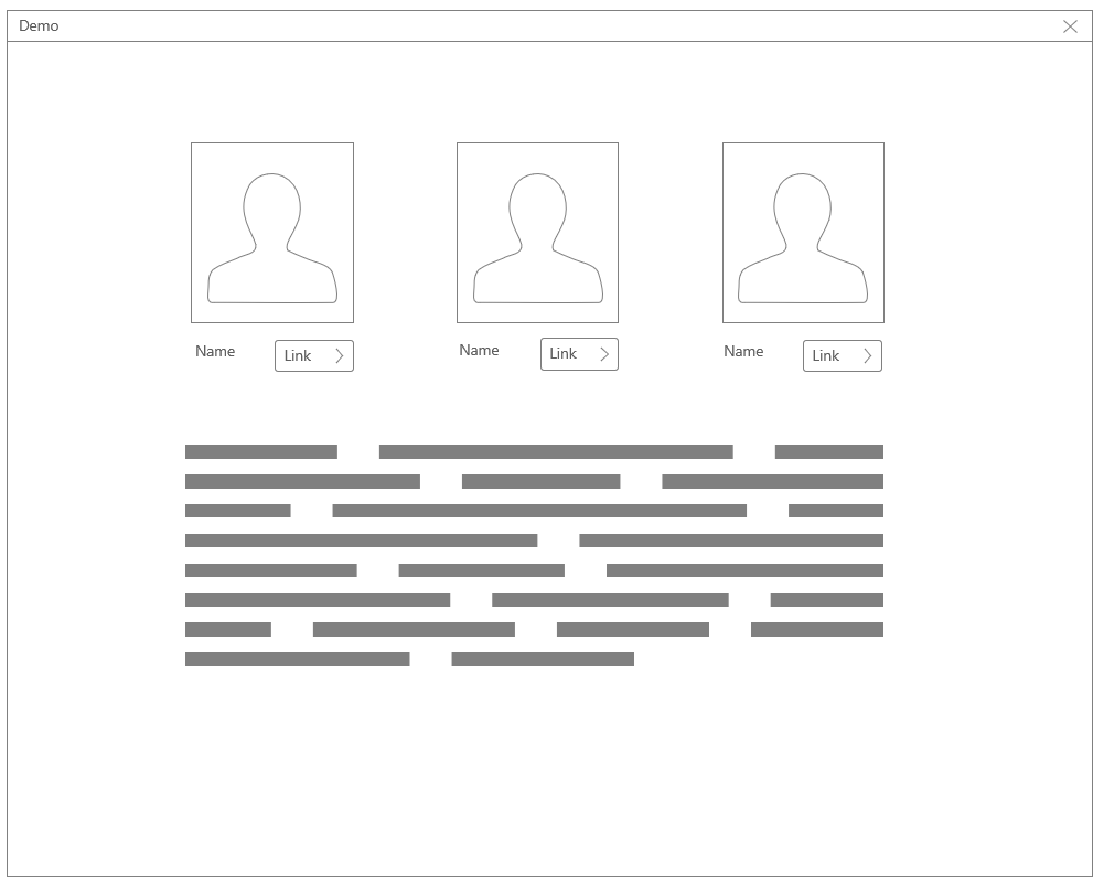
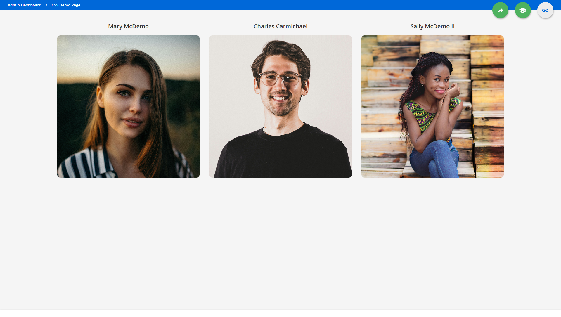
First up, last week I was on the phone with a colleague at a different organization and she was working on making some department and instructor pages. She was lamenting on how it just felt static and stale. After sending some screenshots of what it currently was, it was basically 2-5 people, with a headshot, name, and a link, and then a widget underneath with a broader description and information for the group, something like the below:
We kicked it around a bit, and decided to focus on the images. Could we maybe simplify those setups, add some interaction, and also make it fall back decently for the mobile app. Challenge on.
Step 1: Setup the image widgets
This full setup could work with the HTML widget, but I liked the idea of trying to see what could be accomplished with individual widgets. Here’s what we did.
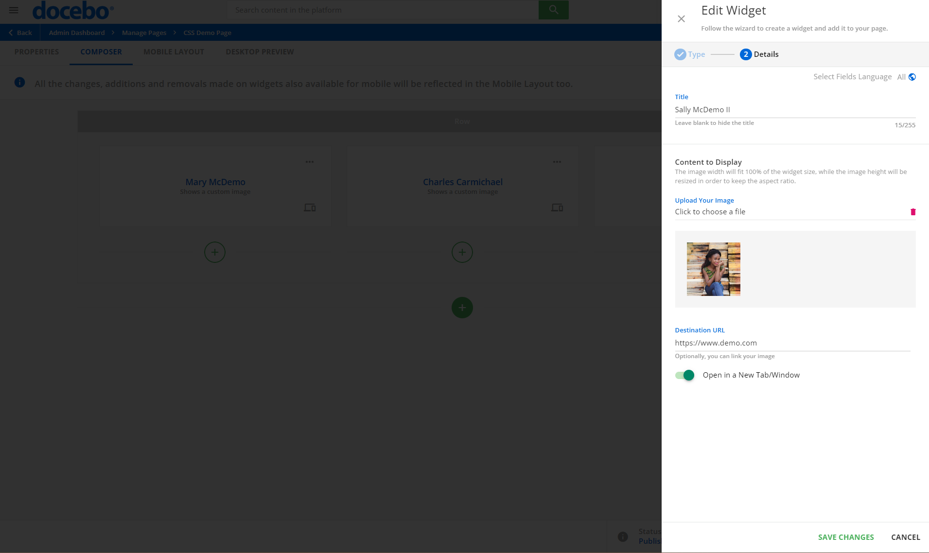
- Added a new row split into 1/3’s on the custom page.
- In each column, add 1 ‘Image Widget’ configured with:
- The instructors name as the title of the widget.
- A squared version (I’ll explain this later) of the headshot was uploaded.
- The appropriate link for each user was added to the ‘Destination URL’ box and open in new tab was selected for any external sites, some were internal though.
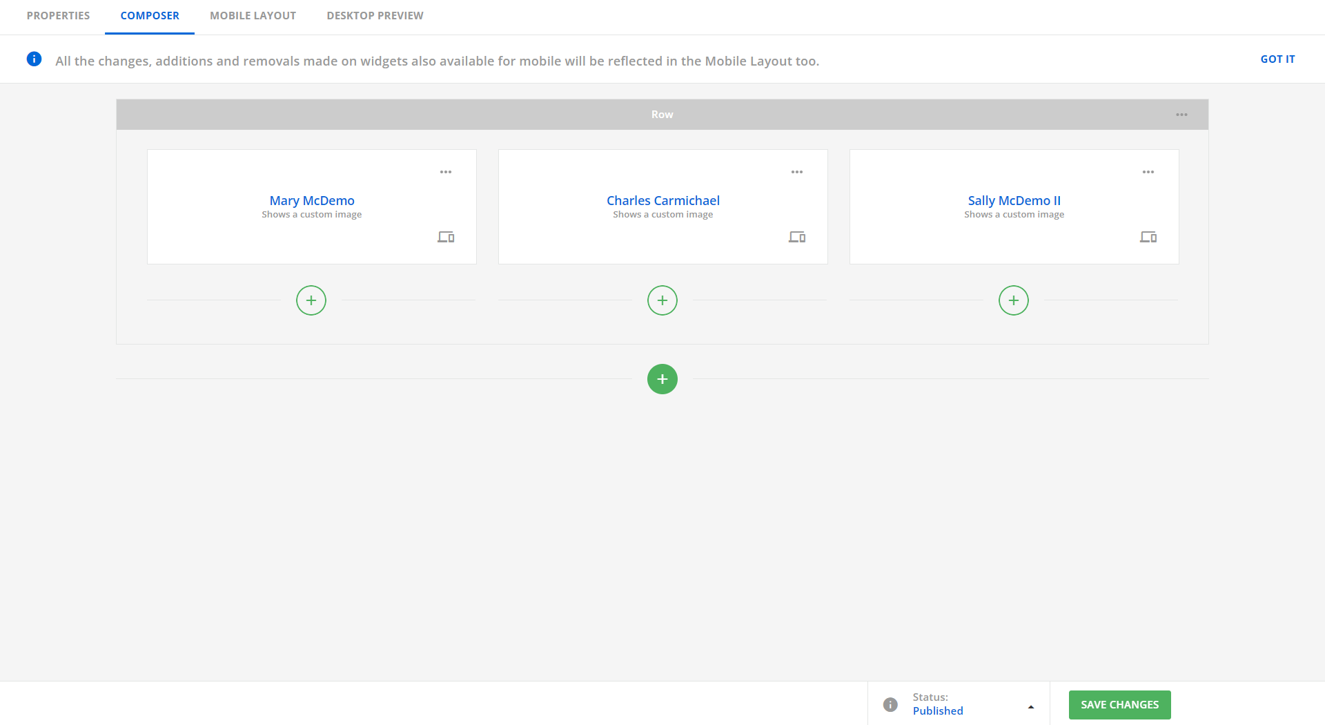
Ok, so we have 3 setup now, our page configuration looks like the following:
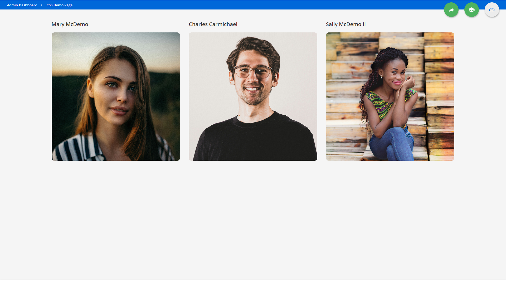
This is on the right track, and is a decent fallback for these, except links are hidden on the image:
Step 2: Custom CSS
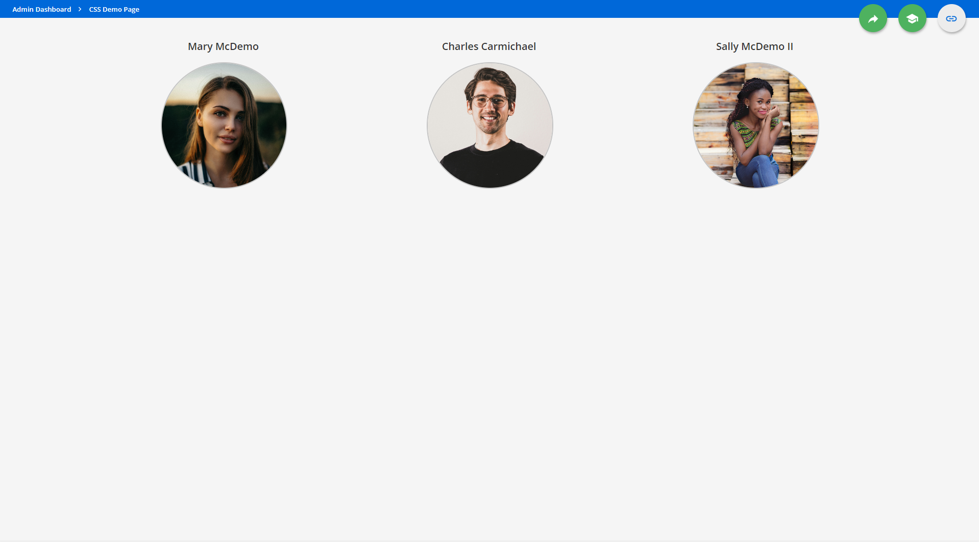
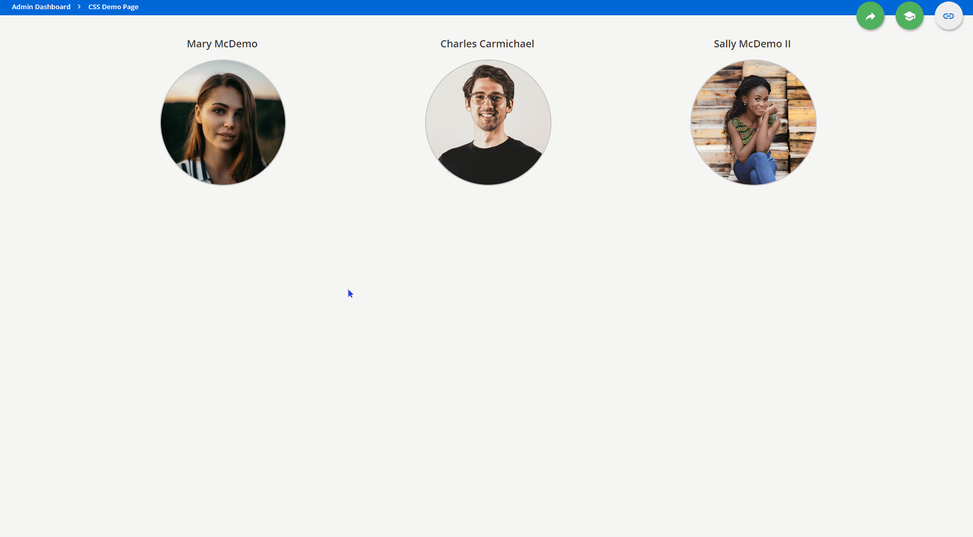
Ok, the goal was to add some interactivity remember? Our desired state was to use the popular effect that the image looks like it zooms within its own container when you hover over it. Lets work through that:
Using Chrome Dev Tools, we looked into the structure of the Image widgets. They are nicely constructed into header and image. To get the effect we wanted, we wanted to do three things:
- Center the title across the widget space:
This gets us there:image-widget .common-widget-title {
text-align: center;
}
- Crop the image to a circle, set its boundaries, and give it a border:
Let’s check how we are doing:.image-container {
display: inline-block;
margin-left: 25%;
margin-right: 25%;
width: 50%;
border: 2px solid rgba(0,0,0,0.2);
border-radius: 50%;
overflow: hidden;
}
- On hover, animate the image to zoom in:
.image-container img {
transform: scale(1);
transition: transform 0.3s ease-in-out;
}

#doc-page-66 .image-container:hover img {
transform: scale(1.3);
}
Done! That was the exact effect we were going for. Now just some cleanup. Since we do not want all image widgets to be impacted by these changes, we can enforce at either the page or widget level, in this case we will do the page. Lets add this in and put all the CSS together:
/* This updates the title on image widgets to center the text */
#doc-page-66 image-widget .common-widget-title {
text-align: center;
}

/* This sizes and crops the image within the image widgets to a circle half the size of the widget. */
#doc-page-66 .image-container {
display: inline-block;
margin-left: 25%;
margin-right: 25%;
width: 50%;
border: 2px solid rgba(0,0,0,0.2);
border-radius: 50%;
overflow: hidden;
}

/* This establishes the default scale and the behavior of this the images in an image widget. */
#doc-page-66 .image-container img {
transform: scale(1);
transition: transform 0.3s ease-in-out;
}

/* This sets how much the image zooms in on hover */
#doc-page-66 .image-container:hover img {
transform: scale(1.3);
}
Some Final Thoughts
A couple of notes on things you can adjust:
- Your page ID will be different, make sure to update it.
- The image border to better match your style, just update this line:
border: 2px solid rgba(0,0,0,0.2); - The size the image takes up of the total space, the width is currently set to 50%. If you update this, you need to adjust the margin-left and margin-right to equal 100%. These three should always equal 100%:
- margin-left: 25%;
- margin-right: 25%;
- width: 50%;
- The amount of the zoom is dictated by the last ‘transform: scale(1.3);’. The larger the number, the more zoom.
- The time the image takes to zoom, is dictated by the below. Adjust the 0.3 to make it faster or slower:
transition: transform 0.3s ease-in-out; - The reason we started with all the images being the same size squares was three-fold. First we wanted them to be ok in the fallback setup. Second, we wanted to achieve a circle as the final result, taking a square and applying a border-radius easily achieves this. Depending on your desired outcome, you could use other shapes (for instance, you could have ovals if you start with rectangles) Finally, we wanted to control where the person’s face was so that the zoom did not crop them out awkwardly.
While, we were using this for essentially profile images, you could use a similar technique for things like departments, locations, sections, etc. Seems pretty flexible.
And with that, this Friday at 4 challenge was closed out. Enjoy and have a great weekend!

