I just got this message from a manager trying to understand.
So, for example, xxxx and xxxx need to log into the learning center and complete NH Training even though they show as Looks Good?
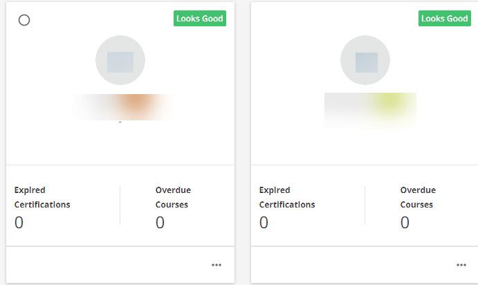
So a question for you - does anyone know if you can hide the KPI “Looks Good” tag via CSS? Because the training is given a deadline? Albeit a soft-deadline - and the KPI tag isnt helping - it is confusing people on my end.
Page 1 / 1
It confuses people on my end too. I see you opened the idea so reposting here to get some more upvotes!
Thank you @dandrews - yeah - we can’t wait anymore - the product is seeing great usage? And I want to get us to a place where we don’t have to worry about a person looking at the KPI tag and thinking…meh...I said it above.
You could try this:
.ui-badge-status { display: none; }
Obviously, you should test it to make sure it doesn’t impact other areas of the platform.
I think communication is key here too.
Our team uses enrollment rules/due dates/notifications/my team in the following way to track compliance courses:
User auto enrolled into compliance courses when they log in for the first time.
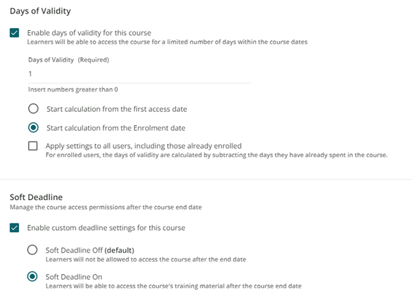
Compliance courses have a variable end date (28 days) and a soft deadline.
Notifications for compliance courses send weekly on Monday @ 8:00 AM to incomplete users before and after the due date until they complete the training.
My Team indicates:
Looks good = all courses complete OR still within variable date range
Take a look = courses past due date
Then the communication becomes something like:
“The user must complete the training by X date, otherwise they will appear as overdue (i.e., take a look).”
Or just hide with the CSS I shared above.
@IanMonk - thank you! This is what I was looking for. And you are right - the key is communication. We have videos and trainings on how to leverage things? But the most common response from Managers who are always on the run? Is that it is not making sense.
So it says looks good no matter what?
I haven’t gotten complaints yet but I bet I will… is that CSS platformwide-safe?
From my testing, this feature specifically looks at 1) what courses a user is enrolled in and 2) the end date of those courses.
Examples:
If the user is enrolled in a course that has an end date in the future OR no end date at all, then it appears as “looks good”.
If the user is enrolled in a course with an end date that is in the past AND is incomplete, then it appears as “take a look”.
When we first launched Docebo, we were not using end dates in the course properties area. Instead we had some self-imposed deadlines for courses that were communicated to staff outside the system (e.g., an email telling staff to complete the ethics training before February 1, 2023). We had leaders going to My Teamafter February 1, 2023, seeing “looks good” and assuming that their staff had completed the training. But really, it was appearing as “looks good” because we were not using end dates, not because staff had actually completed the training.
We would get support inquires from leaders saying that HR is telling them their employees have yet to complete the training, but they were convinced otherwise having looked at My Teams and seeing “looks good” with 0 overdue courses.
Our solution was to start using end dates (with soft deadlines) in the course properties area anytime we are asking people to complete training by a certain date.
This is exactly how we dealt with this problem. In order to help managers know which staff members are still to do their mandatory training we put validity date with a soft deadline so when new starters joined it picked up that ‘take a look’ tag after 1 day.
Great insights! Thank you @KTJD and @IanMonk
We can also customise what the labels say in the localization tool right? So change ‘Looks Good’ to ‘Courses completed or deadline hasn’t passed yet’ or something?