Howdy folks - I am asking for an assist with voting up something I find myself passionate about lately - which is the My Team tools.

One thing that got a nod of evaluating what it would mean to take on is:

My ask - drop a few votes on it if you have interest in an improvement from the top level. When we can get the detail to our managers without them having to drill into individual summaries by better leveraging details that could be in the card view? Everyone wins.

This was a mockup of what I think could improve the story:
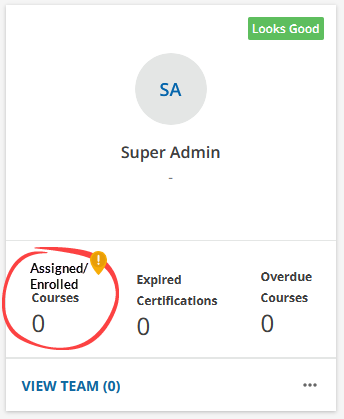
Please take the time to vote this one up


You got my vote!


I’d vote, but you already got me 😉

In my mind I voted again though!


@dklinger Thank you for posting. There are so many ways the My Team page could be improved. This is an excellent example. 


A great concept is with the right tools? You can coach up your managers and eliminate the need for a report and keep the manager engaged with the right level of details on a card or filtered view.

Imagine:

1) filtering on a course via search/ filters (a new filter and results metaphor would be needed)
2) the result of the filter is the name of the course with a sparkline of how your peeps are doing
3) being able to click on the sparkline to instantly filter to those tiles subscribed or in progress
4) being able to email these people (which to be fair? Is already there).

No more need for a report! 


Reply