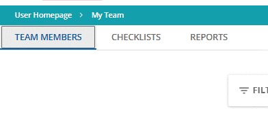
I’m encouraged to the see the columns in the manager reports tidied up. If we could choose the columns then that would be fantastic...but every little helps i guess.
My question is about the reports button. nearly everyone i speak to didnt even realise there was a reports tab when viewing their team. Is there any way (perhaps by using CSS) that we can make this tab a bit more obvious?


