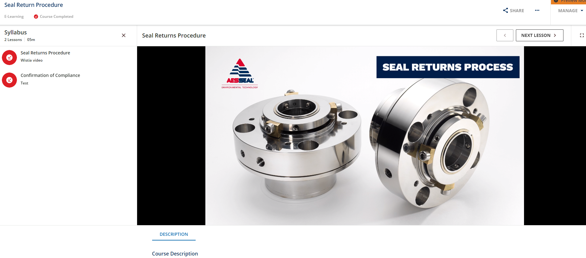
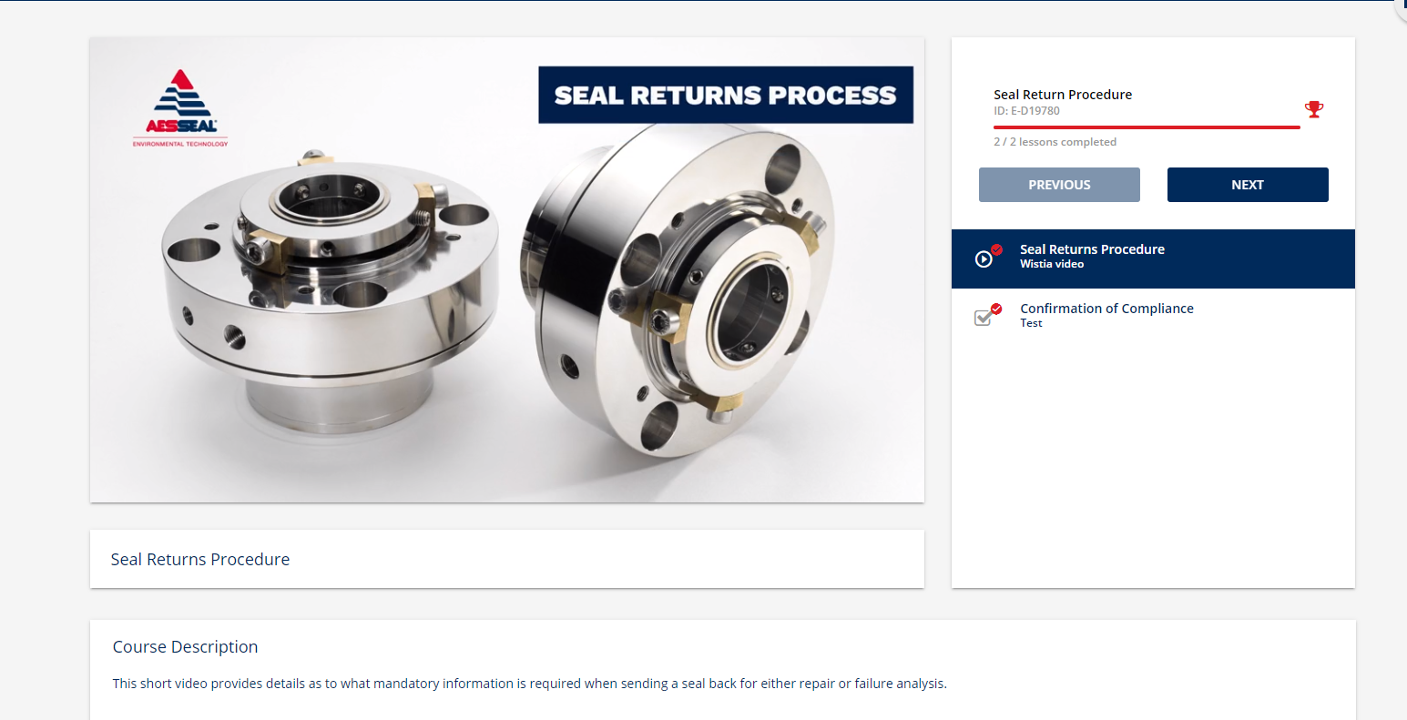
Apologies if this has already been raised, but I can’t seem to locate an exact discussion. Is there a way to change the size of the learning objective window in the new course player when it’s a video? We upload videos that are hosted in Wistia and whereas they fit perfectly in the current window, whilst trialling the new course player view we’re left with black bars either side of the video as it’s wider. I know you can change to full screen once play has been clicked, but the initial view looks awful aesthetically. Thanks.
Best Answer
Window size in new course player
Best answer by KMallette
Hi,
I found a couple of .mp4 videos, one was 16:9 aspect, and the other was 4:3 aspect. And I did get the black bars on the sides for 4:3, but not 16:9. I haven't’ found anything in the player configuration that let’s me define the aspect, so it sounds like you’ll need to use 16:9 going forward.
Log in to Docebo Community
Enter your email address or username and password below to log in to Docebo Community. No account yet? Create an account
Docebo Employee Login
or
Enter your E-mail address. We'll send you an e-mail with instructions to reset your password.


