Best Answer

HTML training material with inline CSS


juergen.hanke
Novice II
Forum|alt.badge.img

Can someone help me with inline CSS?

Most of the style tags just get deleted once I save the HTML training material and I’m a little desperate already. We are offering some pictures to download on our LMS through HTML pages. We show the pictures with a hover effect. When you click on the picture it opens in a new tab where you can download it. On the browser everything is working fine, since I can use custom CSS. However, this custom CSS is not working on the Go.Learn App (only the design).

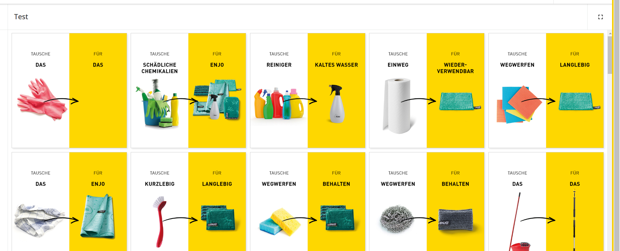
This is how it looks on my browser:

This is how it looks on the App:


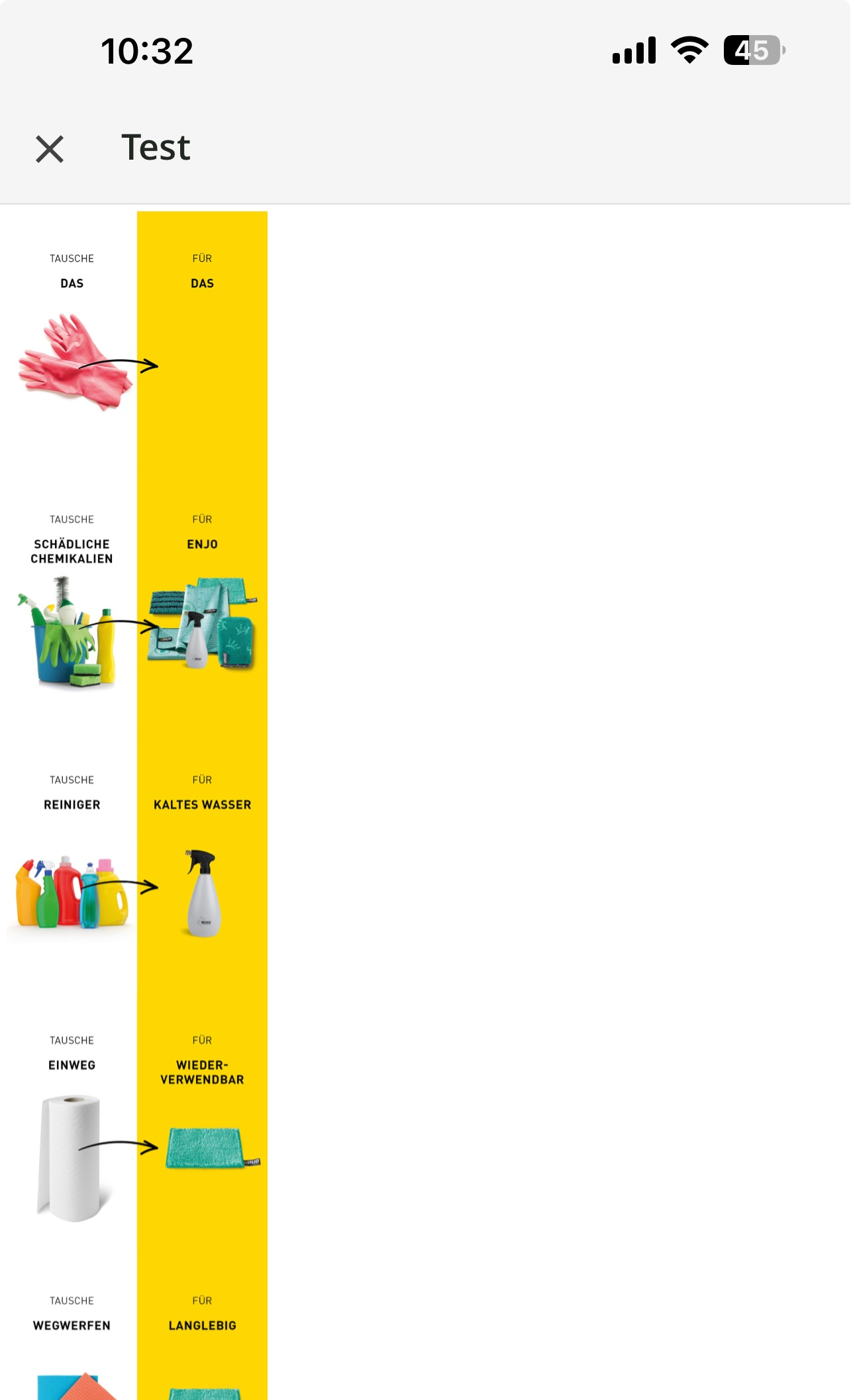
So my problem is that I tried to use some inline CSS to make them look a bit better on the smartphone app (I don’t need any of the effects). But all inline codes were deleted (style=”display:inline-flex;” and the like). Every picture is showing in one column instead of using the whole space (for example if 3 pictures fit in the first line show 3 pictures in each line etc.). Can anyone help me out with this?

This is an example of the html code I’m using on the training material (please be aware that I got many of these pages and I need to do this several pictures/links):

<div class="enjo-gallery">
    <div>
        <a href="link1" target="_blank" rel="noreferrer" download>
        <img src="link1" alt="Image1" width="300" /></a>
    </div>
   <div>
        <a href="link2" target="_blank" rel="noreferrer" download>
        <img src="link2" alt="Image2" width="300" /></a>
    </div>
    <div>
        <a href="link3" target="_blank" rel="noreferrer" download>
        <img src="link3" alt="Image3" width="300" /></a>
    </div>
</div>


This is the custom CSS:

.enjo-gallery {
    display: inline-flex;
    display: -webkit-inline-flex;
    display: -ms-inline-flexbox;
    grid-gap: 10px;
    justify-content: center;
    gap: 10px;
    flex-direction: row;
    flex-wrap: wrap;
    align-items: center;
}

.enjo-gallery img {
        max-width: 300px;
        height: auto;
        border: 1px solid #ccc;
        box-shadow: 2px 2px 4px rgba(0, 0, 0, 0.1);
        transition: transform .2s;
}

.enjo-gallery img:hover {
        transform: scale(1.1);
}

.enjo-gallery div {
        text-align: center;
}

@media screen and (max-width: 767px) {
    .enjo-gallery img{
           max-width:  150px;
     }
}


I really would appreciate the help!!

Best answer by juergen.hanke

@Bfarkas unfortunately your answer wasn’t pretty much of a help, but I figured it out myself.

Just if anyone wants to know how I fixed it. Removing some of the divs did the trick:

So the divs in between did not work on the go.learn app:

<div class="enjo-gallery">
    <div>
        <a href="link1" target="_blank" rel="noreferrer" download>
        <img src="link1" alt="Image1" width="300" /></a>
    </div>
   <div>

        <a href="link2" target="_blank" rel="noreferrer" download>
        <img src="link2" alt="Image2" width="300" /></a>
    </div>
    <div>

        <a href="link3" target="_blank" rel="noreferrer" download>
        <img src="link3" alt="Image3" width="300" /></a>
    </div>
</div>

I changed it to this:

<div class="enjo-gallery">
    <div>
        <a href="link1" target="_blank" rel="noreferrer" download>
        <img src="link1" alt="Image1" width="300" /></a>
        <a href="link2" target="_blank" rel="noreferrer" download>
        <img src="link2" alt="Image2" width="300" /></a>
        <a href="link3" target="_blank" rel="noreferrer" download>
        <img src="link3" alt="Image3" width="300" /></a>
    </div>
</div>

And now everything is showing as expected on both, the smartphone app and the browser.

View original
Did this post help you find an answer to your question?

JeanetteMcVeigh
Hero II
Forum|alt.badge.img+5

Bfarkas
Hero III
Forum|alt.badge.img+5
  • Hero III
  • March 13, 2024

So as you ran into, custom CSS is great but you need a “graceful fallback” if a mobile app user as it is not applied there at all  

The WYSIWYG editor for inline styling does not support a lot of common tags as well as common structure, things like nesting divs often falls apart. It is often a need of just of almost simplifying and even though perfectly valid HTML is in use, do things more manually, for instance I see you wrap the image and text for each link inside a single a tag, normally fine, often have to segment these out otherwise the editor reorders and inserts stuff that messes with you. The styles allowable and not is a lot of trial and error and working through different types, again older, more established methods over newer ones typically work much better. 


juergen.hanke
Novice II
Forum|alt.badge.img

@Bfarkas unfortunately your answer wasn’t pretty much of a help, but I figured it out myself.

Just if anyone wants to know how I fixed it. Removing some of the divs did the trick:

So the divs in between did not work on the go.learn app:

<div class="enjo-gallery">
    <div>
        <a href="link1" target="_blank" rel="noreferrer" download>
        <img src="link1" alt="Image1" width="300" /></a>
    </div>
   <div>

        <a href="link2" target="_blank" rel="noreferrer" download>
        <img src="link2" alt="Image2" width="300" /></a>
    </div>
    <div>

        <a href="link3" target="_blank" rel="noreferrer" download>
        <img src="link3" alt="Image3" width="300" /></a>
    </div>
</div>

I changed it to this:

<div class="enjo-gallery">
    <div>
        <a href="link1" target="_blank" rel="noreferrer" download>
        <img src="link1" alt="Image1" width="300" /></a>
        <a href="link2" target="_blank" rel="noreferrer" download>
        <img src="link2" alt="Image2" width="300" /></a>
        <a href="link3" target="_blank" rel="noreferrer" download>
        <img src="link3" alt="Image3" width="300" /></a>
    </div>
</div>

And now everything is showing as expected on both, the smartphone app and the browser.


Bfarkas
Hero III
Forum|alt.badge.img+5
  • Hero III
  • March 18, 2024

Thanks for sharing back @juergen.hanke , so that would be exactly what I was saying, you had extra structure (tags, divs in your case) and you have to simplify them down, a lot of standard html practices like that don’t work here.


Reply


Cookie policy

We use cookies to enhance and personalize your experience. If you accept you agree to our full cookie policy. Learn more about our cookies.

 
Cookie settings