Design & Layout

A Few CSS Tricks and Tips for Your Custom Widget Pages

A Few CSS Tricks and Tips for Your Custom Widget Pages
gwlasiuk
Contributor I
Forum|alt.badge.img

Those of you who attended this month’s DU Live may remember Greg Wlasiuk from Tripadvisor (Learning Technologist). With some help from Docebo’s own Ryan Woods (Senior Course Developer), Greg has put together some tips and tricks for you to use when building custom widget pages in Docebo.

March’s DU Live is now available on-demand.


Custom widget pages are key when it comes to directing and informing users on your platform, but building a page that engages users can feel challenging when you’re getting started. Here are a few CSS tips to add to your Docebo page design toolbox.


Background images for pages


Adding a background image using CSS is a great way to bring some uniqueness to your platform. It’s also a great way to differentiate pages within a specific theme.


For example, maybe all pages within a learning program have the same background image. Or if you segment users and assign them different pages, you can apply background to the page for each user group to give each section a unique feel. This can prevent users from feeling lost on your platform.


If you want to add a background image to your custom widget page, it’s fairly easy to do so. All you need is a page with at least one widget, as the background image will only appear in the area where widgets are placed.


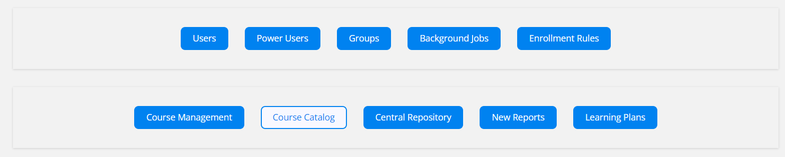
To add a background image, go to the Configure Branding and Look area and select the Custom Styles section.


CSS

#doc-page-PAGE_NUMBER{

    margin: 0;

    padding: 0;

    background-image: url(YOUR-IMAGE.jpg);

    background-size: cover;

    background-position: center;

    background-repeat: no-repeat;

}


Enter the code above in the Custom Styles text box, then make the following adjustments:

  • In the first line, replace PAGE_NUMBER with the number of the page you want to apply the background to. You can find this in the URL of the page.
  • In the fourth line, replace YOUR-IMAGE.jpg with the URL of your preferred background image.

Note: If you want to host your image in Docebo, one option is to upload an image in Docebo in the HTML widget. You can then find the URL and plug it into the code above.


You can adjust the CSS to change the positioning of the background image, or if it repeats as you scroll. Make sure to have a large enough image depending on your page’s dimensions.


Flipcard Buttons

Jr0IXWKXrhxD10-sCGa__VfjktYV-YbvHW-qo0c9AGDtpmJvHmvONPDVOzs3-OJEegHX4tmflyTfiGH9QZAQm8f6RsQ0n8_Tw5aExbREbW9hexktGWUIARzXZHIQD2rqTvJuH2C0HFON0bRcwEiFrBU


Flipcards are engaging and lets you fit a lot more information onto a custom page without sacrificing a clean look and feel. The ones you’ll create from the code below are probably best used for main menu navigation links that might require a little extra information or context.


A quick note: This code was sourced from the materials provided alongside “Road to Inspire | Building a tailored learning experience” from November 2020, which is available on-demand on Docebo University.


To start making your flipcards, go to the Configure Branding and Look area of your platform and open the Custom Styles section. Paste the following code in the text box there.


CSS

/*CUSTOM FLIPCARD - START*/

#custom_flipcard {height: 100%; transform-style: preserve-3d; perspective: 600px; transition:

0.5s; overflow: hidden;}

#custom_flipcard:hover .card-front {transform: rotateY(-180deg);}

#custom_flipcard:hover .card-back {transform: rotateY(0deg);}

.card-front {height: 100%; width: 100%; background-position: 50% 50%; background-size: cover;

position: absolute; top: 0; left: 0; backface-visibility: hidden; transition: 0.5s; }

.card-back {height: 100%; width: 100%; position: absolute; top: 0; left: 0; background-color:

#00AA6C; backface-visibility: hidden; transform: rotateY(180deg); transition: 0.5s; color:

#ffffff; text-align: center; margin: 0 auto; display: flex; justify-content: center;

align-items: center;}

.card_back_text a {padding: 8px 8px; border-radius: 2px; line-height: 20px; font-size: 16px;

font-weight: 700; color: #000000; background: #00aa6c00; text-transform: uppercase;

text-decoration: none;}

.card_back_text a:hover { color: #ffffff; background-color: #00aa6c00;}

.card_front_title {font-size: 30px; line-height: 34px; font-weight: 700; color:#303030;

text-align: center; margin:25px; z-index: 1;}

.card_back_text {font-size: 16px;line-height: 22px; font-weight: 600; text-align: center;

margin:25px; color:#ffffff;}

.flipcard_overlay {width:100%;height:100%; display: flex; justify-content: center; align-items:

center;}

/*CUSTOM FLIPCARD - END*/


Once you’ve done this, you can go to Manage Pages, click on the page you want to add a flipcard to, and go to the composer tab.


HTML

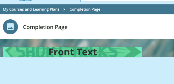
<div id="custom_flipcard">

<div class="card-front" style="background-image:url(YOUR-IMAGE.jpg);">

<div class="flipcard_overlay" style="background:rgba(52,224,161,0.7);">

<div class="card_front_title">Front Text</div>

</div>

</div>

<div class="card-back">

<div class="card_back_text">Back Text.<br /><br /><a href="https://your-link.com">Link Text</a></div>

</div></div>


In the composer, create a new HTML widget and apply the code above with a few alterations:

  • Replace YOUR-IMAGE.jpg with URL of your image. Find this after uploading an image in Docebo in the HTML widget.
  • Replace Front Text and Back Text with the text you want to appear on the respective front and back of the flipcard.
  • Replace https://YOUR-LINK.com with the URL of the page you want the flipcard to link out to, and replace Link Text with the text you want as a hyperlink.

Note: You can also customize each widget by changing the “background: rbga” value (color).


Hover-over Buttons

agIpAe8sqEgQ0FZZYgVnOobSqRDsRhaoeNVmfO0saMePlcAM7jWr83C51hFUrUHi6qVtWxXVRNPqdIhj3W9dJC8LB28Ou19R9WilXmuk4yHW0l4gn9Tt-_KFJ8SroYEh6PSxk3bESLZUnPnlZjGUaE0


Hover-over buttons give pages a responsive, lively feel that breaks away from the static menus of courses / resources. Applying them to your custom pages can be a great way to engage users during their learning journey.


To start, go to the Configure Branding and Look area and select the Custom Styles section.

CSS

/*CUSTOM HOVEROVER - START*/

#hoverover_image {width: 100%;height: auto;transition: transform 0.5s ease;}

#hoverover_image:hover {transform: translateY(-40px);}


Once you’ve added this code to the Custom Styles section, you can change “-40px” to the amount of pixels you want the hover effect to cover. A larger number = more movement.


Now, go to the composer for the custom page you want to work on.


HTML

<div id="hoverover_image"><a href="https://YOUR-PAGE.com"><img src="https://YOUR IMAGE.png" alt="Your Image" /></a></div>


Create an HTML widget on that page and use the above HTML to add the hover-over button with a few adjustments:

  • Replace https://YOUR-PAGE with page you want to link out to, and replace https://YOUR-IMAGE.png with the image you want to use for the button.
  • Replace Your Image with any alt text you would like to add.

Note: The change that occurs when the mouse hovers over the widget can be totally customized. You can have it change color with an overlay, increase in size, or even animate it! Try playing around with the CSS to get your desired outcome.


These are just a few ideas for you to try out while making custom pages, and hopefully they not only offer valuable tools for your design arsenal, but also provide inspiration for your own CSS solutions.


How do you see yourself using these tips? Do you have your own CSS tricks to share? Comment below! ⬇️

Did this post help you find an answer to your question?

18 replies

dwilburn
Guide III
Forum|alt.badge.img+3
  • Guide III
  • 307 replies
  • March 28, 2024

Very nice, time to do some testing in the sandbox


dwilburn
Guide III
Forum|alt.badge.img+3
  • Guide III
  • 307 replies
  • March 29, 2024

@gwlasiuk I enjoyed the DU live and you have a good page put together here.

You mentioned 189 pages in your system. I imagine that can be quite a few pages per user.

Are those pages all delivered by separate menu selections in the hamburger menu?

I have seen some sites like https://explore.skillbuilder.aws/learn that has tabs across the top. I’m not sure if that is just an e-commerce thing. But I am curious if tabs across the top of a user’s homepage are possible.


gwlasiuk
Contributor I
Forum|alt.badge.img
  • Author
  • Contributor I
  • 13 replies
  • April 2, 2024

@dwilburn Thanks!

We have so many pages in part because we segment users based on different fields such as managers, business org, and employee type. This gives us quite a few varying pages (Some that only change slightly based on what info might be relevant to that user). Many of the pages would also be delivered by the hamburger menu - or on the 5 or so menu buttons front page selection area.


Jihane
Docebian
Forum|alt.badge.img
  • Docebian
  • 77 replies
  • April 4, 2024

@Helena Silva and @petr.zavadil I know this can be relevant to you 😉


Hi @Jihane,

This looks super nice. Thanks for tagging us.
I’ll spread the word within the team.

Best,
Helena


lrnlab
Hero III
Forum|alt.badge.img+8
  • Hero III
  • 4788 replies
  • May 2, 2024

thanks for posting this...always nice to have more options...


  • Novice I
  • 3 replies
  • May 25, 2024

thanks for this. how do you make the white background that displays under the image when it hovers go away? ideally to match the page background image


Forum|alt.badge.img
  • Contributor II
  • 31 replies
  • June 5, 2024
hasiniw wrote:

thanks for this. how do you make the white background that displays under the image when it hovers go away? ideally to match the page background image

Same question. Did anyone get the answer to this?


dwilburn
Guide III
Forum|alt.badge.img+3
  • Guide III
  • 307 replies
  • June 5, 2024

We have gotten to this image below. I am mousing over the white one. My remaining question is how to get the spacing more consistent when there is different content.


Below is what we currently have in the CSS, a big thank you to @MandM on her development of what we have so far (based on stuff from the original post).

/* Add Menu and  Admin labels */
#doc-layout-internal-header > nav > div.internal-header-navigation-group.internal-header-navigation-group-bordered.internal-header-admin-menu.ng-star-inserted > div > ui-button-icon::after{
	content: "ADMIN";
    color:#888;
	font-size: 0.88em;
	font-weight: 600;
}
#doc-layout-internal-header > nav > div.internal-header-navigation-group.internal-header-navigation-group-bordered.internal-header-admin-menu.ng-star-inserted > div > ui-button-icon{
	padding-top:0px;  
}
#doc-layout-internal-header > nav > div.internal-header-navigation-group.internal-header-navigation-group-bordered.internal-header-admin-menu.ng-star-inserted > div > ui-button-icon button{
	margin-left: 3px;
	bottom: -6px;
}/* add text "admin" to admin gear menu */
/*
#doc-layout-internal-header button[aria-label='Admin Gear
Where the MAGIC happens™']*/


#doc-layout-internal-header > div.internal-header-main-elements > div.internal-header-user-menu-button.ng-star-inserted > ui-button-icon::after{
	content: "MENU";
    color:#888;
	font-size: 0.88em;
	font-weight: 600;
}
#ui-button-icon-3 {
    bottom: -6;
	padding-top:5px;
}/* add text "menu" to hamburger menu */


  .button-container {
    display: flex;
    flex-direction: row;
	flex-wrap: wrap;
    align-items: center;
	justify-content: center;
	font-family: "Ericsson Hilda", sans-serif;
    padding: 20px; /* The space between the container/widget and the buttons */
	background-color: #f2f2f2; /* The color of the widget */
  }

  .button-container .button-link {
	text-decoration: none;
	transition: 0.3s;
    margin: 15px; /* Space between buttons */
    padding: 10px 20px; /* Space between the text and the edges of the buttons */
    font-size: 16px; /* Text size inside the button */
    cursor: pointer; /* The cursor used when the user hovers over it */

	color: #ffffff; /* The color of the font */
	border: 2px solid #0082f0; /* The border around the button */
	background-color: #0082f0; /* The color of the background of the button */
	border-radius: 8px /* Curve of the corners */
  }

  .button-link:hover {
	background-color: GhostWhite; /* The background color it changes to when the user hovers over it */
    font-size: 16px; /* Text size inside the button */
    color: #0082f0; /* The color of the font */
  }


Forum|alt.badge.img

I love the flipcard look but is it possible to do within a widget, rather than the whole widget? We need to fit more across than 3.


dwilburn
Guide III
Forum|alt.badge.img+3
  • Guide III
  • 307 replies
  • June 6, 2024

@ariel.zimmerman - ours is in one widget, just spread across. We are currently using an individual widget for each link, and we have maxed out our Super Admin page at 20 widgets.

But you bring up a good point, I should see how it does in the more narrow widget.


Forum|alt.badge.img
  • Contributor II
  • 31 replies
  • June 7, 2024

I can’t get the hover to work without the white background. I’m going to try and see if I can customize the flip card to just be an image without the color overlay. I think I can find the right code to eliminate there. Also, it is coming up half of the image I want to use.


gwlasiuk
Contributor I
Forum|alt.badge.img
  • Author
  • Contributor I
  • 13 replies
  • June 11, 2024

@ncmoore I think you should be able to customize the color with the “style="background:rgba(52,224,161,0.7);">” section of the code - but maybe try removing it. Also, to make the full image appear, you might need to expand your button a little by playing with the height - 

Hope you got it working!


Forum|alt.badge.img
  • Contributor II
  • 31 replies
  • June 11, 2024

@gwlasiuk I got it MOSTLY working. I had to set a background for the image because It just cannot be made exactly the right size. I absolutely cannot get the hover to look right. It has a white background and scrollbar no matter what.


Forum|alt.badge.img+2

@gwlasiuk Is that possible to add a background image to a specific custom HTML widget in home page? 


Forum|alt.badge.img

@dwilburn I got it to work!


dwilburn
Guide III
Forum|alt.badge.img+3
  • Guide III
  • 307 replies
  • June 26, 2024

@ariel.zimmerman - to quote “Grease” tell me more, tell me more 😀

I would love to hear about it


Forum|alt.badge.img

@dwilburn  Sure! I found some tips elsewhere and modified for my needs. I’ve since modified more but I THINK this should work.

CSS:

/** General style for the Tile **/

/** Adjust dimensions and padding as desired **/


.myTile {

  background-color: transparent;

  width: 150px;

  height: 150px;

  perspective: 500px;

  display: inline-block;

  padding-bottom: 15px;

  padding-right: 10px;

}

/** This is a wrapper for the effect **/

/** The wrapper will contain both the front and back divs **/

/** Adjust the timing of the flip as desired - I liked 1.5 **/

/** I used the box shadow to provide a sort of thickness to the tile **/

/** Adjust the box shadow or remove as desired **/

/** I also added a little border-radius to round the corners **/

/** If you choose to adjust the radius - there are three spots **/


.myTileWrap {

  position: relative;

  width: 100%;

  height: 100%;

  text-align: center;

  transition: transform 1.5s;

  transform-style: preserve-3d;

  box-shadow: 5px 5px 5px rgba(255,255,255,0.8), 5px 5px 5px rgba(0,0,0,0.8);

  border-radius: 0px;

}


/** This block will rotate the tile half way **/

/** No real need to adjust this **/


.myTile:hover .myTileWrap {

  transform: rotateY(180deg);

/** This block affects both front and back tiles **/

/** Adjust the border-radius as desired to match above **/


.myTileF, .myTileB {

  position: absolute;

  width: 100%;

  height: 100%;

  -webkit-backface-visibility: hidden;

  backface-visibility: hidden;

  border-radius: 0px;

}


/** This block affects the front face of the tile **/

/** Adjust background and text color as desired **/


.myTileF {

  background-color: #bbb;

  color: #156082;

}


/** These two blocks will affect the border-radius **/

/** Front and back settings are here separately **/


.myTileF img {

  border-radius: 0px;

}


.myTileB img {

  border-radius: 0px;

}


/** These two blocks will affect the underline of button link **/

/** Front and back settings are here separately **/


.myTileF a {

  text-decoration: none;

}


}

.myTileB a {

  text-decoration: none;

}


/** This block will affect the back of the tile **/

/** Adjust background and text color as desired **/


.myTileB {

  background-color: #156082;

  color: #ffffff;

  transform: rotateY(180deg);

}


/** This block affects the look of the buttons **/

/** Adjust these settings as desired for your call to action **/


.actionBtn {

  width: 80%;

  padding: 5px;

  text-align: center;

  background-color: #03A7C2;

  color:white;

  border-radius: 15px;

  margin-top: 5px;

  display:inline-block;

}


Cookie policy

We use cookies to enhance and personalize your experience. If you accept you agree to our full cookie policy. Learn more about our cookies.

 
Cookie settings