
Have you used CSS on the course player to change the look / feel? Would love some ideas on what people have come up with!

  • October 19, 2021
  • 4 replies
  • 279 views

josefinarod
Docebian
Forum|alt.badge.img

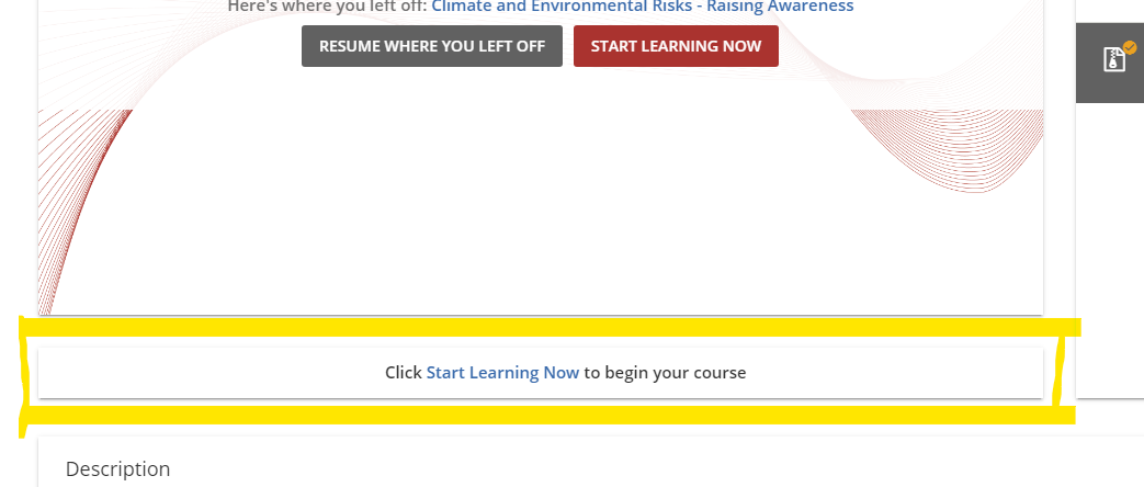
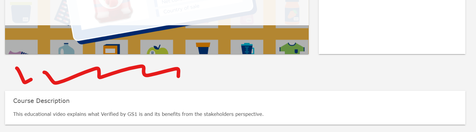
Have you used CSS on the course player to change the look / feel?  If so, I’d love to see a screenshot & a little bit of understanding as to what you’re able to accomplish w the added CSS. 


Would love some ideas on what people have come up! 


Cheers!

Did this post help you find an answer to your question?

4 replies

Alan
Guide I
Forum|alt.badge.img+2
  • Guide I
  • 170 replies
  • October 20, 2021

Hi @josefinarod 

Nothing significant - yet - but we have made one minor tweak to hide the panel that sits under the content player. This one:


It seemed superfluous and just added clutter, so we disappeared it! This is the CSS:


/* Removes the Click Start Learning Now to begin your course bar */

.chapter-info__wrapper {
        visibility: hidden!important;
}

.course-player-elements__navigation{
    height: 510px;
}


Alan


Annarose.Peterson
Hero III
Forum|alt.badge.img+6
Alan wrote:

Hi @josefinarod 

Nothing significant - yet - but we have made one minor tweak to hide the panel that sits under the content player. This one:


It seemed superfluous and just added clutter, so we disappeared it! This is the CSS:


/* Removes the Click Start Learning Now to begin your course bar */

.chapter-info__wrapper {
        visibility: hidden!important;
}

.course-player-elements__navigation{
    height: 510px;
}


Alan

Oooh!  Thank you for sharing @Alan!  I am going to take this back to my team to see if we can implement!


JeanetteMcVeigh
Hero II
Forum|alt.badge.img+5

Question - I added that to my css but then I get an open area between the course player and the description widget.  I am not good at css, so i am not sure how to fix this...can you help?


Alan
Guide I
Forum|alt.badge.img+2
  • Guide I
  • 170 replies
  • October 21, 2021

Hi @JeanetteMcVeigh 

That’s true and it was bugging me a bit too, so I played around with it some more. I found that you can reduce the gap by using “display: none !important;”, so the revised CSS would be:

/* Removes the Click Start Learning Now to begin your course bar */
.chapter-info__wrapper {
        display: none!important;
}
.course-player-elements__navigation{
    height: 510px;
}

Kind regards,

Alan


Reply


Cookie policy

We use cookies to enhance and personalize your experience. If you accept you agree to our full cookie policy. Learn more about our cookies.

 
Cookie settings