Best Answer

Centering Text of a CSS/HTML flipcard

  • November 18, 2021
  • 7 replies
  • 586 views

JZenker
Guide II
Forum|alt.badge.img+1

Hello,

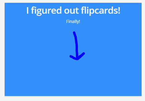
I finally managed to work in flip cards successfully (yay!) but am struggling to get the text of the back of the card to be centered:


Would anyone might have any insight as to what I need to add to either the html or the css to achieve this?


Here is my current code:


HTML:

<div class="flip-card">
  <div class="flip-card-inner">
    <div class="flip-card-front">
      <img src="https://s3.us-east-2.amazonaws.com/docebo.traceinternational/_Site+Images/tasa+widget.jpg" alt="Avatar" style="width:443px;height:300px;" /></div>
    <div class="flip-card-back">
    <div class="align-items-center">
      <h1>I figured out flipcards!</h1>
      <p>Finally!</p>
     </div>
    </div>
  </div>
</div>

CSS:

.flip-card {
  background-color: transparent;
  width: 443px;
  height: 300px;
}

.flip-card-inner {
  position: relative;
  width: 100%;
  height: 100%;
  text-align: center;
  transition: transform 0.8s;
  transform-style: preserve-3d;
}

.flip-card:hover .flip-card-inner {
  transform: rotateY(180deg);
}

.flip-card-front, .flip-card-back {
  position: absolute;
  width: 100%;
  height: 100%;
  -webkit-backface-visibility: hidden; /* Safari */
  backface-visibility: hidden;
}

.flip-card-front {
  background-color: #bbb;
  color: black;
}

.flip-card-back {
  background-color: dodgerblue;
  color: #f5f5f5;
  transform: rotateY(180deg);
}


Best answer by nick.tosto

JZenker wrote:

Would that code look like this?

.flip-card {
  background-color: transparent;
  width: 100%;
  height: 300px;
}

​​

^ yes for the width issue, that’s how I had it. I would leave the static height because there’s nothing setting a height boundary like there is for the width.


For the object-fit CSS, I would add it directly to the <img> html element so it looks like this:

<img src="https://s3.us-east-2.amazonaws.com/docebo.traceinternational/_Site+Images/tasa+widget.jpg" alt="Avatar" style="width:443px; height:300px; object-fit: cover;">

View original
Did this post help you find an answer to your question?

7 replies

JZenker
Guide II
Forum|alt.badge.img+1
  • Author
  • Guide II
  • 232 replies
  • November 18, 2021

Also ran into something else.

On my larger monitor, it displays correctly:

But when I move the browser window to my laptop screen, the widget adds scrollbars. Because my laptop screen is smaller? How can I ensure the formatting will stay the same for any screen size?


Thanks in advance to anyone reading this


Forum|alt.badge.img+2
  • Docebian
  • 65 replies
  • November 24, 2021

Hi @JZenker, I’m not sure if you’re still having issues with this but I messed around with the code and got it working pretty well by changing the width on the flip-card class to 100% instead of 443 px. When it was using the static width, the text was being centered for 443px even if it wasn’t able to be 443px wide. By making it percentage based, it will always be centered in the space that it has and you shouldn’t get those scrollbars.


The other thing I would add is object-fit: cover; to your front image element so that on smaller screen sizes it won’t stretch the image, it will zoom instead.


Hope this helps!


JZenker
Guide II
Forum|alt.badge.img+1
  • Author
  • Guide II
  • 232 replies
  • November 24, 2021

Thanks so much @nick.tosto will give it a shot!


JZenker
Guide II
Forum|alt.badge.img+1
  • Author
  • Guide II
  • 232 replies
  • November 24, 2021
nick.tosto wrote:

Hi @JZenker, I’m not sure if you’re still having issues with this but I messed around with the code and got it working pretty well by changing the width on the flip-card class to 100% instead of 443 px. When it was using the static width, the text was being centered for 443px even if it wasn’t able to be 443px wide. By making it percentage based, it will always be centered in the space that it has and you shouldn’t get those scrollbars.


Would that code look like this?

.flip-card {
  background-color: transparent;
  width: 100%;
  height: 300px;
}

Would you also make the height 100% or just the width?

So the width issue was causing the text not to be centered and the scroll bars?


nick.tosto wrote:

The other thing I would add is object-fit: cover; to your front image element so that on smaller screen sizes it won’t stretch the image, it will zoom instead.


This should be added to the CSS? 

Trying to determine which element that should be added to

.flip-card-front, .flip-card-back {
  position: absolute;
  width: 100%;
  height: 100%;
  -webkit-backface-visibility: hidden; /* Safari */
  backface-visibility: hidden;
}

OR

.flip-card-front {
  background-color: #bbb;
  color: black;
}


Sorry for so many questions, just starting my professional development into CSS. It’s really helpful, thank you


Forum|alt.badge.img+2
  • Docebian
  • 65 replies
  • Answer
  • November 24, 2021
JZenker wrote:

Would that code look like this?

.flip-card {
  background-color: transparent;
  width: 100%;
  height: 300px;
}

​​

^ yes for the width issue, that’s how I had it. I would leave the static height because there’s nothing setting a height boundary like there is for the width.


For the object-fit CSS, I would add it directly to the <img> html element so it looks like this:

<img src="https://s3.us-east-2.amazonaws.com/docebo.traceinternational/_Site+Images/tasa+widget.jpg" alt="Avatar" style="width:443px; height:300px; object-fit: cover;">


JZenker
Guide II
Forum|alt.badge.img+1
  • Author
  • Guide II
  • 232 replies
  • November 24, 2021

@nick.tosto Thank you for going above and beyond, really appreciate it


dklinger
Hero III
Forum|alt.badge.img+8
  • Hero III
  • 1671 replies
  • November 29, 2021

So much to learn from yawl….I have to implement one @JZenker.


Reply


Cookie policy

We use cookies to enhance and personalize your experience. If you accept you agree to our full cookie policy. Learn more about our cookies.

 
Cookie settings