


I came across an animation that I thought was pretty cool and I decided I would try to recreate the effect for use with Docebo.
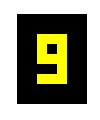
This is an animated countdown timer - currently only 9 to 0 - I suppose you could have it count up as well. It uses two black divs over the top of a greenyellow div. The two black divs simply animate to different locations within the green div to mask portions of it out so that the result is a number showing through.
The animation lasts for 10 seconds as you might imagine.
Here is the code for you to play with and tweak as desired. As usual - there are two parts - CSS and HTML.
First the CSS
/** This is a countdown timer **/

/** This sets the size and color of your overall background **/
.digitBG {
  background-color: black;
  width: 70px;
  height: 90px;
  position: absolute;
}

/** This sets the size, color, and start position of your number digit **/
.digit {
  height: 50px;
  width: 30px;
  background-color: greenyellow;
  position: relative;
  top: 20px;
  left: 20px;
}

/** These are shared parameters of both masks **/
.mask1, .mask2 {
  background-color: black;
  animation-duration: 10s;
  position: absolute;
  animation-iteration-count: infinite;
}

/** This associates the animation to the div **/
.mask1 {
  animation-name: moveMask1;
}

/** This associates the animation to the div **/
.mask2 {
  animation-name: moveMask2;
}

/** This is the movement of mask1 from 9 to 0 **/
@keyframes moveMask1 {
  0% {top: 10px; left: 10px; height: 10px; width: 10px;}
  9% {top: 10px; left: 10px; height: 10px; width: 10px;}
  10% {top: 10px; left: 10px; height: 10px; width: 10px;}
  19% {top: 10px; left: 10px; height: 10px; width: 10px;}
  20% {top: 10px; left: 0px; height: 15px; width: 20px;}
  29% {top: 10px; left: 0px; height: 15px; width: 20px;}
  30% {top: 10px; left: 10px; height: 10px; width: 20px;}
  39% {top: 10px; left: 10px; height: 10px; width: 20px;}
  40% {top: 10px; left: 10px; height: 10px; width: 20px;}
  49% {top: 10px; left: 10px; height: 10px; width: 20px;}
  50% {top: 0px; left: 10px; height: 20px; width: 10px;}
  59% {top: 0px; left: 10px; height: 20px; width: 10px;}
  60% {top: 10px; left: 0px; height: 10px; width: 20px;}
  69% {top: 10px; left: 0px; height: 10px; width: 20px;}
  70% {top: 10px; left: 0px; height: 10px; width: 20px;}
  79% {top: 10px; left: 0px; height: 10px; width: 20px;}
  80% {top: 0px; left: 0px; height: 25px; width: 20px;}
  89% {top: 0px; left: 0px; height: 25px; width: 20px;}
  90% {top: 10px; left: 10px; height: 15px; width: 10px;}
  99% {top: 10px; left: 10px; height: 15px; width: 10px;}
  100% {top: 10px; left: 10px; height: 10px; width: 10px;}
}

/** This is the movement of mask2 from 9 to 0 **/
@keyframes moveMask2 {
  0% {top: 30px; left: 0px; height: 10px; width: 20px;}
  9% {top: 30px; left: 0px; height: 10px; width: 20px;}
  10% {top: 30px; left: 10px; height: 10px; width: 10px;}
  19% {top: 30px; left: 10px; height: 10px; width: 10px;}
  20% {top: 25px; left: 0px; height: 25px; width: 20px;}
  29% {top: 25px; left: 0px; height: 25px; width: 20px;}
  30% {top: 30px; left: 10px; height: 10px; width: 10px;}
  39% {top: 30px; left: 10px; height: 10px; width: 10px;}
  40% {top: 30px; left: 0px; height: 10px; width: 20px;}
  49% {top: 30px; left: 0px; height: 10px; width: 20px;}
  50% {top: 30px; left: 0px; height: 20px; width: 20px;}
  59% {top: 30px; left: 0px; height: 20px; width: 20px;}
  60% {top: 30px; left: 0px; height: 10px; width: 20px;}
  69% {top: 30px; left: 0px; height: 10px; width: 20px;}
  70% {top: 30px; left: 10px; height: 10px; width: 20px;}
  79% {top: 30px; left: 10px; height: 10px; width: 20px;}
  80% {top: 25px; left: 0px; height: 25px; width: 20px;}
  89% {top: 25px; left: 0px; height: 25px; width: 20px;}
  90% {top: 25px; left: 10px; height: 15px; width: 10px;}
  99% {top: 25px; left: 10px; height: 15px; width: 10px;}
  100% {top: 30px; left: 0px; height: 10px; width: 20px;}
}
The HTML is really simple.
<!-- Place the divs in your widget -->
<!-- Make sure the two masks are in the digit div -->

<div class="digitBG">
  <div class="digit">
    <div class="mask1"></div>
    <div class="mask2"></div>
  </div>
</div>
Hopefully this will add some fun to someone’s day!
I would love to hear how you have used this idea - please share below.


