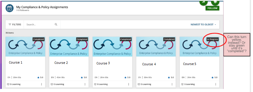
Currently “in progress” courses show as having a black background, which matches the background of “completed” courses. Could this be a different color so it’s more eye-catching to the user? Or stay green until it’s completed?

Currently “in progress” courses show as having a black background, which matches the background of “completed” courses. Could this be a different color so it’s more eye-catching to the user? Or stay green until it’s completed?

Best answer by MHelme
We got it to work with this:
/** Change text color of In-Progess indicator on tile **/Enter your email address or username and password below to log in to Docebo Community. No account yet? Create an account
Enter your E-mail address. We'll send you an e-mail with instructions to reset your password.