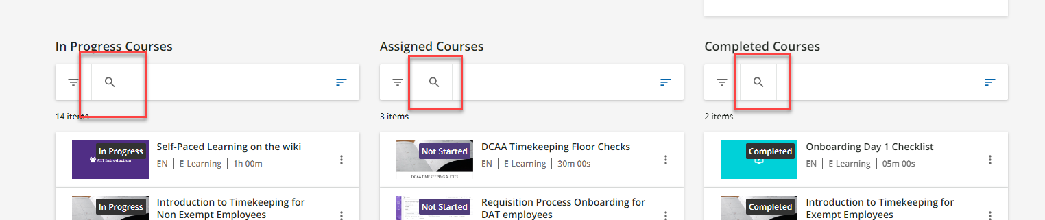


We really like the look and feel of the search on the Courses and Learning Plans widget whenever the widget is three columns wide.
Example of what we like:
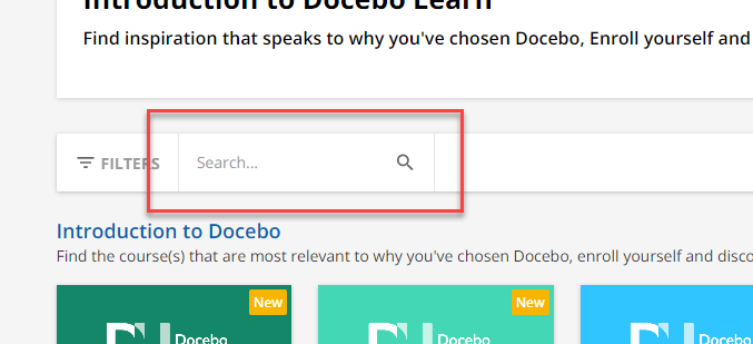
We would love if it would look like this whenever the widget is placed in a singular column or two column, but instead of shortens. There’s more than enough real estate on the page for it to look the same as the one that’s all three column. Does anyone know how to change this? I assume the answer is some sort of CSS or jquery, which I am comfortable doing.
Example of what we don’t like: