


In this idea - I thought I would play with some rotation.
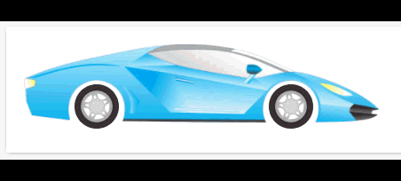
I attempted to provide a little something extra too. A CAR! - or at least the appearance of a moving car.
Perhaps I will see about animating the entire set at some point.
Here we have three images - I am only animating two of them - of course.
Both tires are tied to the same keyframe code.
Here is the code.
/* Here is the CSS for the Branding and Look section */
/* Car Tires */

#backTire {
  width: 50px;
  height: 50px;
  left: 77px;
  top: 65px;
  position: absolute;
  animation-name: carTires;
  animation-duration: 3s;
  animation-iteration-count: infinite;
  animation-timing-function: linear;
}

#frontTire {
  width: 50px;
  height: 50px;
  left: 296px;
  top: 65px;
  position: absolute;
  animation-name: carTires;
  animation-duration: 3s;
  animation-iteration-count: infinite;
  animation-timing-function: linear;
}

@keyframes carTires
{
    100% {transform: rotate(360deg);}
}
<!-- Here is the HTML for the widget -->
<div style="padding:20px;">
<div><img src="https://path/to/your/graphic/car.png" width="400" height="101"/></div>
<div>
<img id="backTire" src="https://path/to/your/graphic/tire.png" width="50" height="50"/></div>
<div>
<img id="frontTire" src="https://path/to/your/graphic/tire.png" width="50" height="50"/></div>
</div>
What are some other ideas you can think of to spice up your platform with rotation animations?

