


In this example, I tried to do something a little bit more complicated and come up with an effect that might resemble cycling through a set of flash cards.
The tricky part of this was that using the z-index - which was my first idea - was not cooperating well. So I ended up working with the opacity instead. I figured it did the job well enough.
This animation is set to allow you a full 5 seconds to view each of 5 cards.
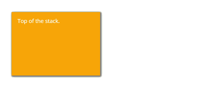
Due to the timing nature of this particular effect - it is only meant to cycle once through the deck. The animated gif above simply captures it once through and repeats it for you.
Here is the CSS for this one…
/* Card Shuffle */

/* This CSS goes in the Branding and Look Section */

.cards {
  width: 250px;
  height: 170px;
  margin: 40px;
  padding: 20px;
  color: white;
  font-size: large;
  position: absolute;
  box-shadow: 2px 2px 5px grey;
}

#card1 {
  background-color: green;
}

#card2 {
  background-color: blue;
  animation-name: shuffle;
  animation-duration: 2s;
  animation-delay: 26s;
  animation-fill-mode: forwards;
  animation-iteration-count: 1;
}

#card3 {
  background-color: red;
  animation-name: shuffle;
  animation-duration: 2s;
  animation-delay: 19s;
  animation-fill-mode: forwards;
  animation-iteration-count: 1;
}

#card4 {
  background-color: black;
  animation-name: shuffle;
  animation-duration: 2s;
  animation-delay: 12s;
  animation-fill-mode: forwards;
  animation-iteration-count: 1;
}

#card5 {
  background-color: orange;
  animation-name: shuffle;
  animation-duration: 2s;
  animation-delay: 5s;
  animation-fill-mode: forwards;
  animation-iteration-count: 1;
}

@keyframes shuffle {
  25% {transform: translateX(315px);}
  50% {transform: translateX(0px);}
  100% {opacity: 0;}
}
Here is the HTML I used in my widget.
<!-- This is the HTML for your widget -->

<div class="cards" id="card1">
This is the last card.
</div>

<div class="cards" id="card2">
This is card 4.
</div>

<div class="cards" id="card3">
This is the third card.
</div>

<div class="cards" id="card4">
This is the second card.
</div>

<div class="cards" id="card5">
Top of the stack.
</div>
What are some ideas that you have for an effect like this? Please share!


