


Once again, Nick Tosto (Technical Services Team Lead) is here to help with your design needs. Custom widget pages can be essential to directing your learners on their journey, so read on to learn more about how to effectively use images in widget design.
Nick joined our DU Live session on March 13. Click here to check out the on-demand session!
Docebo widget pages have a maximum width of 1440px with 25px padding on the left and right. Subtracting the padding, that means the maximum space of the content is 1390px wide. For browser windows smaller than 1390px wide, Docebo will automatically resize the content to best fill the space.
The height of a widget depends on the content that needs to be displayed. When more content is shown, the height of the widget will increase because the widget widths are fixed.
When adding images to a widget page, the Image and Custom Content Box widgets are the most commonly used options, but each one handles images in a slightly different way.
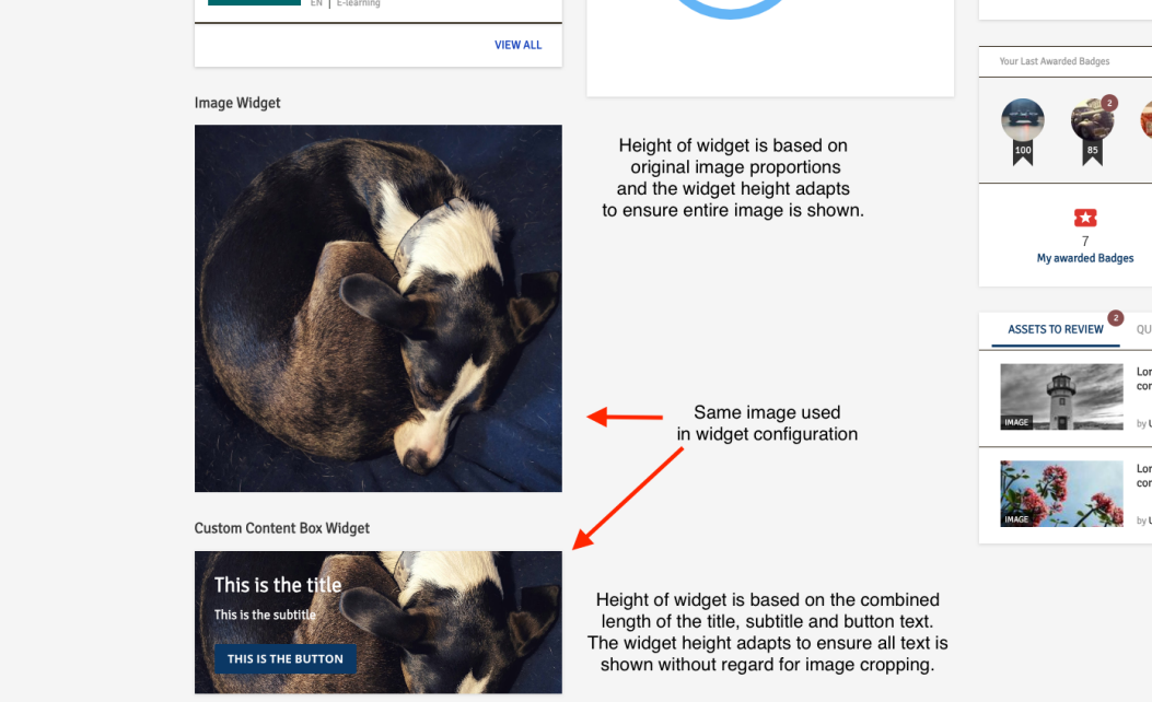
Image Widget
The image widget uses the CSS background-size property “contain”, which means it will scale the image as large as possible within the widget without cropping or stretching the image.
Using the image widget will always result in being able to see the entire image and the height of the widget will be proportional based on the original image’s aspect ratio.
Custom Content Box Widget
The custom content box widget uses the CSS background-size property “cover”, which means it will scale the image to fill the widget container, leaving no empty space. If the proportions of the background differ from the element, the image is cropped either vertically or horizontally.
When using the Custom Content Box widget, the height is dependent on the space that the title, subtitle, and/or button take up. If a background image is added to the widget, it may be cropped either on the top and bottom or left and right in order to make it so the the entire widget’s space is filled by the background image.
For this reason it is not recommended to include text, faces, or anything that shouldn’t be cut off in the background image for your custom content box.
Widget Page Sizing and Spacing
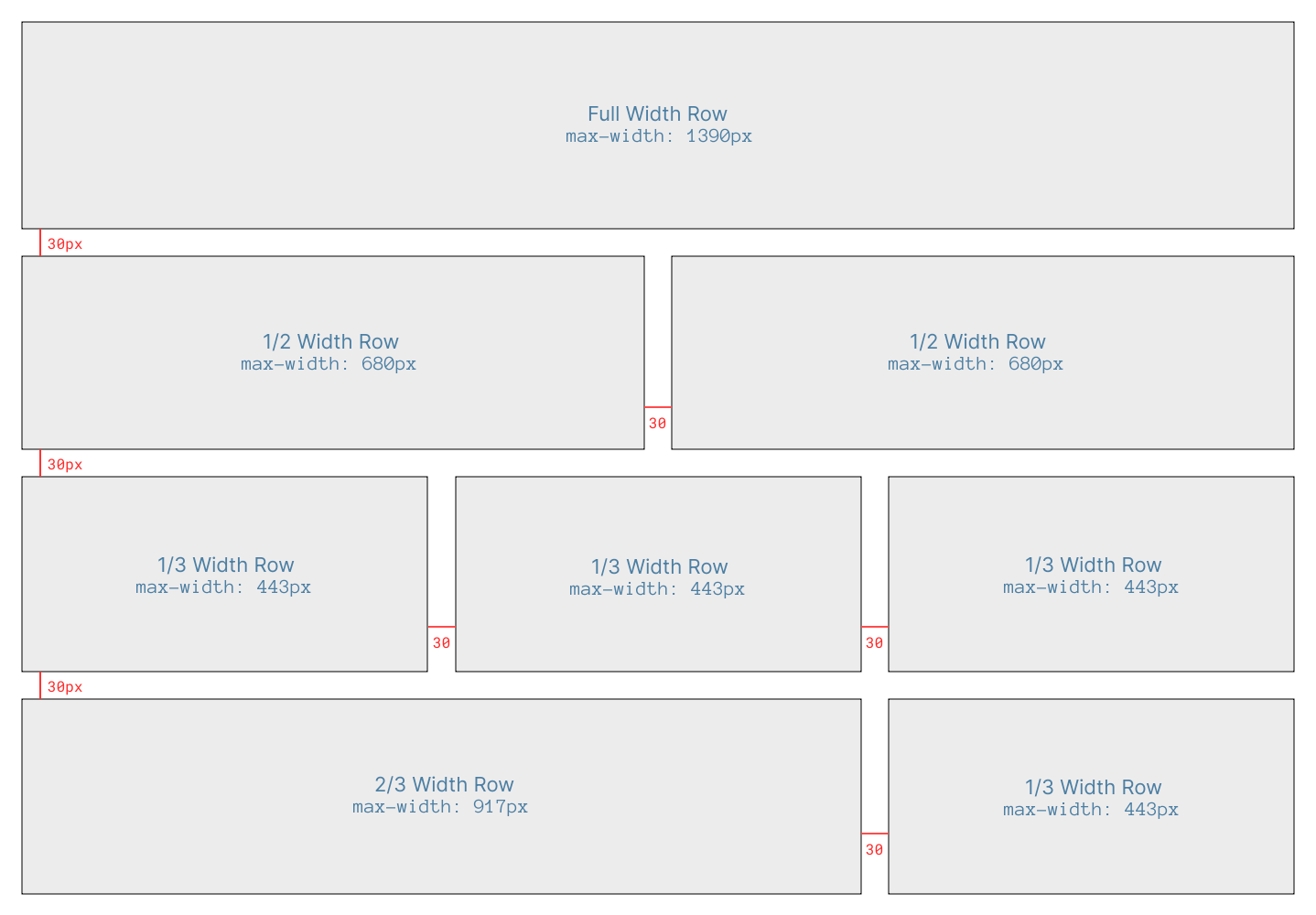
Here are the standard pixel max-widths of widgets depending on the column width. Spacing between columns will be 30px in width.
Full width row: 1390px
2/3 width row: 917px
1/2 width row: 680px
1/3 width row: 443px
When designing a widget page with retina and 4k monitors in mind, you may want to use higher resolution images. To do this, use double or triple these max-widths when selecting your images.
Do you have any of your own tips on designing widgets? Share in the comments below! ⬇️


