


Hello Community members!
I'd like to share one of my favorite code snippets with you, which can enhance the learning experience with a modern touch. By incorporating the code below, you can turn your widgets into rounded objects, similar to buttons, giving your platform a more contemporary look and feel."
/* ****************** */
/* Rounded Experience */
/* ****************** */

/* Sign-in pop-up window block */
.external-simple-content {
  border-radius: 20px;
  overflow: hidden;
  z-index: 1; /* To ensure it stacks above the background */
}

/* Sign-in pop-up window */
.external-simple-signin.ng-star-inserted,
/* Cards in Built-in pages (e.g. My catalogs, My Courses and Learning Plans, etc) */
.ui-card-wrapper,
/* Course Panel Thumbnails within Learning Plans */
.ui-card-header,
/* Enrollment Types badges (e.g. Mandatory, optional, etc) */
.lmn-badge-status-theme-info,
/* Locked courses */
dcb-sh-content-thumbnail {
  border-radius: 10px !important;
  overflow: hidden; /* ensures content respects the rounded corners */
}

/* Badges status (Not Started, In Progress, Completed) */
.ui-badge-status,
/* Buttons */
button {
  border-radius: 100px !important;
  overflow: hidden; /* ensures child elements also follow the rounded shape */
}

/* Widgets in widgets pages */
.pages-widget-page .single-widget *:not(.title):not(.ui-carousel-title):not(.ui-text-link):not(.ui-card-title):not(.ui-typography-heading-5):not(.subtitle) {
  border-radius: 10px;
}
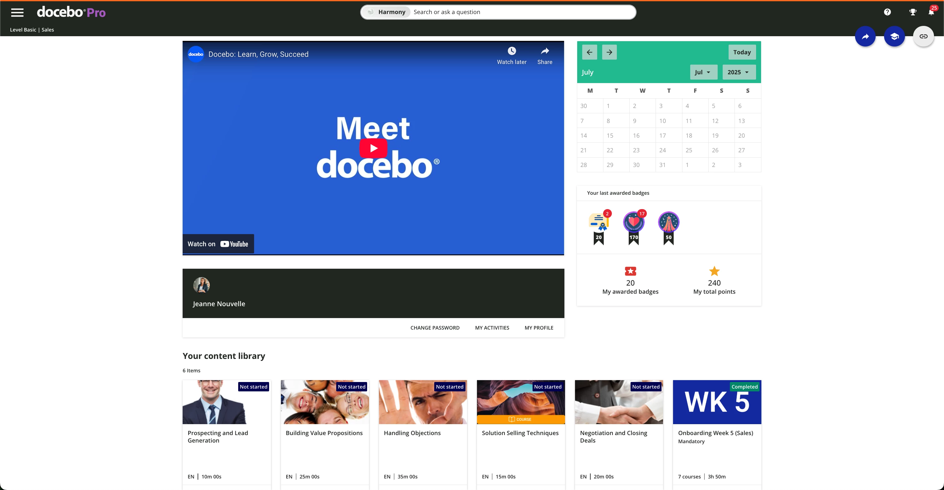
Without the rounded experience :
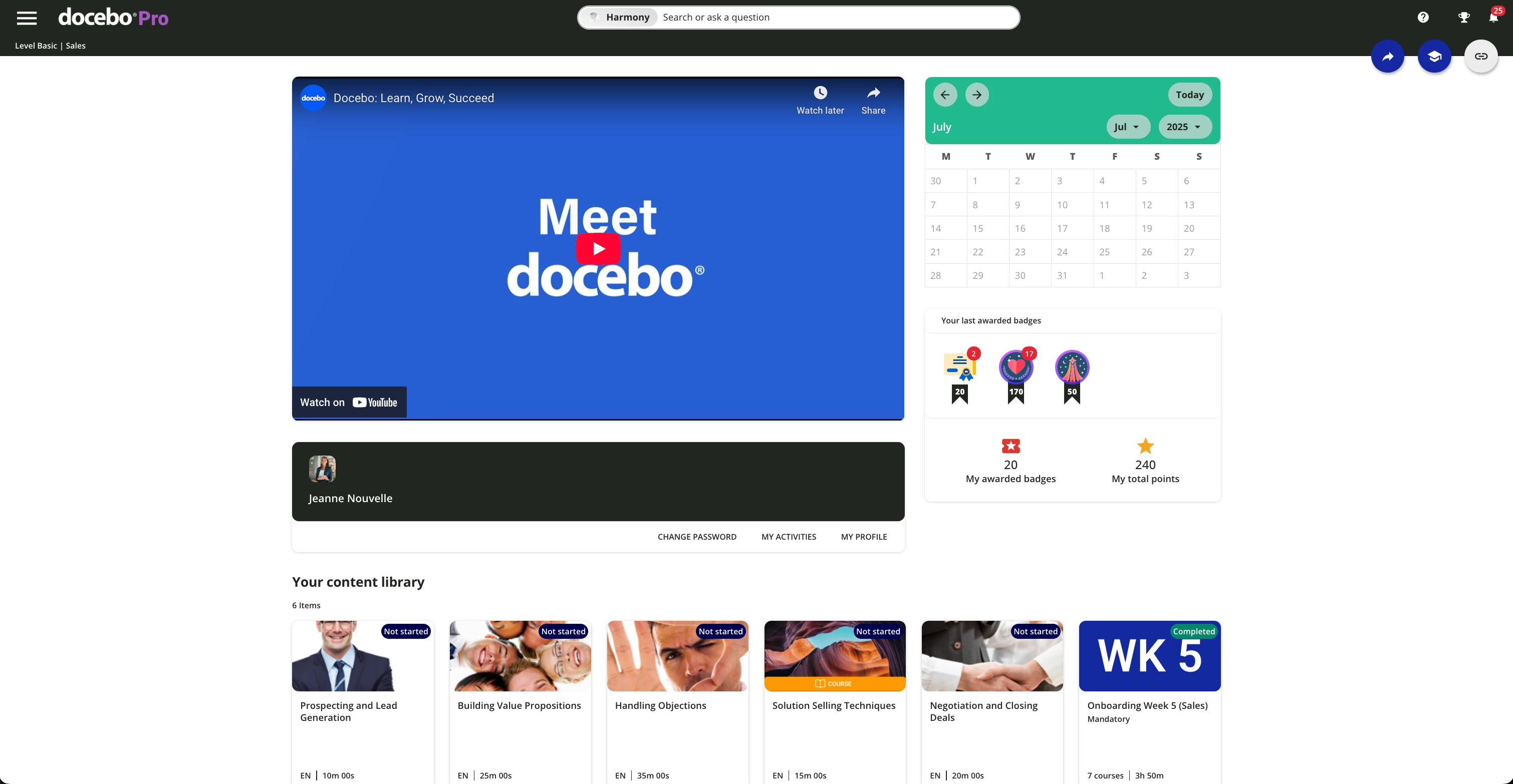
With the rounded experience:
Of course you can increase the border radius if you like to accentuate even further the rounded experience.
Hope it helps!
Similar articles:
- Change the course status color
- Enhance the new calendar widget
- Hide the Page Title and subtitle
- Hide the language code on courses cards

